Chapter 5 Bivariate Data

Figure 5.1: A Statypus Working on a Linear Regression
A female platypus does lactate after giving birth, but it does not have nipples. Their milk oozes out of their skin and the puggles lick it off the mother’s fur.54
When looking at a dataset, we can often go beyond looking at each variable in isolation and investigate the relationship between two different variables. If both variables are quantitative, we can visualize the two variables as a collection of ordered pairs in the \(xy\)-plane. While there are many ways in which one variable can be correlated to another, this chapter will focus on the simplest way, a linear model. That is, we will look at a linear equation which attempts to predict one variable’s value based on the value of the other. We will investigate not only a function used to test the strength of the linear model, but also the function used to find the least squares regression line.
New R Functions Used
Most of the functions listed below have a help file built into RStudio. Most of these functions have options which are not fully covered or not mentioned in this chapter. To access more information about other functionality and uses for these functions, use the ? command. E.g. To see the help file for cor, you can run ?cor or ?cor() in either an R Script or in your Console.
We will see the following functions in Chapter 5.
plot(): Draw a scatter plot with decorations such as axes and titles in the active graphics window.cor(): Computes the covariance or correlation ofxandy.lm(): Used to fit linear models, including multivariate ones. It can be used to carry out linear regression.residuals(): A generic function which extracts model residuals from objects returned by modeling functions.LinearRegression(): Combines all of the major components of linear regression into one function. [Statypus Original Function]
The function
abline()is also mentioned here, but its full functionality is not fully explained. See?ablinefor more information.LinearRegression()was developed at Saint Louis University and does not have any built in help file. Please contact Dr. Phil Huling at phil.huling@slu.edu if you have further questions about its functionality.
The function cor is actually more robust than the treatment it will receive in this chapter. It can use Pearson’s product moment correlation coefficient (what we will call \(r\)), Kendall’s \(\tau\), or Spearman’s \(\rho\).
To load all of the datasets used in Chapter 5, run the following line of code.
5.1 Graphing Bivariate Data
It is often helpful to examine how two quantitative variables are related. The most basic way to do this is to plot them in the \(xy\)-plane. We do this with the concept of a Scatter Plot.
Definition 5.1 Given a set of ordered pairs, \(\left\{ (x_i, y_i ) \right\}\) for \(i = 1,2, \ldots, n\), the Scatter Plot of this data is the collection of these points in the \(xy\)-plane. We will call the variable represented by the \(x\) data points the Independent Variable and the variable represented by the \(y\) data points the Dependent Variable.
The term dependent variable is used to indicate that the distribution of the \(y\) variable may depend on the value of the \(x\) variable, but it should not be inferred that the value of \(x\) actually causes the value of \(y\) to change. We are looking at the relationship between two variables and are not discussing causality.
There are a lot of variations to how scatter plots are drawn including “connecting the dots,” but all scatter plots have their origins in simply plotting the collection of ordered pairs.
The creation of scatter plots is accomplished with the plot() function.
The syntax of plot is
where the arguments are:
type: Sets what type of plot should be drawn. See?plotfor a full list of options
The first vector entered, x, is graphed on the horizontal axis and the second vector entered, y, is graphed on the vertical axis.
Example 5.1 We can make a quick scatter plot investigating the relationship between a car’s horsepower and it’s time taken to complete a quarter mile race using the plot() function.
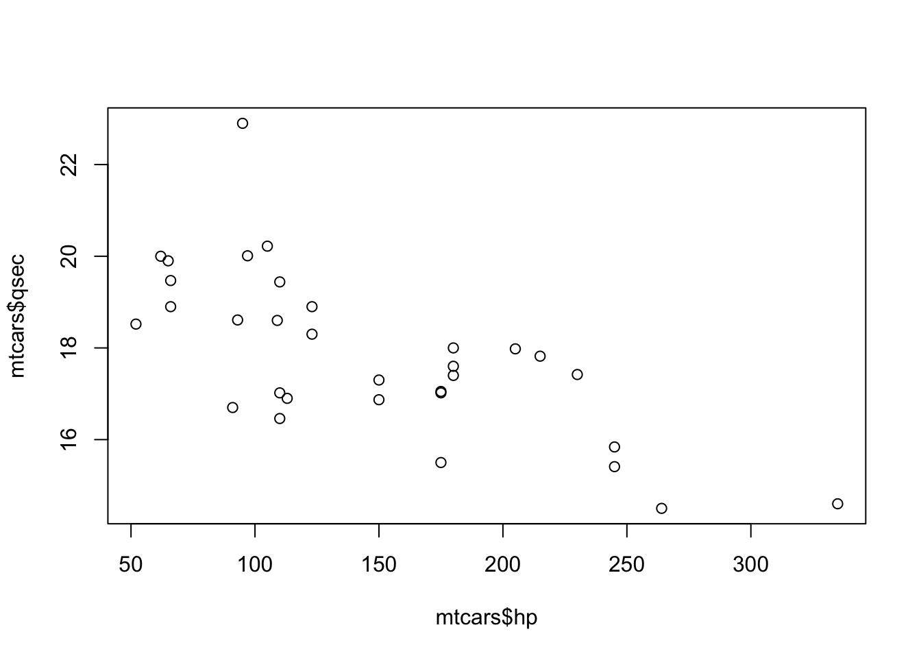
Figure 5.2: Scatter Plot of hp and qsec
We can use head to look at these variables to see some of the values in the plot.
##                    hp  qsec
## Mazda RX4         110 16.46
## Mazda RX4 Wag     110 17.02
## Datsun 710         93 18.61
## Hornet 4 Drive    110 19.44
## Hornet Sportabout 175 17.02
## Valiant           105 20.22
You can check that these six ordered pairs (e.g. \((110, 16.46)\) and \((110,17.02)\)) appear on the plot above. This shows us that a scatter plot is just a collection of the ordered pairs plotted on the same axes.
There that there are many options which can be used with plot which can improve the quality of the output. As we noted before, the aim of this chapter is to create basic graphs and the interested reader is encouraged to use the help function in R or other resources, including other R packages such as ggplot2 if they wish to make more elaborate graphs.
To make a scatter plot of the vector x as the independent variable and y as a dependent variable, we use the code:
If x and y are not equal in length, plot will return an error like below.
## Error in xy.coords(x, y, xlabel, ylabel, log) :
##   'x' and 'y' lengths differ
If both vectors are columns of a dataframe, we could use the following form.
If a dataframe only has 2 columns, we can also simply use the following code.
The plot function is actually quite robust and will even work in many other situations. For example, try running plot( mtcars ) on your computer and see what happens.
Example 5.2 We can use plot to construct a scatter plot between displacement and horsepower of 4 cylinder cars using one of the methods we used in Example 3.6.
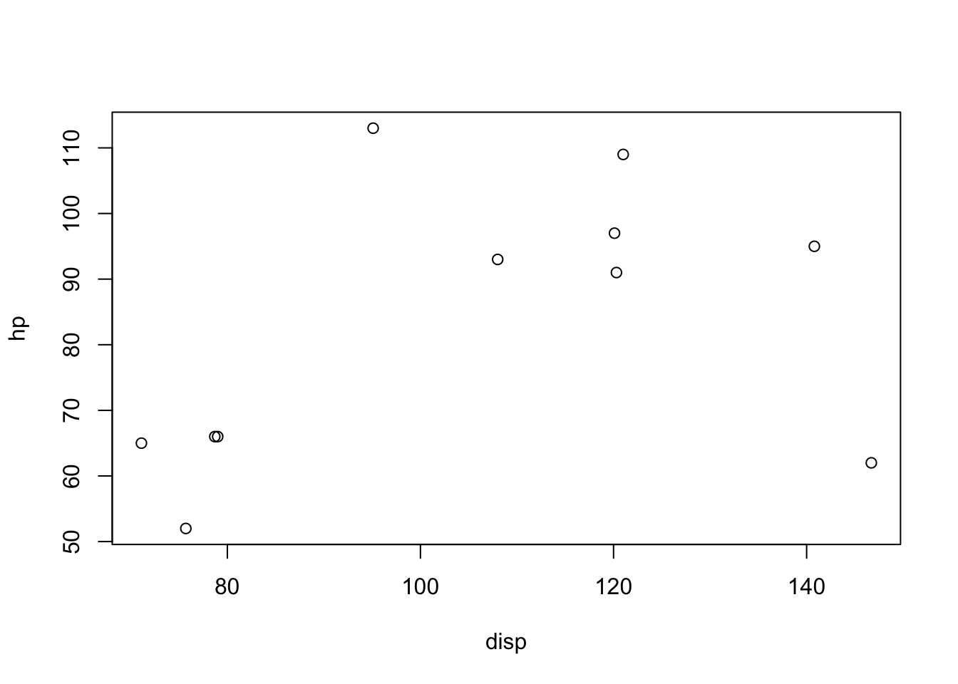
Figure 5.3: Scatter Plot of disp and hp for 4 Cylinder Cars
We remind the reader that the options typed within the brackets, [ ], following mtcars give restrictions on which parts of the dataframe to use. The first part, mtcars$cyl==4, tells R to restrict to only those rows for which the value of the cyl variable is 4. The second part, c( "disp" , "hp" ) tells R to only use those columns labeled disp and hp.
5.2 Time Series
Time series can be seen as a special kind of bivariate data, but they are unique enough that we will treat them separately here. In fact, R has a special data type called Time-Series. airmiles is a dataset which shows the revenue passenger miles flown by commercial airlines in the United States for each year from 1937 to 1960. Running the single line airmiles in RStudio gives the following:
## Time Series:
## Start = 1937
## End = 1960
## Frequency = 1
##  [1]   412   480   683  1052  1385  1418  1634  2178  3362  5948  6109  5981
## [13]  6753  8003 10566 12528 14760 16769 19819 22362 25340 25343 29269 30514
We get that the first time value used is the year 1937 and the final time value is 1960. The fact that Frequency = 1 means that we have data for each year between 1937 and 1960. Using ?airmiles tells us that this is indeed the fact and that the values given are the revenue passenger miles flown for each of those years. Since airmiles is already in the Time-Series data format, we can simply ask RStudio to plot it.
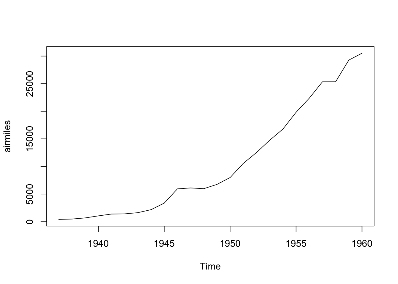
Figure 5.4: Time Series Plot for airmiles
What we see is that we have plotted the ordered pairs \((1937, 412), (1938, 480), \ldots, (1960,30514)\) and connected the ordered pairs along the way. Time series are a bit more organized than generic bivariate data as they are assumed to be equally spaced out (in time) values of a variable. The data should be given in the order they occurred and thus we always get a graph that is drawn from left to right without any “backing up” which is reminiscent of the concept of the Vertical Line Test for a function.
As mentioned before, this chapter will focus on getting a graph out of RStudio and not focus on how one may improve or enhance the output.
Example 5.3 A lot of time series data we look at will likely be in the correct format, but especially data from online homework systems may be imported as a dataframe rather than in the explicit time series format.
We will demonstrate how to handle data that is in a dataframe by creating a toy example of part of the airmiles dataset. The following code creates a dataframe named df and then displays it for us.
year <- c( 1937, 1938, 1939, 1940 )
miles <- c( 412, 480, 683, 1052 )
cola <- data.frame( ColA = year )
colb <- data.frame( ColB = miles )
df <- data.frame( cola, colb )
df
## ColA ColB
## 1 1937 412
## 2 1938 480
## 3 1939 683
## 4 1940 1052As we can see, this is just the first four values in the time series of airmiles along with the years they represent. If we wanted to plot this, we can simply use plot since the dataframe only has two columns.
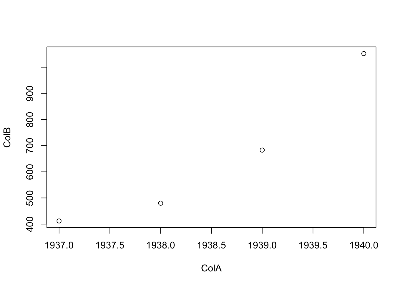
Figure 5.5: First Attempt at Basic Time Series
However, it is customary for time series plots to be connected graphs. This can be done with the argument type of the plot function. We could use type = "b", type = "c", type = "l", or type = "o" and each will give slightly different results. Feel free to play with the other options to see which each does. For more information, you can also run ?plot and look at the arguments portion of the help literature.
We start with just appending the option type = "l" into our existing code where it appears that type = "l" indicates a line.
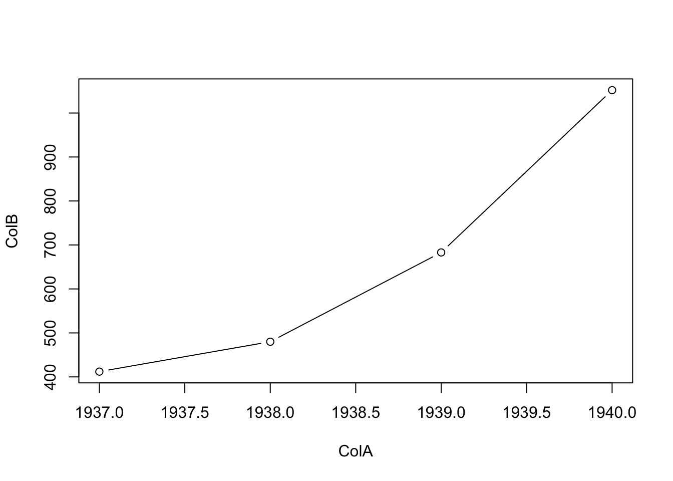
Figure 5.6: Second Attempt at Basic Time Series
If df happened to have more than two columns and we wanted the same graph, we would use the code below where we now use type = "b" where we now get both the lines and the original point markings.
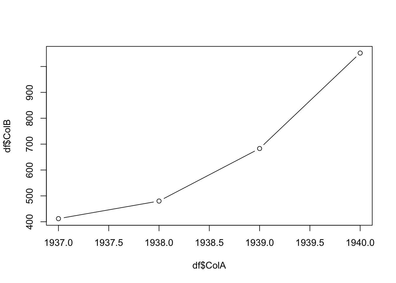
Figure 5.7: Third Attempt at Basic Time Series
5.3 Correlation
There is a very intuitive difference between the two scatter plots shown below.
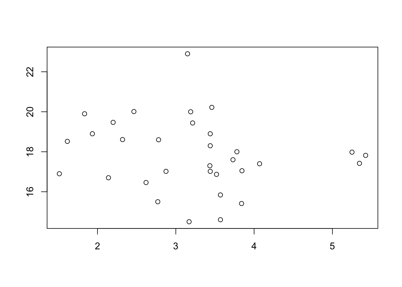
Figure 5.8: Scatterplot Showing No Clear Pattern
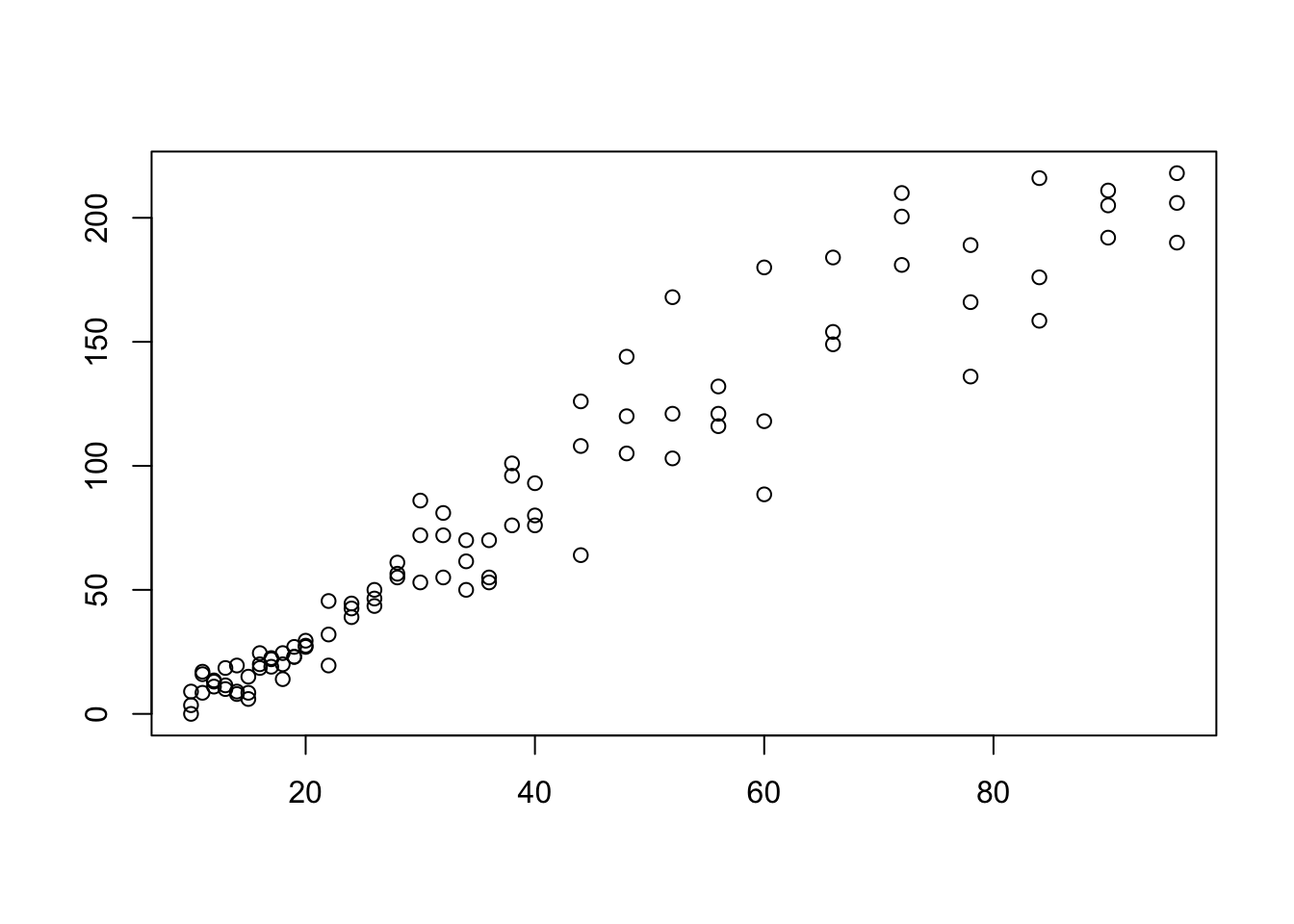
Figure 5.9: Scatterplot Showing an Obvious Pattern
In Figure 5.9 we see a fairly clear relationship between the \(x\) and \(y\) variables. Higher values of \(x\) seem to correspond to higher values of \(y\). In Figure 5.8, however, it does not seem that the values of \(y\) depend much if any on the values of \(x\). In order to talk about the distinction between scatter plots like the ones above, we need the concept of correlation.
5.3.1 Pearson’s Correlation Coefficient
The concept of a correlation is to give a numerical value indicating the relationship between two different datasets. While there are a few ways of doing this, we will use Pearson’s (Product Moment) Correlation Coefficient predominantly here at Statypus. Some alternatives are mentioned in the remark following the next definition.
Definition 5.2 Given a set of ordered pairs of real numbers \(\big\{ (x_i, y_i)\big\}\), we can define Pearson’s Correlation Coefficient, the Correlation Coefficient, or just simply the Correlation between \({\bf x} = (x_1, x_2, \ldots, x_n)\) and \({\bf y} = (y_1, y_2, \ldots, y_n)\) to be the value \(r\) defined as below. \[ r = \frac{\sum \big( (x_i - \bar{x}) (y_i - \bar{y}) \big)}{\sqrt{ \sum (x_i -\bar{x})^2 \sum (y_i -\bar{y})^2}}\] If \(r>0\), we say that the values are positively correlated. If \(r<0\), we say that the values are negatively correlated.
The concept of correlation is actually more intricate than the treatment it will receive here. Pearson’s (Product Moment) Correlation Coefficient, Kendall’s \(\tau\), and Spearman’s \(\rho\) are all concepts of correlation that have subtly different definitions. Unless otherwise stated, any mention of correlation or correlation coefficient in Statypus should be taken to mean Pearson’s Correlation Coefficient.
Theorem 5.1 The correlation, \(r\), between two vectors, \({\bf x}\), and \({\bf y}\), satisfies the following:
\(-1 \leq r \leq 1\)
\(|r| =1\) means that the ordered pairs \(\big\{ (x_i, y_i)\big\}\) are collinear.
Correlation is a symmetric operation. That is, the correlation of \({\bf x}\) and \({\bf y}\) is the same as the correlation of \({\bf y}\) and \({\bf x}\), i.e. the order of the vectors does not matter.
\(r=1\) means that there is perfect positive correlation, or that all of the values lie along a line with a positive slope.
\(r=-1\) means that there is perfect negative correlation, or that all of the values lie along a line with a negative slope.
The proof of Theorem 5.1 (and the above Remark) is in this chapter’s appendix, Section 5.7.2.1.
It is imperative to note that a correlation of \(r = \pm 1\) is not a goal to be sought after. Data varies and the correlation measures how much of the variability of one variable can be explained by another variable. We will go into this further in Section 5.6.2.
If we have \(r = \pm 1\), then, in essence, the two variables are simply a “conversion” of the one another like we would have between temperature being measured on the Celsius and Fahrenheit scale. This is unrealistic with data we are likely to encounter.
As we will see in Example 5.6, there is a strong correlation between the height of the ramp a toy car is rolled down from and the distance it travels once it leaves the ramp and begins to “fly.” However, just as we assume that the flight of a coin will result in a “random” result, we should also expect some randomness or variability in the flight of a car even if all other effects have been controlled to the extent of our abilities.
The following exploration can be used to see how the value of \(r\) changes as points are moved around.
You can move each point to any place within the black box and the value of \(r\) will be displayed at the top of the screen.
The “crosshairs” align to the point \((\bar{x}, \bar{y})\) and show the mean of both of the variables.
If you toggle the “Labels” switch to On, the meaning of the colored rectangles is made clear.
Move the points in the scatter plot above to obtain the following values of \(r\).
- \(r\) = 0.9.
- \(r\) = 0.75.
- \(r\) = 0.5.
- \(r\) = 0.25.
- \(r\) = 0.
- \(r\) = -0.5.
- \(r\) = -0.8.
- \(r\) = -1.
The value of correlation is so fundamental, that R has a built in function to calculate it, cor().
The syntax of cor is
where the arguments are:
use: An optional character string giving a method for computing covariances in the presence of missing values.
To find the value of the correlation between two variables, we use the cor() function.
We will make this more formal in Section 5.6.2, but the square of the correlation, \(r^2\), is called the Coefficient of Determination and is a direct measure of “how strong” the correlation is between two vectors.
While \(r\) is the correlation, it is the value of \(r^2\) that explicitly states the strength of the relationship between the \(x\) and \(y\) values.
Remark.
Due to the symmetry of the formula for correlation, the order of the variables does not matter.
If you run
coron a dataframe of all numeric values, it will give an array of all of the correlations between the variables.If you run
coron a dataframe that contains non-numeric values, you will likely see an error such as:## Error in cor(df) : 'x' must be numeric
Example 5.4 (A Weak Example) Using the mtcars dataset, we can see the level of correlation between a vehicle’s weight and the time it takes to complete a quarter mile race.
## [1] -0.1747159This shows a weak correlation and gives an \(r^2\) value of around 3%. This means that the variation of a vehicle’s quarter mile time can only be 3% explained by the vehicle’s weight and the other 97% is due to randomness. That is, a vehicle’s weight has very little correlation to its quarter mile time. We will go deeper into this topic in Section 5.6. For now, we simply interpret \(r^2\) as a measure of the strength of the linear relationship between two sets of data.
We can see this by looking at the scatter plot of the relationship.
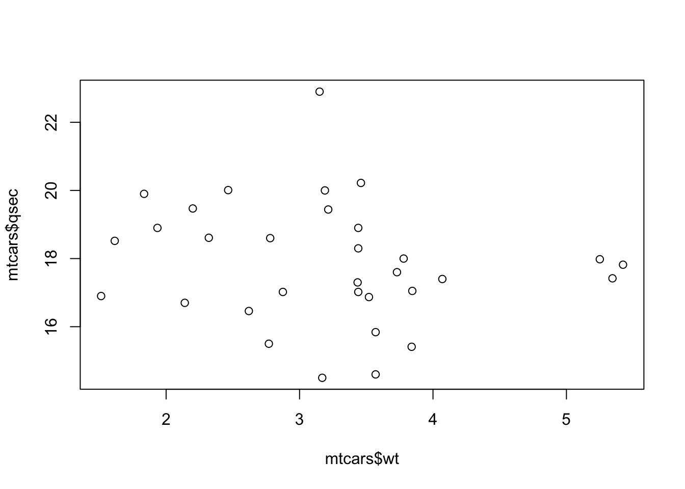
Figure 5.10: Scatter Plot of wt and qsec
Example 5.5 We can examine the relationship between a vehicle’s engine displacement, measured in cubic inches, and it’s weight, measured in thousands of pounds. An engine’s displacement is a measure of an engine’s size and is the measure of the cylinder volume swept by all of the pistons of a piston engine, excluding the combustion chambers according to Wikipedia.
We can begin by creating the scatter plot showing weight as the dependent variable.

Figure 5.11: Scatterplot Showing a Stronger Correlation
This gives us a feel that we will have a much better value of \(r^2\) so that the linear model will be a better predictor. The value of \(r\) is calculated below.
## [1] 0.8879799This means that \(r^2\) is given below.
## [1] 0.7885083As mentioned above, we will leave it until Section 5.6 to be precise in our language, but for now we will simply say that the strength of the correlation between a car’s engine’s displacement and that car’s weight is approximately 78.9%.
Example 5.6 (Toy Cars: Part 1) Having a mathematician as a father definitely impacts the way you are raised. When your father is a professor, every part of your life can become a lesson, even your toy cars. Lincoln was a boy who loved toy cars and used to get so excited for the single new car he would get from his grandfather upon (nearly) every visit.
 Enjoying the Beach](images/LincolnSDPencil.png)
Figure 5.12: Lincoln Enjoying the Beach
One day Lincoln asked his father if he could roll his toy cars down a large tube that had been purchased for another project.55 His father obliged, but decided to turn the adventure into a statistics lesson. With the help of Lincoln’s sister, Melody (we will meet her in Chapter 8), they carefully measured the height that the back end of the tube was elevated to and then also the lateral distance that the car traveled once it left the tube. Both measurements were made in inches. That data can be downloaded via the following line of code.
Use the following code to download ToyCars.
As always, we will run str to see what we are working with.
## 'data.frame':    96 obs. of  2 variables:
##  $ Height  : int  10 10 10 11 11 11 12 12 12 13 ...
##  $ Distance: num  9 0 3.5 16 17 8.5 11 13 13.5 11.5 ...
ToyCars is a dataframe with 96 observations of 2 variables, Height and Distance. The data was originally compiled in a Desmos spreadsheet to show Lincoln what bivariate data looked like. We can reproduce the graph that Lincoln saw now using R.
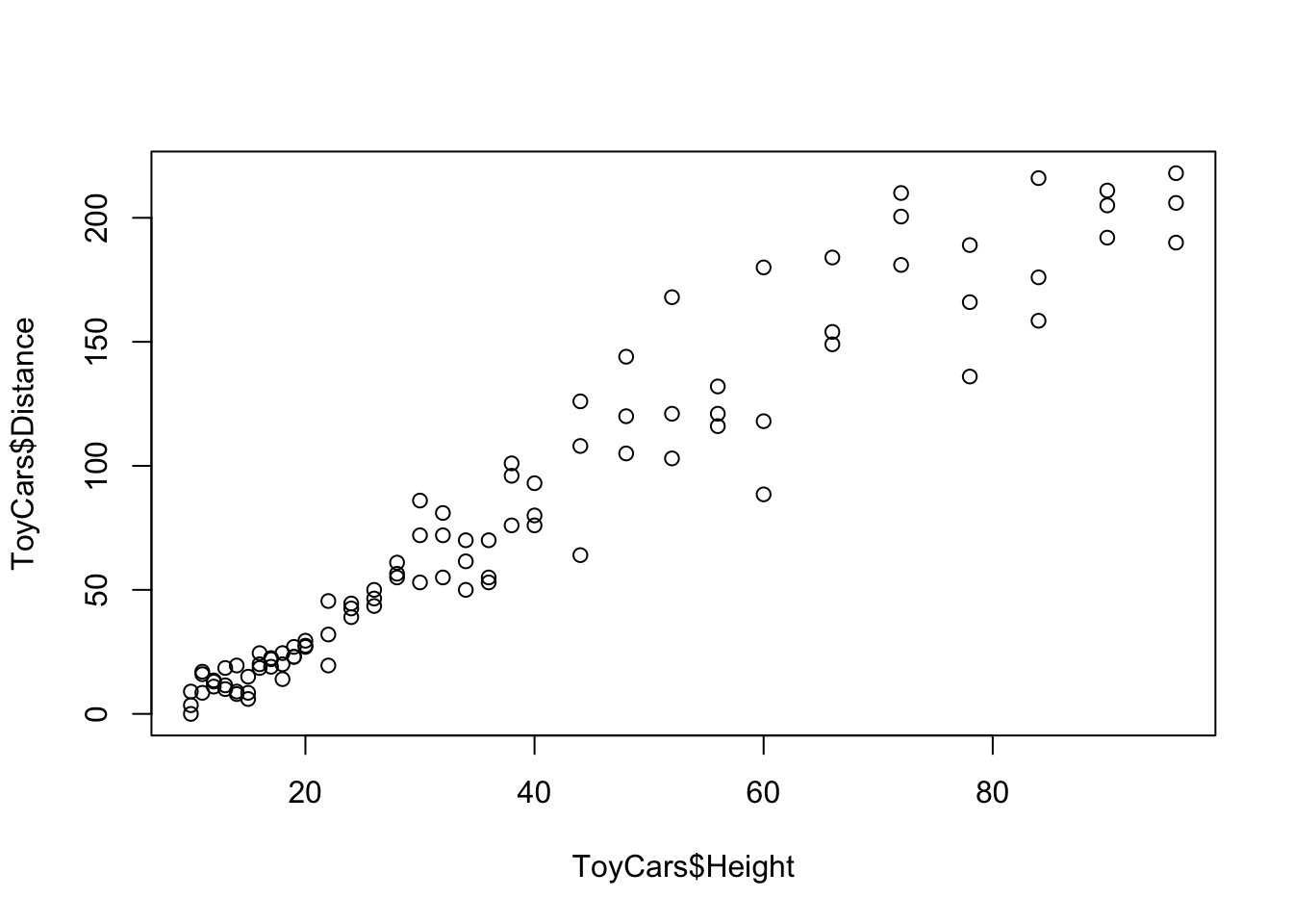
Figure 5.13: Scatterplot for Toy Cars
This is, in fact, the dataset we showed you as an example of an obvious pattern at the beginning of Section 5.3. Visually we see what appears to be a very strong positive correlation. We can now get a value of this correlation coefficient, \(r\), from R, using cor.
## [1] 0.9644005This gives us a very high correlation of \(r \approx 0.9644\)! Squaring this value gives us an \(r^2\) value of approximately 93%. This means that the correlation between the height the car was dropped from and the distance it traveled is 93% strong!
We will revisit this example again once we have the concept and formula for our Least Squares Regression Line, which we will introduce shortly in Section 5.4.
5.3.2 Linear Correlation
It is imperative to make it explicit that the concept of correlation we have defined here is only looking for linear relationships. If the datasets have a non-linear relationship, it is possible to get surprising values of \(r\).
While it is possible to do more advanced types of correlation, we will only be looking at Linear Correlation in this chapter.
Example 5.7 Lets look at the following sets of points.
If we plot these, we will see a very clear relationship.
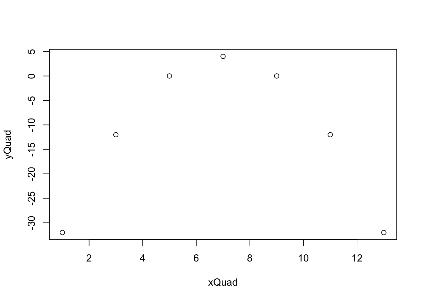
Figure 5.14: Scatterplot for Quadratic Data
The points make up a very clear parabola and come from a perfect quadratic relationship. However, if we calculate \(r\) for these data, we will get the following.
## [1] 0This says that there is 0 linear correlation between the datasets and that means that the strength of the linear relationship is \(r^2 = 0\) as well. We will look at the precise meaning of this in Section 5.6.2.
5.3.3 Missing Values
We have seen that datasets can often have missing or NA values which can cause errors for certain R functions.
Example 5.8 We revisit the dataframe BabyData1 which we first encountered in Chapter 3. If you already have BabyData1 in your RStudio environment, you can skip the next line of code, as it will load BabyData1 into RStudio.
Use the following code to download BabyData1.
We will look at the relationship between the age of a baby’s mother to the age of a baby’s father.
## [1] NAAs we have seen before, this means that some value is missing. The option we used before, na.rm, isn’t ideal as we need to keep only the pairs where both values are present.
The fix we need is to use the use argument we have overlooked to this point. We can set use = "complete.obs" as shown below.
## [1] 0.7516507This immediately resolves our issue.
5.4 Least Squares Regression Line
After Lincoln had rolled his car well over a 100 times (only 96 rolls were scientifically recorded, but many other rolls were had for fun), they entered the data into a Desmos spreadsheet which is shown below. Lincoln’s father then asked him if the data fell on a perfect straight line, to which he responded: No. However, he did say he could “see” where the “best” line should be and he then chose the line shown below completely by “eye.”
This is visually pretty appealing, but we will have to wait until Part 3 of Toy Cars in Example 5.13 to see just how close Lincoln came.
Definition 5.3 Given vectors, \(\bf{x}\) and \(\bf{y}\), we can define the Sum Squared Error of a formula \(y = f(x)\) to be
\[\sum \left( y - f(x)\right)^2 \] where the sum is over all possible ordered pairs \((x,y)\).
As we have written \(y\) as a function of \(x\), we will call \(y\) the Dependent or Response Variable and \(x\) the Independent or Explanatory Variable.
Moreover, we say that the values of \(y - f(x)\) are the Residuals of the formula \(y = f(x)\).
We first encountered this structure in Chapter 4 when we defined the standard deviation. In that instance, we set \(f(x)\) to be the constant value of \(\bar{y}\). It is our hope that allowing the use of a non-constant function will allow us to find a smaller sum squared error than \(\sum \left( y - \bar{y}\right)^2\).
If we return to our ToyCars dataset from Example 5.6, we are looking for a better estimate of \(y\) values than the constant function \(y = \bar{y}\). That is, we want to find a better estimate than the line shown in the following scatter plot.
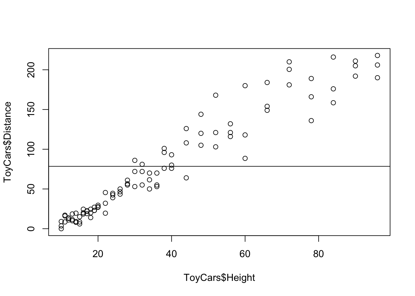
Figure 5.15: Scatterplot Showing the Distance Mean
It appears that simply “tilting” the line above could lower the sum squared error. That is, we would like to find the line that minimizes the sum squared error. While the actual derivation of the line that minimizes the sum squared error requires calculus, the concept of trying to find the “best” line is intuitive for most people. We will give the formula that minimizes the sum squared error and then look at an exploration to see how close we can get to the ideal line.
Theorem 5.2 The linear model that minimizes the sum squared error is given by
\[\hat{y} = a + bx\] where \[\begin{align*} b =&\; r \cdot \frac{s_{\bf{y}}}{s_{\bf{x}}}\\ &\text{and}\\ a =&\; \bar{ y}- b \; \bar{ x}. \end{align*}\] We call this the Least Squares Regression Line, Regression Line, or Linear Regression. The value of \(\hat{y}\) when \(x= x_0\) is given by
\[\hat{y}|_{x=x_0} = a + b \cdot x_0.\]
Some readers may be taken aback by the notation used for the regression line as most people are more familiar with the equation \(y = mx + b\). However, this notation leads to the interesting query of why the letter \(m\) is used to denote slope. Historians of math have not been able to offer a definitive reason why \(m\) was chosen and its use may simply have been arbitrary and then copied in near perpetuity. In most modern statistical textbooks (as well as some modern algebra texts), the preferred method for denoting a line in slope intercept form is given by \(y = a + bx\) where \(a\) now represents the \(y\)-coordinate of the \(y\)-intercept and \(b\) denotes the slope. The curious reader will note that this will allow us to quickly generalize to a quadratic function by setting \(y = a + bx + cx^2\) and even push into cubic or quartic functions. While we admit that this notation may not align with what you may have learned previously, we adopt the notation of \(y = a + bx\) to align with most modern resources and to not simply perpetuate the use of \(m\) whose historical origin has no consensus.
It is absolutely vital that the concept of correlation not be incorrectly interpreted as causation. The concepts and tools explored in this chapter, as well as Chapter 12, are only correctly interpreted in terms of the relationship between two variables. While we do call one variable dependent, we are simply analyzing how two variables correlate and are not making a statement about causality.
This comment is crucial as many statistical findings are often misconstrued as causation. For example, there have been numerous studies examining the effects of chocolate on people’s health. This article from CBS explores how one researcher was able to get his “results” into mainstream media when he claimed to have shown that eating chocolate helped people lose weight. Despite any correlation that may (or may not) exist between the consumption of chocolate and weight loss, the study did nothing to prove that chocolate consumption actually caused any weight loss.
A humorous set of examples of spurious correlations can be found at the following website where they even offer “GenAI’s made-up explanation” for each correlation. For one poignant example, click here for an discussion on the correlation between statistics degrees and stomach discomfort.
Example 5.9 A researcher was looking at some data and noticed a very strong correlation between local ice cream sales and violent crime in the area. This is a very clear example of where we have a Confounding Variable, see Definition 2.13, that is affecting both of above variables. At least one confounding variable would be the area’s weather. When the weather is more favorable, we can expect a rise in both ice cream sales and violent crimes as there are simply more people out in public. So while there may be a strong correlation between ice cream sales and violent crimes, we could not claim that one caused the other one.
The facts that the slope of the line is \(b\) and that \(a = \bar{ y}- b \bar{ x}\) is equivalent to saying the slope is \(b = r \cdot \frac{s_{\bf{y}}}{s_{\bf{x}}}\) and the line contains the point \((\bar{ x}, \bar{ y})\).
That is, we can use the equation: \[ \hat{y} - \bar{ y} = b \; ( x - \bar{ x})\] This says that \(\text{dev}(\hat{y}) = b \cdot \text{dev}(x)\) or that
\[\frac{\text{dev}(\hat{y})}{\text{dev}(x)} = b = r\cdot \frac{s_y}{s_x}.\] The value of \(b\) represents the increase we expect in the \(y\) variable for every unit increase of \(x\). The value of \(a\) may not have any practical interpretation if looking at the value of \(x = 0\) requires extrapolation. (See Section 5.5 for more information.)
In this exploration, we will be looking at the interaction of sum squared errors and the least squares regression line.
In this exploration, the points begin in a perfect line which is reflected by the statement that \(r = 1\).
Move the points so that the correlation, \(r\), is a value between 0.7 and 0.8 (or -0.8 and -0.7).
Drag the “Guess Line” slider to “On.”
Move the red and green points and attempt to minimize the value shown as “S.S. Error,” which is the sum squared error for the line shown.
You can toggle the “Show Deviations” slider to get a visualization of what you are attempting to minimize and also toggle the “Show Mean” slider for a bit of a cheat as we know the best line must pass through the point shown which is \(( \bar{x}, \bar{y})\).
Once you believe you have minimized the value sum squared error, you can see how close you are to the least squares regression line by toggling the “Show Best” slider.
The value \(\bar{y}\) is the mean value of the \(y\) variable given no other information. \(\hat{y}\) gives a formula that gives the mean value of \(y\) at a particular \(x\) value. That is to say, \(\hat{y}\) should give us a better estimate of a \(y\) value because we have more information.
In nearly all cases (where \(|r| \neq 1\)), there will be variability in \(y\) even with knowledge of what the value of \(x\) is. The value of \(\hat{y}|_{x=x_0}\) should be seen as a point estimate for the mean of all possible values of \(y\) such that \(x = x_0\), which we can denote as \(\bar{y}|_{x=x_0}\).
The linear model function, lm(), is used to find the least squares regression line. The syntax needed to have a variable x or df$xCol be an explanatory variable for the variable y or df$yCol is given below.
Please pay particular attention to the order of the variables as it is reversed from
cor.If we recall that the value of \(r\) does not depend on which variable is considered the independent variable and note that the slope of the line is given by \(b = r \cdot \frac{s_y}{s_x}\) shows that the choice of the independent variable affects the graph of the line and not just the equation. That is, if you reverse the roles of \(x\) and \(y\) and then find the regression line you will not get the same line as simply reversing \(x\) and \(y\) in the original regression line.
Fortunately,
lmautomatically handles missing values well and no fix is typically required.
While it is possible to run lm( df ) if df is a two column dataframe, it will run the first column as the dependent variable and the second column as the independent variable. This would mean the dataframe would need to display ordered pairs as (y,x) which is definitely not standard.
Example 5.10 (Revisiting BabyData1) We again revisit BabyData1 which we first encountered in Chapter 3 and saw again in Example 5.8.
We can investigate if there is a relationship between the age of a baby’s mother and its birth weight56 of their baby. Looking at the scatter plot below, we have little hope that this model will produce good results.
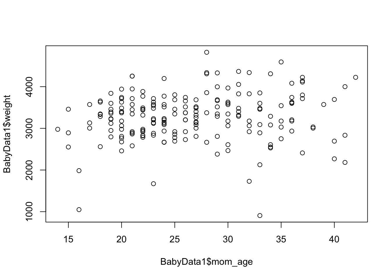
Figure 5.16: Scatter Plot of Mothers’ Ages and the Baby Masses
The lm function will work regardless of how bad the relationship looks to our eye. We can find it using the following code.
##
## Call:
## lm(formula = BabyData1$weight ~ BabyData1$mom_age)
##
## Coefficients:
##       (Intercept)  BabyData1$mom_age
##          3023.610              9.746
This gives a formula of
\(\hat{y} = 3023.610 + 9.746 x\)
where x is a mother’s age and \(\hat{y}\) is the predicted baby’s birth weight.
## [1] 0.1111139which gives an \(r^2\) value of 0.0123463 or approximately 1.2%. This means that the linear model found above only accounts for 1.2% of the variation in a baby’s weight and the other 98+ percent is due to factors not related to the mother’s age.
While we can explicitly label x and y in most functions, for example, x = BabyData1$weight, doing so in lm could cause an error.
Example 5.11 (Returning to mtcars) We can return to the relationship between a vehicle’s engine displacement and its weight which we investigated in Example 5.5. The variables had an \(r^2\) value of 0.7885083 which means that any variation in a vehicle’s weight can be approximately 79% explained by the engine’s displacement.
As we will be doing repeated calculations with these vectors, we rename57 the vectors x and y.
We can find the linear model using the lm function.
##
## Call:
## lm(formula = y ~ x)
##
## Coefficients:
## (Intercept)            x
##     1.59981      0.00701
This gives a formula of
\[\hat{y} = 1.59981 + 0.00701 x\]
where x is a vehicle’s engine displacement and \(\hat{y}\) is the predicted vehicle’s weight. To see if we should trust this linear model, we can further investigate mtcars$disp and mtcars$wt.
As an example, this means that if a car had an engine displacement of \(x = 200\) cubic inches, then we would get that the predicted weight would be
\[\hat{y}|_{x = 200} = 1.59981+ 0.00701\cdot 200\]
which we can calculate in R via the following line of code.
## [1] 3.00181which would give a mean weight of approximately 3002 (\(\approx 3.00181\cdot 1000\) since the wt variable is measured in thousands of pounds) pounds for cars with 200 cubic inches of engine displacement.
This is only a point estimate and almost certainly not the exact value. We could invoke more advanced techniques to get a confidence interval for the mean weight of a vehicle with an engine displacement of 200 cubic inches. This type of analysis is covered in Chapter 12.
5.4.1 How to plot yHat with Base R
The code to plot \(\hat{y}\) requires the use of the function abline(), but as mentioned at the beginning of this chapter, we will not be using the full features of this function, so we present it simply as part of a code chunk. The reader can see the Appendix Section 5.7.1 for an alternate way of plotting \(\hat{y}\).
The following is a code chunk of “raw” R code to plot \(\hat{y}\) based on vectors x and y.
We will demonstrate how to use this code via the example we have looked at previously. That is, the regression line of the distance a toy car traveled based on the height it was released from.
Example 5.12 (Toy Cars: Part 2) We can now finally give a least squares regression line for our ToyCars dataset which we first saw in Example 5.6. Using the Code Template above, we get the following output.
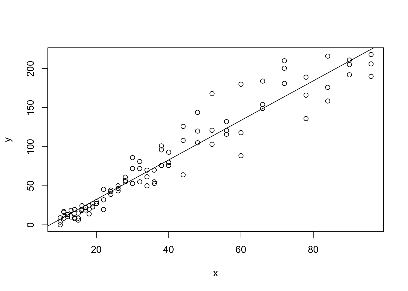
Figure 5.17: Regression Line with Plotted with Base R
This example allows us to demonstrate a few of the characteristics of the least squares regression line. First, the line always passes through the “mean point,” \((\bar{x}, \bar{y})\). To see this we add in a horizontal line through mean(y) and a vertical line through mean(x).58
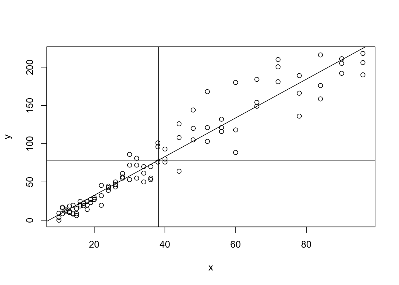
Figure 5.18: Regression Line with Both Sample Means Added
The “width of the box” (that is the plotting window) above is related to \(s_{\bf{x}}\) and the “height of the box” is related to \(s_{\bf{y}}\) as plot automatically chooses a plotting window that captures all points of the scatter plot while leaving a minimum of excess space.
If we were to draw a box which extends \(s_{\bf{x}}\) on either direction of \(\bar{x}\) and \(s_{\bf{y}}\) on either direction of \(\bar{y}\), then the formula
\[b = r \frac{s_{\bf{y}}}{s_{\bf{x}}}\]
means that the slope of the regression line is \(r\) multiplied by the ratio of the box’s dimensions. Moreover, if \(r = \pm 1\), then the regression line should go directly through two corners of the box (lower left and upper right if \(r=1\) and the remaining corners if \(r = -1\)) and measure of how “flat” the regression line is relative to the shape of the box is a visual interpretation of \(r\).
This is, of course, only a loose way of understanding \(r\), and we will give a precise description of what \(r\) is and what it measures in the next section.
You should see that when \(r=1\) that the regression line goes through the top most point of the right edge of the box. As you move the points around, look at how the value of \(r\) affects where the regression line falls on the edge of the purple box. A value of \(r=0.8\) means that it would cross the right edge of the box 80% of the way from the middle to the top corner. A value of \(r = -0.5\) means that the regression line would hit the right edge of the box half way between the middle and lower corner.
5.4.2 The LinearRegression Function
While it is our goal to use native R functions to do our analysis, it is the view of the author that the need for different syntax for lm versus plot and cor can cause student confusion. In addition, to actually plot the regression line require even another function, abline(), which needs to be embedded into another plot as we saw in Section 5.4.1.
Statypus Original Function: See Section 5.7.1 for the code to use this function.
The syntax of LinearRegression() is
#This code will not run unless the necessary values are inputted.
LinearRegression( x, y, x0 = "null" )
where the arguments are:
x,y: Numeric vectors of data values.x0: The \(x\) value to be tested for. Defaults to"null"and is not used.
LinearRegression has been programmed to omit missing values automatically. However, it will return a Warning Message to alert the user that it did so.
Example 5.13 (Toy Cars: Part 3) We looked at the relationship between the height a toy car was released from and the distance it was able to travel after leaving a tube. We used plot, cor, lm, and abline to investigate the correlation before, but LinearRegression above can do all of that (and more) at once.
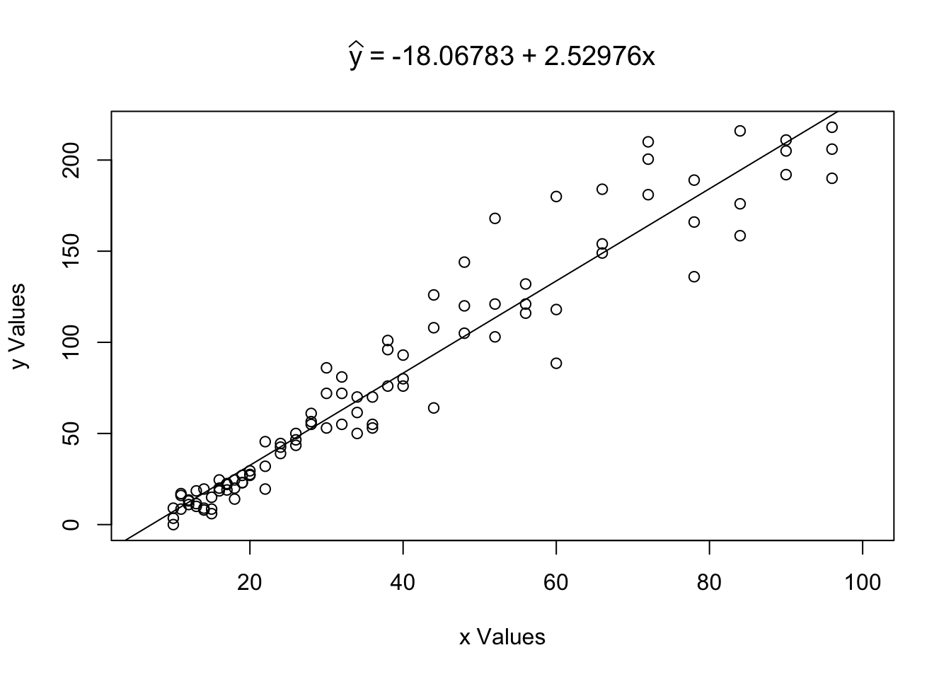
Figure 5.19: Example of Using the LinearRegression Function
## $Correlation
## [1] 0.9644005
##
## $Intercept
## [1] -18.06783
##
## $Slope
## [1] 2.52976
We can also use LinearRegression to calculate \(\hat{y}\) for a given value \(x_0 =\)x0. For example, we can calculate \(\hat{y}|_{x = 62}\) by setting x0 = 62 as follows.
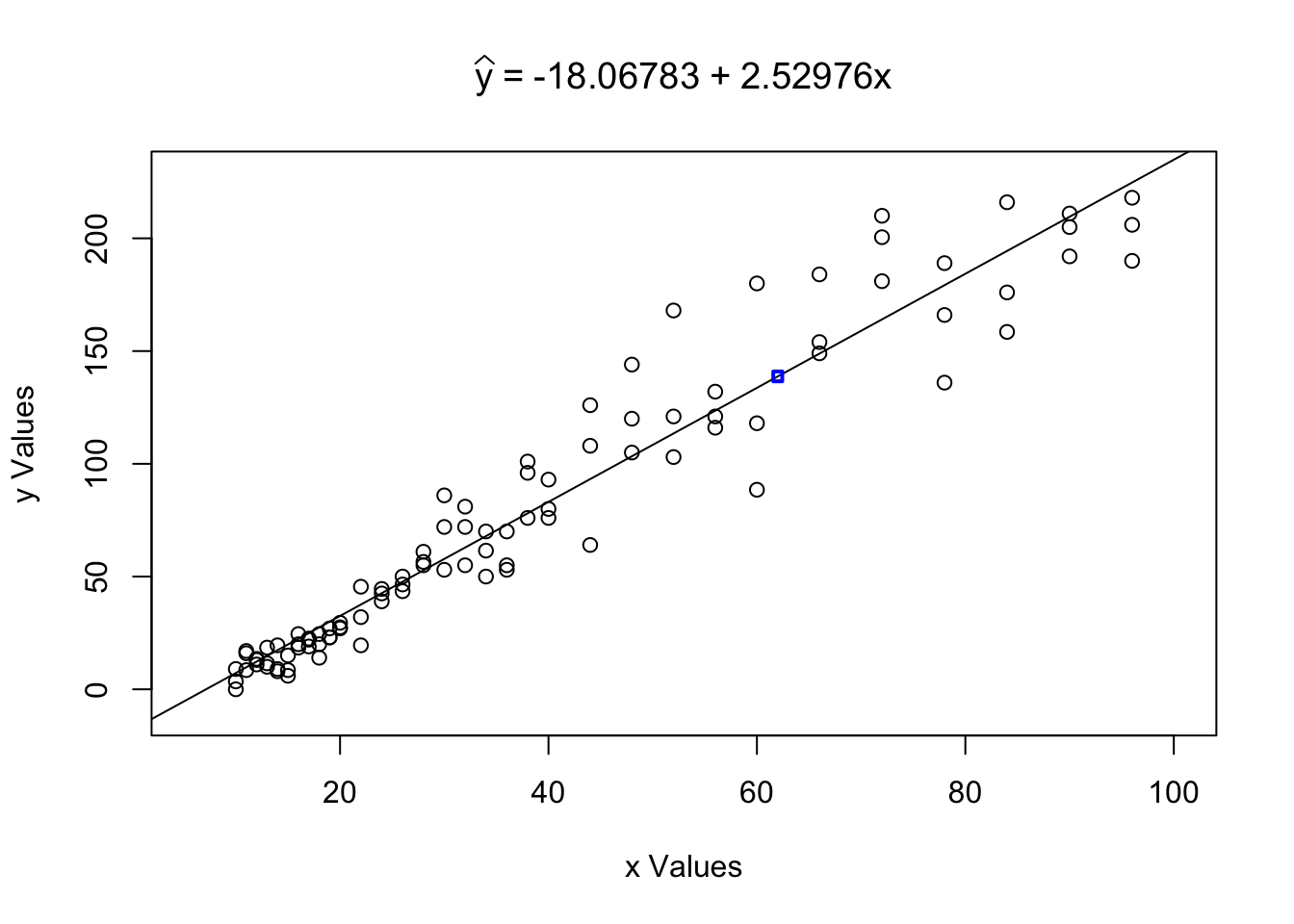
Figure 5.20: Example of Using the LinearRegression Function
## $Correlation
## [1] 0.9644005
##
## $Intercept
## [1] -18.06783
##
## $Slope
## [1] 2.52976
##
## $`yHat at x0`
## [1] 138.7773
Here we see a numerical statement that \(\hat{y}|_{x = 62} \approx 138.7773\) which you can confirm is the same as the calculation \(-18.06783 + 2.52976 \cdot 62\). We also see the ordered pair \((62,138.7773 )\) in the scatter plot as a blue square.
For those of you curious just how close Lincoln came to giving the exact regression line, his line is shown below in blue with the true regression line shown in red.
x <- ToyCars$Height
y <- ToyCars$Distance
plot( x, y)
abline( lm( y ~ x ), col = "red" )
abline( a = -22, b = 2.5, col = "blue" )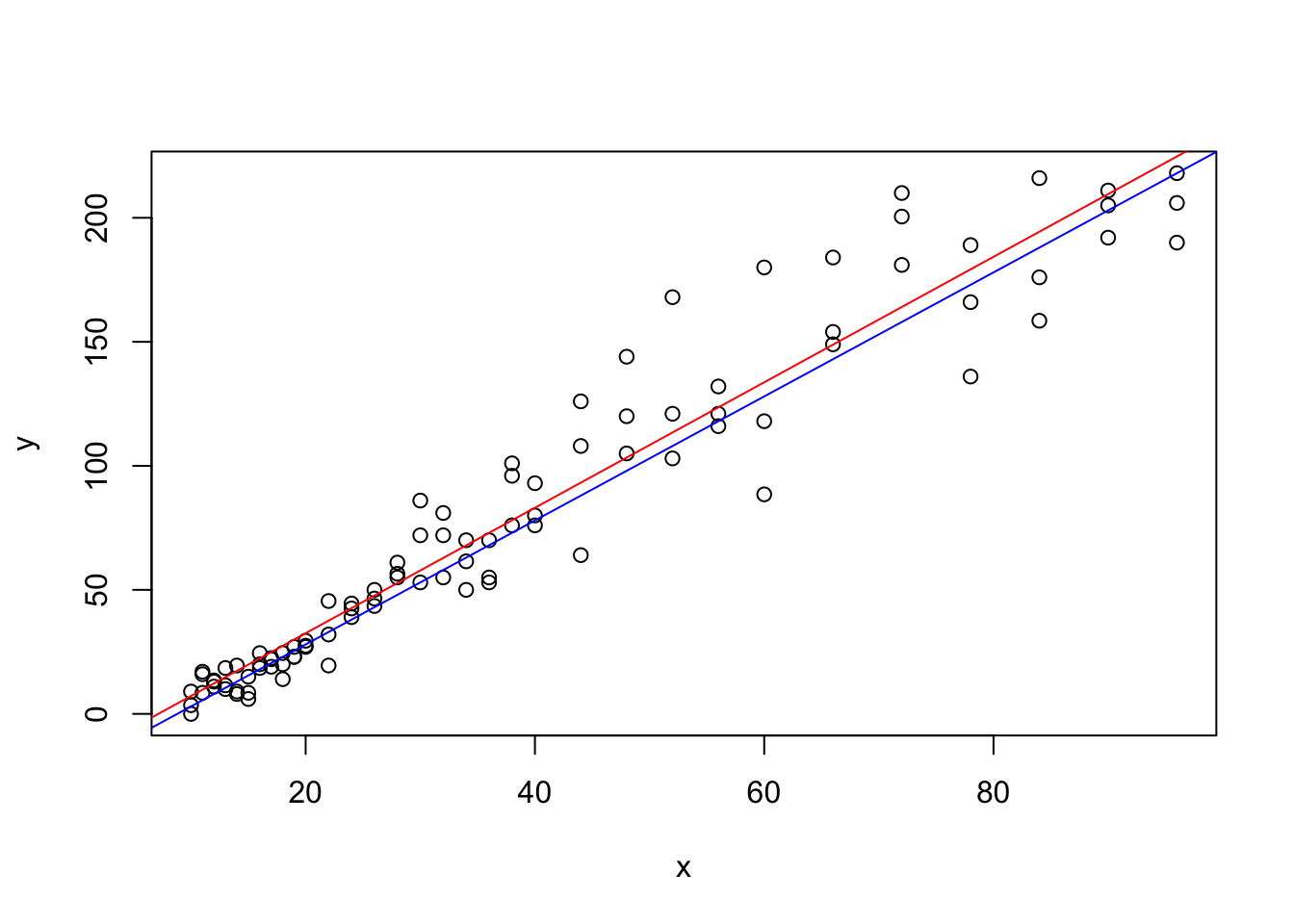
Figure 5.21: Lincoln’s Guess along with the Actual Regression Line on top of a Scatterplot
While the author may be biased (being Lincoln’s father), I would argue that this was a very good guess by Lincoln and shows that the fancy math used to create the least squares regression line does indeed match our intuition.
It is important to remember that we expect the values of \(y\) to vary even for a fixed value of \(x\). The value \(\hat{y}|_{x = 62}\) should be considered the mean value of \(y\) when \(x = 62\).
Example 5.14 If we return to Example 5.7, we can investigate how the least squares regression line will play with the datasets we investigated there. The statement \(r = 0\) is saying is that there is no line that can give a better estimate for a value of \(y\) based on \(x\) than just a horizontal line through \(\bar{y}\) (and thus through \((\bar{x}, \bar{y})\)). The symmetry of the parabolic data would mean that neither a positively sloped or a negatively sloped line through \((\bar{x}, \bar{y})\) could help to improve the predictive nature.
Passing xQuad and yQuad to LinearRegression gives slightly odd results, but this is just the result of the errors inherent to floating point arithmetic.
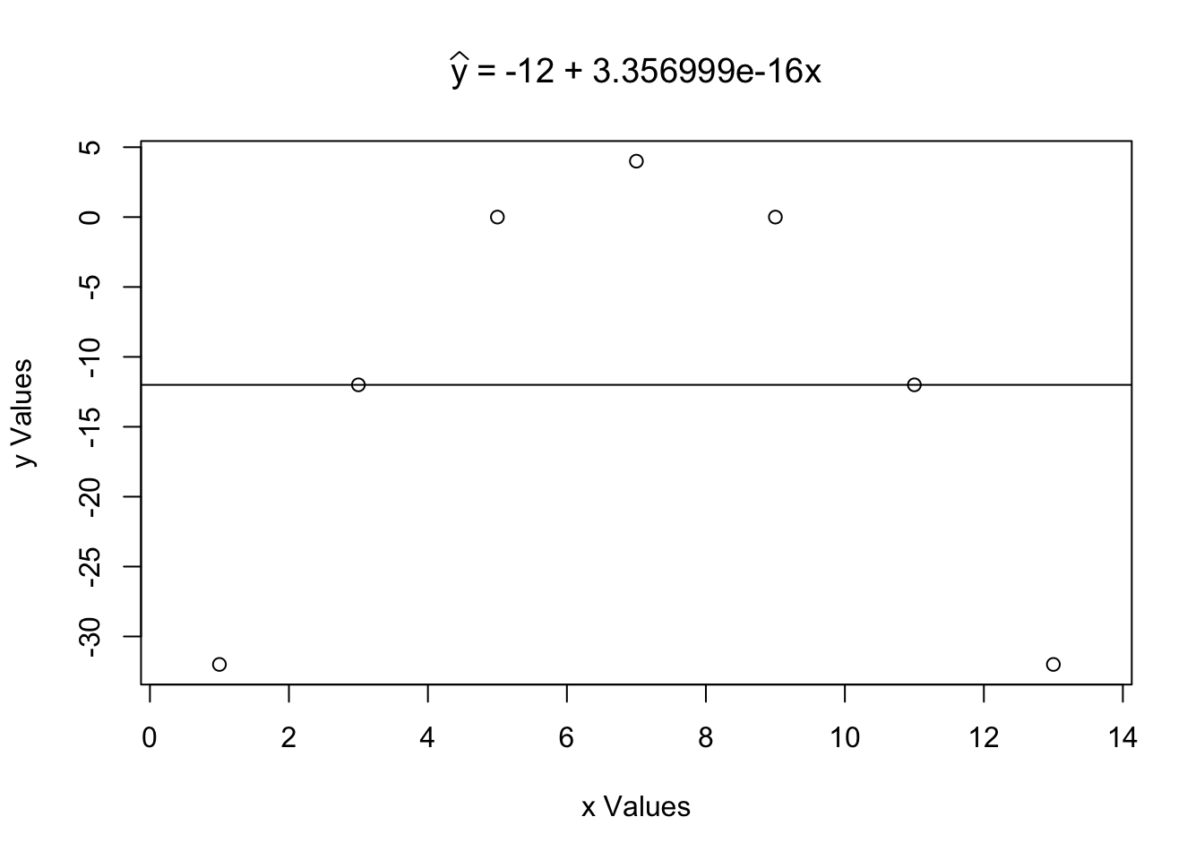
Figure 5.22: Using the LinearRegression Function with Quadratic Data
## $Correlation
## [1] 0
##
## $Intercept
## [1] -12
##
## $Slope
## [1] 5.647072e-16
The formula that \(b = r \cdot \frac{s_y}{s_x}\) quickly confirms that the slope of the linear regression should be 0.
5.5 Interpolation vs. Extrapolation
As we saw earlier in Section 5.4, the \(y\) intercept, \(a\), of a linear regression may not have any practical interpretation. For example, if we consider the relationship between an engine’s displacement and the related car’s weight, the value
\[\hat{y}|_{x = 0} = a + b \cdot 0 = a\] would be interpreted as the mean weight of all cars that had internal combustion engines with no displacement. While it is possible for modern electric cars to exist without these types of engines, the cars we were looking at required the displacement which is literally the amount of room that is given for gas to combust to drive the engine. Negative values of \(x\) are obviously nonsensical, but even \(x = 0\) makes no sense within the population of vehicles we were analyzing.
This shows us that our least squares regression line only makes sense for certain values of \(x\). This leads to the terms of Interpolation and Extrapolation. We investigate those concepts in this section.
Definition 5.4 Using the least squares regression line to approximate a \(y\) value for an \(x\) value within the range of \(x\) values used in its construction is known as Interpolation or Interpolating.
That is, in this context, interpolation is calculating a value of \(\hat{y}\) for a value \(x_0\) such that \(\text{min}({\bf x}) \leq x_0 \leq \text{Max}({\bf x})\).
It is possible that an interpolated value of \(\hat{y}\) can fall outside of the range of \(y\) values used in the construction of the least squares regression line. That is to say that interpretation does require that \(\text{min}({\bf x}) \leq x_0 \leq \text{Max}({\bf x})\) but we may have interpolation where we see values such that \(\hat{y}|_{x = x_0} \leq \text{min}({\bf y})\) or \(\hat{y}|_{x = x_0} \geq \text{Max}({\bf y})\).
Example 5.15 (Toy Cars: Part 4) We can return to Lincoln’s ToyCars dataset we first saw in Example 5.6 and look at using the least squares regression line to interpolate information about how far a car will travel once it has been rolled down a tube.
We will do this with the aid of the LinearRegression function. We will examine the value \(x = 46\) (or x0 = 46 in R code).

Figure 5.23: Regression Line of ToyCars
## $Correlation
## [1] 0.9644005
##
## $Intercept
## [1] -18.06783
##
## $Slope
## [1] 2.52976
##
## $`yHat at x0`
## [1] 98.30114
This tells us that if we repeatedly dropped a car from a height of 46 inches, we should expect the mean distance traveled to be about 98.3 inches. Just to verify that LinearRegression is operating correctly, we also show this calculation being made by hand
\[\hat{y}|_{x = 46} = -18.06783 + 2.52976 \cdot 46 \approx 98.30113\] as well as in R.
## [1] 98.30113The output of LinearRegression clearly shows that \(x = 46\) was well within the range of the \(x\) values and thus this is an example of interpolation.
The condition that we consider \(x_0\) such that \(\text{min}(x) \leq x_0 \leq \text{Max}(x)\) should not be taken lightly. While it is sometimes possible to choose values outside of this range and get meaningful result, the adherence to this condition is so fundamental that we give the use of the least squares regression line for values outside the range of the \(x\) sample a different name, Extrapolation.
Definition 5.5 Using the least squares regression line to approximate a \(y\) value for an \(x\) value that does not fall within the range of \(x\) values used in its derivation is known as Extrapolation or Extrapolating.
That is, extrapolation is calculating \(\hat{y}|_{x = x_0}\) where \(x_0 < \text{min}({\bf x})\) or \(x_0 > \text{Max}({\bf x})\)
Any value calculated via extrapolation should be treated with caution. While extrapolation is not always invalid, any extrapolated values should be given justification as to why the extrapolation was made and why it should be given credence.
While we have already commented on the danger of extrapolation, it is not the belief here at Statypus that extrapolating should always be considered invalid. For example, the science of meteorology attempts to predict the weather in the future based on the weather data up to the time of forecasting. While modern weather forecasting is far more elaborate and sophisticated than a simple least squares regression, the concept of extrapolation is still the same. Using meteorology to predict the weather in the coming hour or day is likely fairly accurate while predictions made even for just a few days into the future become much more likely to be incorrect.
In fact, LinearRegression has been programmed to allow the use of any \(x\) value that is within 5% of the range of the dataset. We call this the Advisable Range and it is between
\[\text{min}({\bf x}) - 0.05 ( \text{Max}({\bf x}) -\text{min}({\bf x}) )\]
and
\[\text{Max}({\bf x}) + 0.05 ( \text{Max}({\bf x}) -\text{min}({\bf x}) ).\]
This is explored in Example 5.16.
Example 5.16 (Toy Cars: Part 5) This example will illustrate how LinearRegression handles values outside of the range of \(x\). We will continue looking at the ToyCars dataset and once again will be viewing ToyCars$Height as being x.
## [1] 10 96LinearRegression will accept any \(x\) value that is within 5% of the range length of the interval \([10,96]\). That is, it will take values between \(10 - 0.05 \cdot (96-10) = 5.7\) and \(96 + 0.05 \cdot (96-10) = 100.3\). We illustrate that with a few examples. Trying x0 = 100 gives the following result.
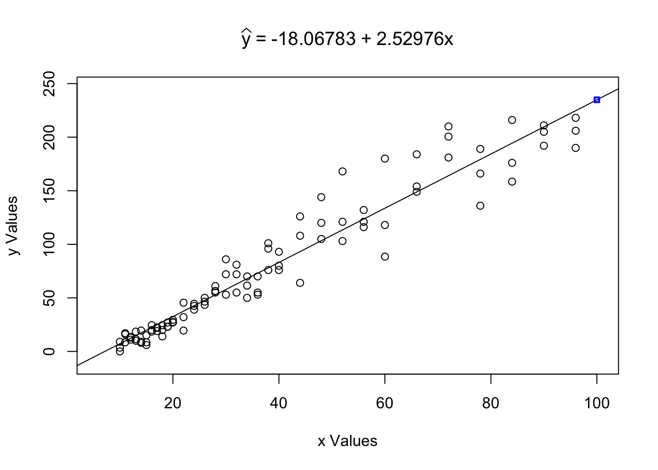
Figure 5.24: LinearRegression with Extrapolation Within the Advisable Range
## $Correlation
## [1] 0.9644005
##
## $Intercept
## [1] -18.06783
##
## $Slope
## [1] 2.52976
##
## $`yHat at x0`
## [1] 234.9082
When x0 is in the advisable range, LinearRegression will show the predicted value of \(\hat{y}\) and display it on the scatter plot as shown in Figure 5.24. However, trying x0 = 101 gives the following result.
## Warning in LinearRegression(x = ToyCars$Height, y = ToyCars$Distance, x0 =
## 101): Value outside of Advisable Range
Figure 5.25: LinearRegression with Extrapolation Outside of the Advisable Range
## $Correlation
## [1] 0.9644005
##
## $Intercept
## [1] -18.06783
##
## $Slope
## [1] 2.52976
When x0 is not in the advisable range, LinearRegression will return a warning to the user and then give the same output as if x0 was not inputted.
The user is, obviously, able to manually calculate \(\hat{y}\) for any value of \(\bf x\), but LinearRegression will not make the calculation if the value is outside the advisable range to allow the user to be clear that the extrapolation should be treated cautiously.
Example 5.17 A humorous example of the dangers of extrapolation comes from the Nobel Laureate, Kenneth Arrow. Kenneth Arrow was an economist and mathematician. The following is a passage from the book Against the Gods: The Remarkable Story of Risk,59 by Peter L. Bernstein discussing Arrow’s time as a meteorologist during World War II.
Some officers had been assigned the task of forecasting the weather a month ahead, but Arrow and his statisticians found that their long-range forecasts were no better than numbers pulled out of a hat. The forecasters agreed and asked their superiors to be relieved of this duty. The reply was: “The Commanding General is well aware that the forecasts are no good. However, he needs them for planning purposes.”
This exchange shows the paradoxical way in which we often deal with predictions. We are often desirous of having predictions well in advance, but upon careful reflection, it often found that certain predictions are “no better than numbers pulled out of a hat.”
5.6 Analysis of The Regression Line
In Section 5.3, we commented that \(r^2\) is a measure of the strength of the linear relationship between two sets of data. In this section, we will dive deeper into what that means. The following exploration will give us belief in what this means before we push into detailed calculations using R.
We can visualize this with an exploration.
In this exploration, the black vertical segments show the deviations between the data points and the mean of the vertical values of the points while the orange vertical segments show the residuals between the data points and the linear model shown. This is illustrated as the points begin along the linear model and the sum squared of the residuals is 0. Dragging points away from the linear model will create an error for both residuals and deviations and we can then see the numerical relationship between these errors.
To make the above concept concrete, we will use the example we have likely overdone at this point, the relationship between the height a toy car was released from, \(x\), and distance it traveled, \(y\). We first begin by looking at \(y\).
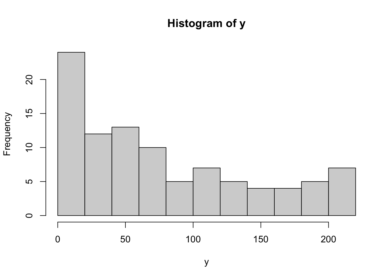
Figure 5.26: Histogram of the Distance Toy Cars Traveled
We replicate the work done in Section 4.2.4 to manually calculate the standard deviation.
Prior to any regression, our estimator for y would be \(\bar{y}\) which is calculated below.
## [1] 78.45833To see how good of an estimator \(\bar{y}\) is of y, we can calculate the deviations of y, \(y - \bar{y}\), like we did when we looked at the standard deviation in Chapter 4. We save the deviations as Devy and look at the first few using head.
## [1] -69.45833 -78.45833 -74.95833 -62.45833 -61.45833 -69.95833We note that the deviations sum to 0 which led us to use \(n-1\) degrees of freedom when defining \(s_{\bf{y}}\).
## [1] -2.586376e-12Yes, the above is not equal to 0, but it is within the range of error of the calculations being made.
As with the standard deviation, we calculate the sum of the squares of Devy, which we call the Sum Squared Error of y Using Deviations and denote it as SumSquareDevy in R.
## [1] 404847.8We will come back to this value, but mention that it is an estimator of how “good” of an estimator \(\bar{y}\) is without any information from x or mtcars$disp in our case. Another way of saying this is to say that SumSquareDevy is a measure of how much variation that \(y\) has. This is also what is called “S.S. Dev.” in the exploration at the start of Section 5.6.
Since we have come this far, we continue on to the sample standard deviation of y by taking the square root of SumSquareDevy divided by \(n-1\) where \(n\) is the length of y.
## [1] 65.2806This matches exactly with the base function sd.
## [1] 65.2806Superimposing the lines \(y = \bar{y}\) as well as \(\hat{y}\) on top of a scatter plot shows that \(\hat{y}\) appears to get “closer” to the ordered pairs than the constant function \(y = \bar{y}\).
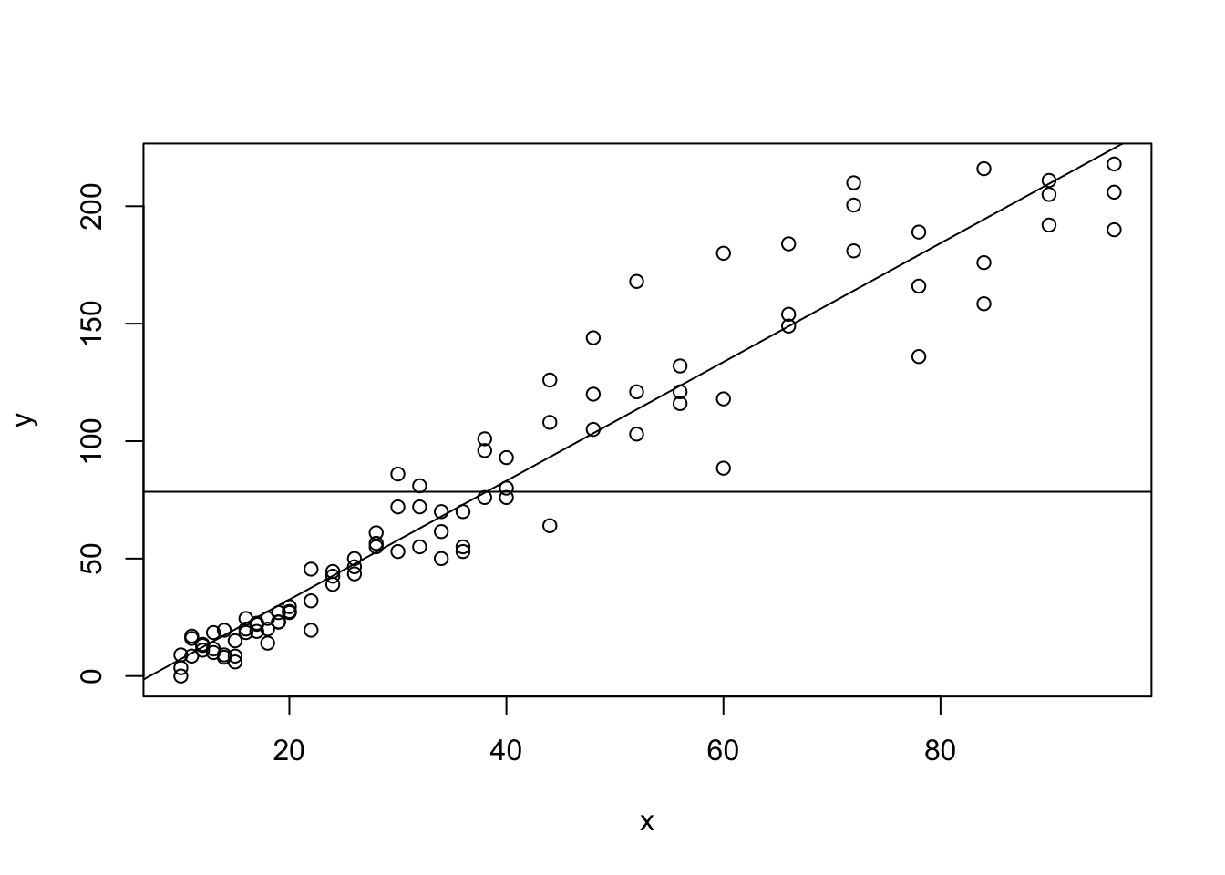
Figure 5.27: The Regression Line compared to Sample Mean for ToyCars
5.6.1 Residuals
With a regression line, we can look at how well \(\hat{y}\) predicts \(y\) values using the function residuals(). This function finds the vector \(y - \hat{y}\). Residuals are an analog of deviations where we now compare the actual \(y\) value of an ordered pair to the predicted one that \(\hat{y}\) would give based on the ordered pairs \(x\) value.
We note that the input of residuals is best set to be the output of the lm function. We save this value as Residy and look at the first few values.
##         1         2         3         4         5         6
##  1.770224 -7.229776 -3.729776  6.240464  7.240464 -1.259536
Example 5.18 (The Residual Plot) Since we have the residuals for the regression line between ToyCars$Height and ToyCars$Distance, we can also give what is called the Residual Plot of the relationship.
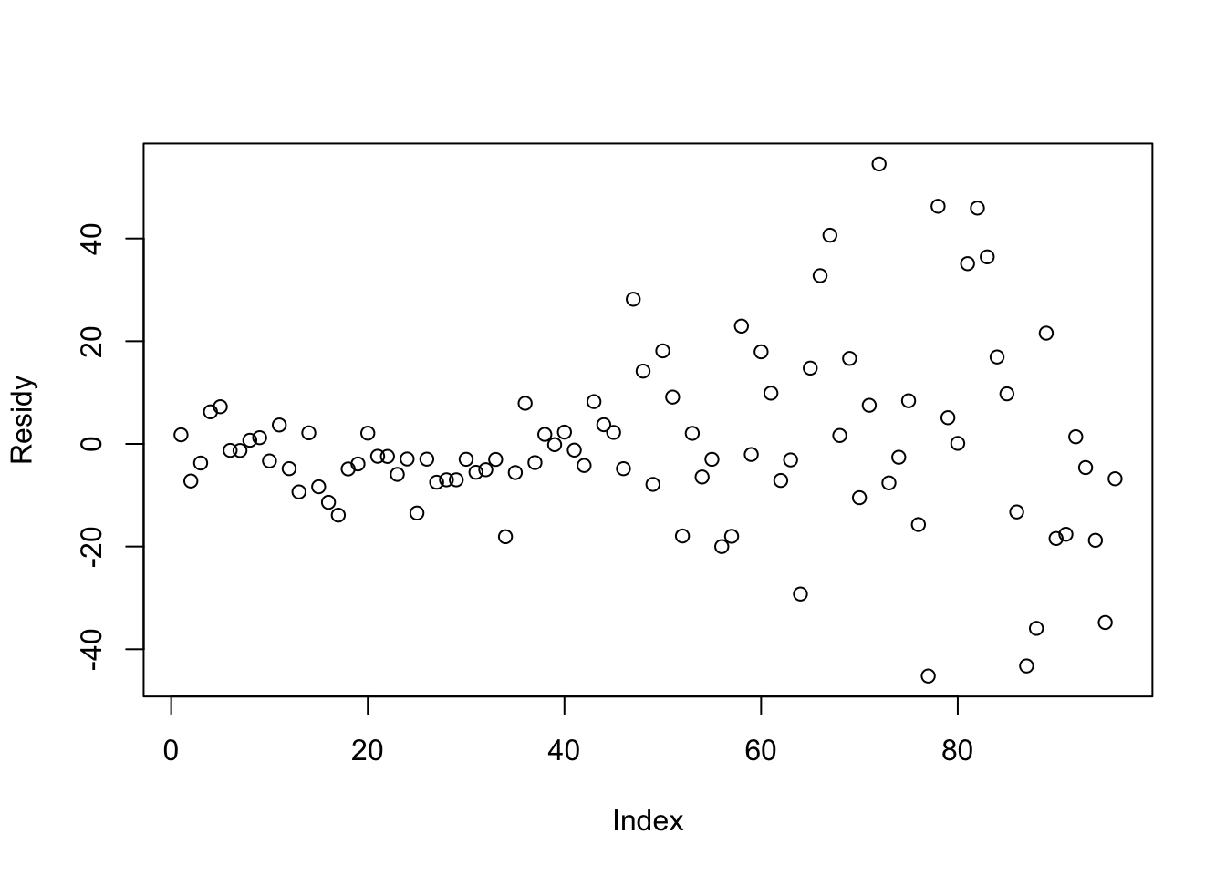
Figure 5.28: Residual Plot for Height versus Distance
A positive residual means that an observed data point has a higher \(y\) value than \(\hat{y}\) would predict for that corresponding \(x\) value while a negative value represents an observed value lower than \(\hat{y}\) would predict and a residual of 0 means that \(\hat{y}\) perfectly predicts \(y\) based off of \(x\).
Like deviations, it turns out that the sum of residuals is always necessarily 0.
Theorem 5.3 The sum of the residuals of a regression line model is 0.
The proof of Theorem 5.3 is in this chapter’s appendix, Section 5.7.2.2.
We can also check this for our example with the following line of code and remembering that rounding error will often give a result very close, but not exactly equal to 0.
## [1] -1.163514e-13Returning to the techniques first seen in Section 4.2.4, we can avoid the cancellation by finding the sum of the squares of the residuals instead of the deviations. We call this value Sum Squared Error of y Using Residuals and denote it as SumSquareResid in R.
## [1] 28311.7The value of SumSquareDevy measured the total deviation that the dataset had from its mean and is the value shown as “S.S. Resid.” in the exploration at the beginning of Section 5.6.
5.6.2 The Meaning of \(r^2\)
The value of SumSquareResidy / SumSquareDevy therefore represents the proportion of SumSquareDevy that cannot be explained by \(\hat{y}\) and is explained only through the some other process.
## [1] 0.06993171This means that \(\hat{y}\) can account for all but approximately 7% of the variation found in \(y\). The amount of the variation that \(\hat{y}\) can account for is therefore given by 1 - SumSquareResidy / SumSquareDevy which is
## [1] 0.9300683which means that \(\hat{y}\) accounts for roughly 93% of all of the variation in \(y\). To understand what it means, we recall the value of \(r^2\) for our example and note that it matches 1 - SumSquareResidy/SumSquareDevy exactly.
## [1] 0.9300683That is, we have given a numeric example that motivates the following fact.
Theorem 5.4 \[r^2 = 1- \frac{\text{SumSquareResidy}}{\text{SumSquareDevy}} = 1-\frac{\sum{(y-\hat{y})^2}}{\sum{(y-\bar{y})^2}}\]
The proof of Theorem 5.4 is in this chapter’s appendix, Section 5.7.2.3.
Therefore, the lease squares regression line is the line that either minimizes SumSquareResidy/SumSquareDevy, which is \(1-r^2\), or equivalently maximizes 1 - SumSquareResidy/SumSquareDevy, which is \(r^2\).
It may be helpful to go back and play with the exploration at the beginning of Section 5.6 now that we (hopefully) understand what the sum squared errors are.
How good of an estimator \(\hat{y}\) is can be measured by the coefficient of determination, \(r^2\).
The coefficient of determination, \(r^2\), tells us how much of an improvement we have for an estimate of \(y\) if we know the corresponding value of \(x\).
When \(0 < r^2 < 1\), \(\hat{y}\) offers a \(r^2\) more certain point estimate than \(\bar{y}\). When \(r^2 = 0\), \(\hat{y}\) is no better an estimator than \(\bar{y}\). However, when \(r^2 = 1\), then \(\hat{y}\) can perfectly predict the value of \(y\) given an \(x\) value because it is now a 100% better estimate.
Example 5.19 (Toy Cars: Part 6) When we looked at the ToyCars dataset, we found a correlation of 0.9644005 which gives a coefficient of determination of \(r^2 \approx 0.9300683\). This means that our estimate of how far a toy car will travel after leaving the pipe is roughly 93% more precise if we know how high the car was released from.
Loosely, we can say that \(\hat{y}\vert_{x = x_0}\) is a 93% better estimate of \(y\) than \(\bar{y}\).
5.6.3 Influential Observations/Potential Outliers
We know that both the mean and standard deviation are not very resistant to outliers, so we definitely expect that \(r\) (and \(r^2\)) will also have very little resistance.
To see the lack of resistance that \(r\) has, do the following:
Drag all but one of the data points into the lower left quadrant of the Desmos window.
Toggle the “\(r\) visual” slider to “On” to see how \(r\) can be understood visually.
With one data point remaining to manipulate, start it near the upper right corner and notice where the regression line hits the right side of the purple box.
Drag the point in the upper right point towards the lower right corner of the screen and notice how dramatically the value of \(r\) and thus the regression line are affected by a single point.
Example 5.20 (Adding an Outlier to `mtcars`) As a “real world” example of the lack of resistance of r and the Least Squares Regression Line, we will include a vehicle which has no business being included with the cars from the 1970s, the 2015 Ford F-450 Super Duty, into the mtcars dataset (at least for disp and wt). The F-450 has an engine displacement of 409 cubic centimeters and a weight of 8,611 pounds. We can append this vehicle to the vectors mtcars$disp and mtcars$wt via the following lines of code.
xNew <- c( mtcars$disp , 409 )
yNew <- c( mtcars$wt, 8.611 )
#Note: 8611 pounds gives a value of 8.611 since the units are in thousands of pounds
Giving the scatter plot and looking for the ordered pair \((409, 8.611)\) shows that the Ford F-450 sits well above all the other ordered pairs we had from mtcars.
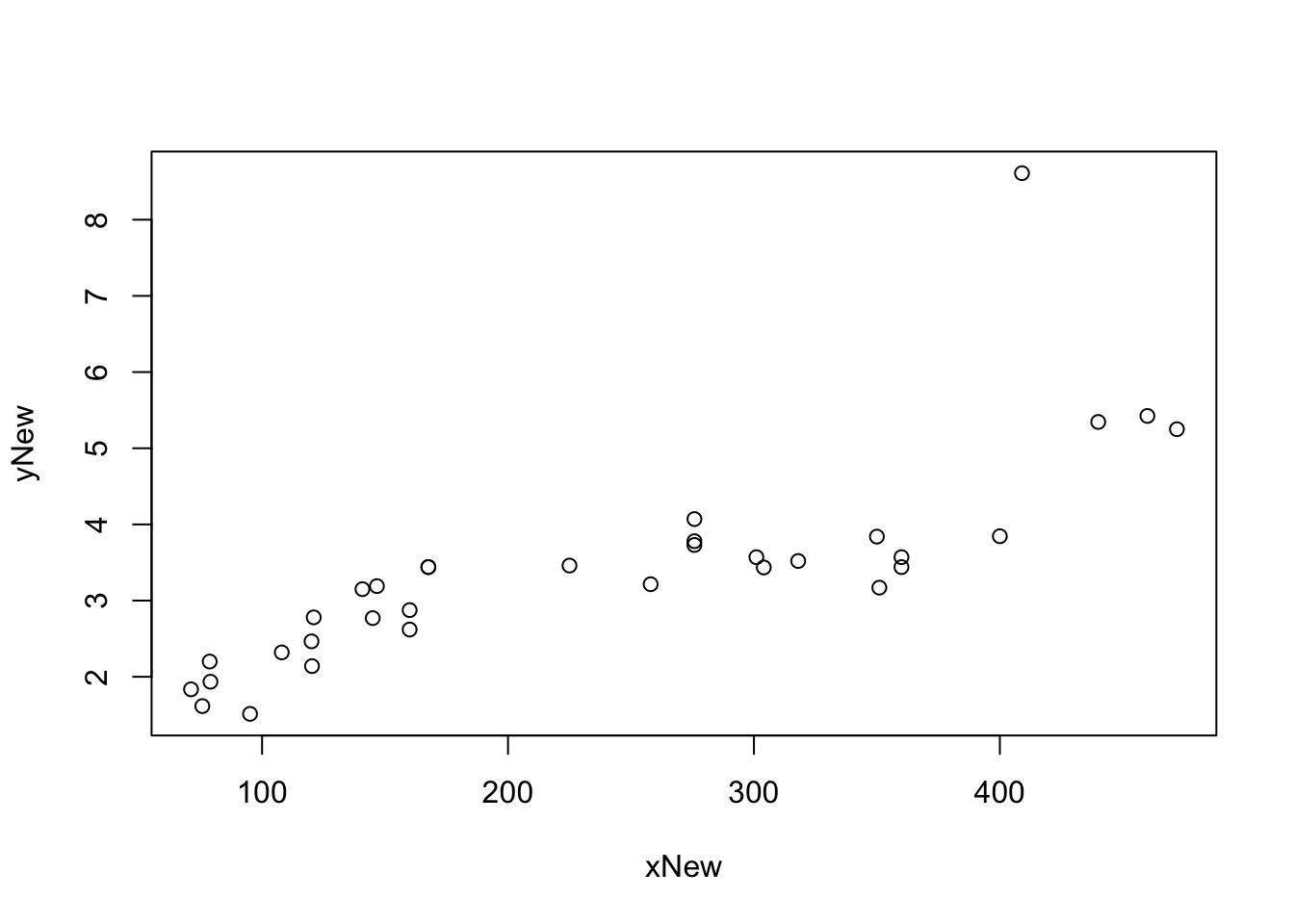
Figure 5.29: Scatter Plot with an Outlier
We now include the original regression line for the vehicles in mtcars in blue as well as the regression line of our new dataset with the Ford F-450 included.
plot( x = xNew, y = yNew, abline( lm( yNew ~ xNew ), col = "red" ) )
abline( lm( mtcars$wt ~ mtcars$disp), col = "blue")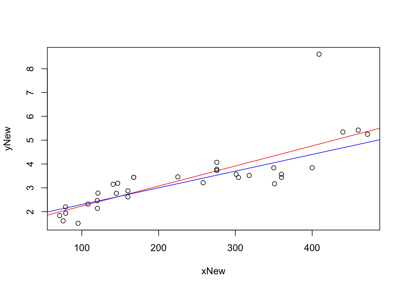
Figure 5.30: Scatterplot Showing the Effect of an Outlier on Linear Regression
We see that the additional point did pull the regression line “up” towards the right side of the graph to try and minimize what is obviously the largest residual. To see how much the inclusion of the
## [1] 0.6214075which we compare to what we had before.
## [1] 0.7885083This says that for the original mtcars dataset, that the linear regression accounted for roughly 78.9% of all variation in mtcars$wt. However, if we include the F-450 then the best that a line can do is account for approximately 62.1% of the variation. While this is still a fairly good value for \(r^2\), the inclusion of a single new ordered resulted in a value of \(r^2\) which is approximately 21.2% less than it was before.
That is, a single ordered pair can drastically change the value of \(r\) and \(r^2\).
Review for Chapter 5
Chapter 5 Quiz: Bivariate Data
This quiz tests your understanding of core statistical terminology, types of variables, and research methods presented in Chapter 5. The answers can be found prior to the Exercises section.
True or False: The primary tool for visualizing the relationship between two quantitative variables is a scatterplot.
True or False: The correlation coefficient, \(r\), measures the strength and direction of any type of relationship between two variables, including non-linear or curved relationships.
True or False: Since \(-0.95 < 0.85\), a correlation coefficient, \(r\), value of \(-0.95\) indicates a weaker linear association than a value of \(0.85\).
True or False: The least squares regression line is calculated by minimizing the sum of the squared vertical distances from the data points to the line.
True or False: The slope of the regression line predicts the change in the explanatory variable, \(x\), for every one-unit increase in the response variable, \(y\).
True or False: Using the regression line to predict an outcome for an input value that is outside the range of the observed data is called extrapolation and is generally considered an unreliable prediction.
True or False: The coefficient of determination, \(r^2\), represents the proportion of the variation in the response variable, \(y\), that is explained by the linear model with the explanatory variable, \(x\).
True or False: A residual is calculated as the predicted value, \(\hat{y}\), minus the observed value, \(y\).
True or False: The
cor()function is used to calculate the correlation coefficient, \(r\), and thelm()function is used to find the least squares regression line.True or False: The regression line always contains the ordered pair \(\left( \bar{x}, \bar{y} \right)\).
Definitions
Section 5.1
Definition 5.1 \(\;\) Given a set of ordered pairs, \(\left\{ (x_i, y_i ) \right\}\) for \(i = 1,2, \ldots, n\), the Scatter Plot of this data is the collection of these points in the \(xy\)-plane. We will call the variable represented by the \(x\) data points the Independent Variable and the variable represented by the \(y\) data points the Dependent Variable.
Section 5.3
Definition 5.2 \(\;\) Given a set of ordered pairs of real numbers \(\big\{ (x_i, y_i)\big\}\), we can define Pearson’s Correlation Coefficient, the Correlation Coefficient, or just simply the Correlation between \({\bf x} = (x_1, x_2, \ldots, x_n)\) and \({\bf y} = (y_1, y_2, \ldots, y_n)\) to be the value \(r\) defined as below. \[ r = \frac{\sum \big( (x_i - \bar{x}) (y_i - \bar{y}) \big)}{\sqrt{ \sum (x_i -\bar{x})^2 \sum (y_i -\bar{y})^2}}\] If \(r>0\), we say that the values are positively correlated. If \(r<0\), we say that the values are negatively correlated.
Section 5.4
Definition 5.3 \(\;\) Given vectors, \(\bf{x}\) and \(\bf{y}\), we can define the Sum Squared Error of a formula \(y = f(x)\) to be
\[\sum \left( y - f(x)\right)^2 \] where the sum is over all possible ordered pairs \((x,y)\).
As we have written \(y\) as a function of \(x\), we will call \(y\) the Dependent or Response Variable and \(x\) the Independent or Explanatory Variable.
Moreover, we say that the values of \(y - f(x)\) are the Residuals of the formula \(y = f(x)\).
Section 5.5
Definition 5.4 \(\;\) Using the least squares regression line to approximate a \(y\) value for an \(x\) value within the range of \(x\) values used in its construction is known as Interpolation or Interpolating.
That is, in this context, interpolation is calculating a value of \(\hat{y}\) for a value \(x_0\) such that \(\text{min}({\bf x}) \leq x_0 \leq \text{Max}({\bf x})\).
Definition 5.5 \(\;\) Using the least squares regression line to approximate a \(y\) value for an \(x\) value that does not fall within the range of \(x\) values used in its derivation is known as Extrapolation or Extrapolating.
That is, extrapolation is calculating \(\hat{y}|_{x = x_0}\) where \(x_0 < \text{min}({\bf x})\) or \(x_0 > \text{Max}({\bf x})\)
Results
Section 5.3
Theorem 5.1 \(\;\) The correlation, \(r\), between two vectors, \({\bf x}\), and \({\bf y}\), satisfies the following:
\(-1 \leq r \leq 1\)
\(|r| =1\) means that the ordered pairs \(\big\{ (x_i, y_i)\big\}\) are collinear.
Correlation is a symmetric operation. That is, the correlation of \({\bf x}\) and \({\bf y}\) is the same as the correlation of \({\bf y}\) and \({\bf x}\), i.e. the order of the vectors does not matter.
Section 5.4
Theorem 5.2 \(\;\) The linear model that minimizes the sum squared error is given by
\[\hat{y} = a + bx\] where \[\begin{align*} b =&\; r \cdot \frac{s_{\bf{y}}}{s_{\bf{x}}}\\ &\text{and}\\ a =&\; \bar{ y}- b \; \bar{ x}. \end{align*}\] We call this the Least Squares Regression Line, Regression Line, or Linear Regression. The value of \(\hat{y}\) when \(x= x_0\) is given by
\[\hat{y}|_{x=x_0} = a + b \cdot x_0.\]
Big Ideas
Section 5.3
It is imperative to note that a correlation of \(r = \pm 1\) is not a goal to be sought after. Data varies and the correlation measures how much of the variability of one variable can be explained by another variable. We will go into this further in Section 5.6.2.
If we have \(r = \pm 1\), then, in essence, the two variables are simply a “conversion” of the one another like we would have between temperature being measured on the Celsius and Fahrenheit scale. This is unrealistic with data we are likely to encounter.
As we will see in Example 5.6, there is a strong correlation between the height of the ramp a toy car is rolled down from and the distance it travels once it leaves the ramp and begins to “fly.” However, just as we assume that the flight of a coin will result in a “random” result, we should also expect some randomness or variability in the flight of a car even if all other effects have been controlled to the extent of our abilities.
We will make this more formal in Section 5.6.2, but the square of the correlation, \(r^2\), is called the Coefficient of Determination and is a direct measure of “how strong” the correlation is between two vectors.
While \(r\) is the correlation, it is the value of \(r^2\) that explicitly states the strength of the relationship between the \(x\) and \(y\) values.
While it is possible to do more advanced types of correlation, we will only be looking at Linear Correlation in this chapter.
Section 5.4
The value \(\bar{y}\) is the mean value of the \(y\) variable given no other information. \(\hat{y}\) gives a formula that gives the mean value of \(y\) at a particular \(x\) value. That is to say, \(\hat{y}\) should give us a better estimate of a \(y\) value because we have more information.
In nearly all cases (where \(|r| \neq 1\)), there will be variability in \(y\) even with knowledge of what the value of \(x\) is. The value of \(\hat{y}|_{x=x_0}\) should be seen as a point estimate for the mean of all possible values of \(y\) such that \(x = x_0\), which we can denote as \(\bar{y}|_{x=x_0}\).
Section 5.5
While we have already commented on the danger of extrapolation, it is not the belief here at Statypus that extrapolating should always be considered invalid. For example, the science of meteorology attempts to predict the weather in the future based on the weather data up to the time of forecasting. While modern weather forecasting is far more elaborate and sophisticated than a simple least squares regression, the concept of extrapolation is still the same. Using meteorology to predict the weather in the coming hour or day is likely fairly accurate while predictions made even for just a few days into the future become much more likely to be incorrect.
In fact, LinearRegression has been programmed to allow the use of any \(x\) value that is within 5% of the range of the dataset. We call this the Advisable Range and it is between
\[\text{min}({\bf x}) - 0.05 ( \text{Max}({\bf x}) -\text{min}({\bf x}) )\]
and
\[\text{Max}({\bf x}) + 0.05 ( \text{Max}({\bf x}) -\text{min}({\bf x}) ).\]
This is explored in Example 5.16.
Section 5.6
How good of an estimator \(\hat{y}\) is can be measured by the coefficient of determination, \(r^2\).
The coefficient of determination, \(r^2\), tells us how much of an improvement we have about \(y\) if we know the corresponding value of \(x\).
When \(0 < r^2 < 1\), \(\hat{y}\) offers a \(r^2\) more certain point estimate than \(\bar{y}\). When \(r^2 = 0\), \(\hat{y}\) is no better an estimator than \(\bar{y}\). However, when \(r^2 = 1\), then \(\hat{y}\) can perfectly predict the value of \(y\) given an \(x\) value because it is now a 100% better estimate.
Important Alerts
Section 5.1
The term dependent variable is used to indicate that the distribution of the \(y\) variable may depend on the value of the \(x\) variable, but it should not be inferred that the value of \(x\) actually causes the value of \(y\) to change. We are looking at the relationship between two variables and are not discussing causality.
Section 5.3
It is absolutely vital that the concept of correlation not be incorrectly interpreted as causation. The concepts and tools explored in this chapter, as well as Chapter 12, are only correctly interpreted in terms of the relationship between two variables. While we do call one variable dependent, we are simply analyzing how two variables correlate and are not making a statement about causality.
This comment is crucial as many statistical findings are often misconstrued as causation. For example, there have been numerous studies examining the effects of chocolate on people’s health. This article from CBS explores how one researcher was able to get his “results” into mainstream media when he claimed to have shown that eating chocolate helped people lose weight. Despite any correlation that may (or may not) exist between the consumption of chocolate and weight loss, the study did nothing to prove that chocolate consumption actually caused any weight loss.
A humorous set of examples of spurious correlations can be found at the following website where they even offer “GenAI’s made-up explanation” for each correlation. For one poignant example, click here for an discussion on the correlation between statistics degrees and stomach discomfort.
Section 5.4
While it is possible to run lm( df ) if df is a two column dataframe, it will run the first column as the dependent variable and the second column as the independent variable. This would mean the dataframe would need to display ordered pairs as (y,x) which is definitely not standard.
While we can explicitly label x and y in most functions, for example, x = BabyData1$weight, doing so in lm could cause an error.
Section 5.5
The condition that we consider \(x_0\) such that \(\text{min}(x) \leq x_0 \leq \text{Max}(x)\) should not be taken lightly. While it is sometimes possible to choose values outside of this range and get meaningful result, the adherence to this condition is so fundamental that we give the use of the least squares regression line for values outside the range of the \(x\) sample a different name, Extrapolation.
Important Remarks
Section 5.1
There are a lot of variations to how scatter plots are drawn including “connecting the dots,” but all scatter plots have their origins in simply plotting the collection of ordered pairs.
There that there are many options which can be used with plot which can improve the quality of the output. As we noted before, the aim of this chapter is to create basic graphs and the interested reader is encouraged to use the help function in R or other resources, including other R packages such as ggplot2 if they wish to make more elaborate graphs.
Section 5.3
The concept of correlation is actually more intricate than the treatment it will receive here. Pearson’s (Product Moment) Correlation Coefficient, Kendall’s \(\tau\), and Spearman’s \(\rho\) are all concepts of correlation that have subtly different definitions. Unless otherwise stated, any mention of correlation or correlation coefficient in Statypus should be taken to mean Pearson’s Correlation Coefficient.
\(r=1\) means that there is perfect positive correlation, or that all of the values lie along a line with a positive slope.
\(r=-1\) means that there is perfect negative correlation, or that all of the values lie along a line with a negative slope.
Section 5.4
The facts that the slope of the line is \(b\) and that \(a = \bar{ y}- b \bar{ x}\) is equivalent to saying the slope is \(b = r \cdot \frac{s_{\bf{y}}}{s_{\bf{x}}}\) and the line contains the point \((\bar{ x}, \bar{ y})\).
That is, we can use the equation: \[ \hat{y} - \bar{ y} = b \; ( x - \bar{ x})\] This says that \(\text{dev}(\hat{y}) = b \cdot \text{dev}(x)\) or that
\[\frac{\text{dev}(\hat{y})}{\text{dev}(x)} = b = r\cdot \frac{s_y}{s_x}.\] The value of \(b\) represents the increase we expect in the \(y\) variable for every unit increase of \(x\). The value of \(a\) may not have any practical interpretation if looking at the value of \(x = 0\) requires extrapolation. (See Section 5.5 for more information.)
LinearRegression has been programmed to omit missing values automatically. However, it will return a Warning Message to alert the user that it did so.
It is important to remember that we expect the values of \(y\) to vary even for a fixed value of \(x\). The value \(\hat{y}|_{x = 62}\) should be considered the mean value of \(y\) when \(x = 62\).
Section 5.5
It is possible that an interpolated value of \(\hat{y}\) can fall outside of the range of \(y\) values used in the construction of the least squares regression line. That is to say that we require \(\text{min}({\bf x}) \leq x_0 \leq \text{Max}({\bf x})\) but we may have interpolation where we see values such that \(\hat{y}|_{x = x_0} \leq \text{min}({\bf y})\) or \(\hat{y}|_{x = x_0} \geq \text{Max}({\bf y})\).
Any value calculated via extrapolation should be treated with caution. While extrapolation is not always invalid, any extrapolated values should be given justification as to why the extrapolation was made and why it should be given credence.
The user is, obviously, able to manually calculate \(\hat{y}\) for any value of \(\bf x\), but LinearRegression will not make the calculation if the value is outside the advisable range to allow the user to be clear that the extrapolation should be treated cautiously.
Code Templates
Section 5.1
To make a scatter plot of the vector x as the independent variable and y as a dependent variable, we use the code:
Section 5.3
Section 5.4
The linear model function, lm(), is used to find the least squares regression line. The syntax needed to have a variable x or df$xCol be an explanatory variable for the variable y or df$yCol is given below.
New Functions
Section 5.1
The syntax of plot is
where the arguments are:
type: Sets what type of plot should be drawn. See?plotfor a full list of options
The first vector entered, x, is graphed on the horizontal axis and the second vector entered, y, is graphed on the vertical axis.
Section 5.3
Section 5.4
Statypus Original Function: See Section 5.7.1 for the code to use this function.
The syntax of LinearRegression() is
#This code will not run unless the necessary values are inputted.
LinearRegression( x, y, x0 = "null" )
where the arguments are:
x,y: Numeric vectors of data values.x0: The \(x\) value to be tested for. Defaults to"null"and is not used.
Quiz Answers
- True
- False (The correlation coefficient measures the strength and direction of only the linear relationship.)
- False (The relationship with \(r=-0.95\) is stronger because the Coefficient of Determination, \(r^2\), is greater for \(r=-0.95\) than for \(r=0.85\). \({\left( -0.95 \right)^2 = 0.9025 > 0.7225 = \left( 0.85 \right)^2}\) )
- True
- False (It predicts the change in the response variable, \(y\), for every one-unit increase in the explanatory variable, \(x\).)
- True
- True
- False (A residual is the observed value (\(y\)) minus the predicted value (\(\hat{y}\)).)
- True
- True
Exercises
For Exercises 5.1 and 5.3, you will need to load the dataset BabyData1. The code for this can be found in Example 5.8.
For Exercises 5.4 through 5.6, you will need to load the dataset hot_dogs. The code for this can be found in Example 1.15.
Exercise 5.1 For each of the following parts, identify where the student went wrong and find a way to fix their code. Feel free to run the code as it is to see what Errors or Warnings appear.
- A student uses the following line of code to try and make a scatter plot between the
wtandmpgvariables of themtcarsdataframe.
- Using the following line of code, a student was unsuccessful in trying to find the correlation between the ages of a baby’s mother and father.
- A student was trying to the formula for the regression line between the
Petal.LengthandPetal.Widthvariables of theirisdata frame with the following line of code.
- While the following code runs perfectly, a student mistakenly used it to claim that approximately 88.8% of variation in the
wtvariable can be explained by the variation in thedispvariable of themtcarsdataset.
## [1] 0.8879799Exercise 5.2 Using mtcars, make a scatter plot to see if the horsepower of a car seems dependent on it’s displacement.
Exercise 5.3 Using the BabyData1 data frame to find the correlation and equation of the linear regression relating the value of the father’s age to the age of the mother (viewed as the independent variable). Write a full sentence explaining the meaning of the value of \(r^2\).
Exercise 5.4 Find the correlation between the calories and sodium of all of the hot dogs in the hot_dogs dataset. Write a full sentence explaining the meaning of the value of \(r^2\).
Exercise 5.5 The relationship you found in Exercise 5.4 should not have been very strong. Find the correlation between calories and sodium for each type of hot dog in hot_dogs. Which type has the strongest relationship? Write a full sentence explaining the meaning of the value of \(r^2\).
Exercise 5.6 How many grams of sodium would you expect to find in poultry hot dog that has 150 calories?
Exercise 5.7 Which two variables in mtcars show the strongest correlation? Which variable would you think is the explanatory variable and which is the response? Explain your reasoning. Find the equation for the least squares regression line between your two variables and verify that if you input the mean of the explanatory variable that the model gives the mean of the response variable.
Exercise 5.8 The dataset sunspots contains 2820 measurements of the monthly mean relative sunspot numbers from 1749 to 1983. The data was collected at Swiss Federal Observatory, Zurich until 1960, then Tokyo Astronomical Observatory. Make a time series plot of sunspots and write a couple of sentences about any patterns you see.
5.7 Appendix
5.7.1 Linear Regression Function
It is at the discretion of the user if this custom function is beneficial, but it is offered as a scaffold between beginner users and R.
Description
LinearRegression generates all of the basic components of a linear regression
Usage
LinearRegression( x, y, x0 = "null" )
Arguments
x, y numeric vectors.
x0 a numeric value within 5 percent of the range of the x vector.
Details
Both x and y must be numeric vectors. If not, an Error will be returned.
A scatter plot of x and y is produced along with the least squares regression line overlaid on top of it. The equation of the regression line is shown as the main title of the graph.
If x0 is provided and falls within 5 percent of the range of the x vector, then the value of the regression line at x0 is included in the output and the point is highlighted as a blue square on the line.
Value
A list containing the following components:
Correlation The value of Pearson’s (Product Moment) Correlation Coefficient
Intercept The \(y\)-intercept of the least squares regression line.
Slope The slope of the least squares regression line.
yHat at x0 The expected value of the \(y\) variable when the \(x\) is equal to x0. This is suppressed if x0 is not numeric or if it falls outside of the advisable range.
Source
Developed by Dr. Phil Huling from Saint Louis University for use in r.statypus.org (2025).
References
Contact Dr. Phil Huling at phil.huling@slu.edu with further questions.
See Also
For further analysis of a linear regression model, see RegressionInference at r.statypus.org in Section 12.3.2.
Examples
# From r.statypus.org Chapter 5
ToyCars <- read.csv( "https://statypus.org/files/ToyCars.csv" )
# Simple Execution
LinearRegression( x = ToyCars$Height, y = ToyCars$Distance )
# Using a Test Point
LinearRegression( x = ToyCars$Height, y = ToyCars$Distance, x0 = 62 )
Installation Code
Use the following code to install LinearRegression on your machine.
LinearRegression <- function( x, y, x0 = "null" ){
  if( !is.numeric( x ) | !is.numeric( y ) ){
    stop("Both 'x' and 'y' must be numeric vectors. Consider using `as.numeric`.")
      }
  xVec <- x
  yVec <- y
  OK <- complete.cases(xVec, yVec)
  x <- xVec[OK]
  y <- yVec[OK]
  if( length(x) != length(xVec) )
    warning("Missing values omitted from calculations")
  a <- (summary(lm(y~x))$coefficients[1, 1])
  b <- (summary(lm(y~x))$coefficients[2, 1])
  xDelta <- ( max(x) - min(x) )/100
  yDelta <- ( max(y) - min(y) )/100
  xMin <- min(x) - 5*xDelta
  xMax <- max(x) + 5*xDelta


  ResultsWO <- list("Correlation" = cor(x,y),
                    "Intercept" = a,
                    "Slope" = b )

  if( x0 == "null")
    {
      plot(x,y,xlab="x Values",ylab="y Values",
         xlim = c(xMin, xMax),
         main=bquote(widehat(y)~"="~.(summary(lm(y~x))$coefficients[1, 1])~"+"
                     ~.(summary(lm(y~x))$coefficients[2, 1])*"x"))
      abline(lm(y~x))
      return(ResultsWO)
    }
  if( (x0 != "null") &  (x0 < xMin | x0 > xMax) )
    {
      warning( "Value outside of Advisable Range" )
      plot(x,y,xlab="x Values",ylab="y Values",
         xlim = c(xMin, xMax),
         main=bquote(widehat(y)~"="~.(summary(lm(y~x))$coefficients[1, 1])~"+"
                     ~.(summary(lm(y~x))$coefficients[2, 1])*"x"))
      abline(lm(y~x))
      return(ResultsWO)
    }
  if( x0 != "null" & x0 >= xMin & x0 <= xMax )
    {
     y0 <- a + b*x0
     yMin <- min( c(y, y0) ) - 5*yDelta
     yMax <- max( c(y, y0) ) + 5*yDelta
     plot(x,y,xlab="x Values",ylab="y Values",
          xlim = c(xMin, xMax),
          ylim = c(yMin, yMax),
          main=bquote(widehat(y)~"="~.(summary(lm(y~x))$coefficients[1, 1])~"+"
                      ~.(summary(lm(y~x))$coefficients[2, 1])*"x"))
     abline(lm(y~x))
     ResultsW <- list("Correlation" = cor(x,y),
                       "Intercept" = a,
                       "Slope" = b,
                       "yHat at x0" = y0)
     x0Right <- x0 + xDelta/2
     x0Left <- x0 - xDelta/2
     y0High <- y0 + yDelta
     y0Low <- y0 - yDelta
     cord.x = c( x0Left, x0Left, x0Right, x0Right, x0Left  )
     cord.y = c( y0Low, y0High, y0High, y0Low , y0Low )
     lines( cord.x, cord.y, col = "blue", lwd =2)
     return(ResultsW)
    }
}
5.7.2 Tedious Proofs
5.7.2.1 Proof of Theorem 5.1
Proof. This proof requires knowledge of some facts about vectors which are not covered in this book.
Define \(\widehat{\text{dev}({\bf v})} = \frac{\text{dev}({\bf v})}{||\text{dev}({\bf v})||}\) where
\[ ||\text{dev}({\bf v})|| = \sqrt{\sum_{i=1}^n (v_1 - \bar{v})^2}\] so that \(\widehat{\text{dev}({\bf v})}\) is the unit vector (magnitude of 1) in the direction of \(\text{dev}({\bf v})\). Looking at the formula of \(r\) as given in Definition 5.2, we can rewrite \(r\) as
\[\begin{align*} r &= \sum_{i=1}^n\left( \left( \frac{x_i - \bar{ x}}{||\text{dev}({\bf x})||}\right) \left( \frac{y_i - \bar{ y}}{||\text{dev}({\bf y})||}\right) \right)\\ {} &= \widehat{\text{dev}({\bf x})} \cdot \widehat{\text{dev}({\bf y})}\\ {} &= 1\cdot 1 \cdot \cos \left(\theta\left( \widehat{\text{dev}({\bf x})}, \widehat{\text{dev}({\bf y})} \right)\right)\\ {} &= \cos \left(\theta( \text{dev}({\bf x}), \text{dev}({\bf y}))\right) \end{align*}\] where \(\theta( {\bf v_1}, {\bf v_2})\) is the angle between the vectors \({\bf v_1}\) and \({\bf v_2}\). We also used the fact taking positive scalar multiples of vectors does not change the angle between them.
This immediately shows that correlation is symmetric in \({\bf x}\) and \({\bf y}\) as \(\theta\) is a symmetric function.
As \(\theta( {\bf v_1}, {\bf v_2}) \in [0, \pi]\), we get immediately that \(-1 \leq r \leq 1\). If \(|r| = 1\), we must have that \(\theta( \text{dev}({\bf x}), \text{dev}({\bf y}))\) is 0 or \(\pi\) which means that \(\text{dev}({\bf x})\) and \(\text{dev}({\bf y})\) are collinear so that \(\text{dev}({\bf y}) = b\cdot \text{dev}({\bf x})\) for some real value \(b\). This immediately gives that \(y_i - \bar{ y} = b \left( x_i - \bar{ x} \right )\) for all \(i = 1,2,\ldots, n\) which means that all of the ordered pairs, \((x_i, y_i)\), lie along the line \(y_i = \bar{ y} + b \left( x_i - \bar{ x} \right )\) which is exactly the Least Squares Regression Line.
Moreover, if more care is taken, it can be shown that \(r = 1\) leads to \(b>0\) and \(r = -1\) leads to \(b<0\) showing that \(r = 1\) means perfect positive correlation and \(r=-1\) means perfect negative correlation. This is the content of the Remark following Theorem 5.1.
5.7.2.2 Proof of Theorem 5.3
Proof. We actually prove a stronger fact here. That is, that the sum of the residuals of a line with any (finite) slope passing through the point \((\bar{x}, \bar{y})\) will yield a sum of 0 for its residuals. We now proceed using the fact that \(\hat{y} = \bar{y} + b( x- \bar{x})\) and some algebra.
\[\begin{align*} \sum_{i=1}^n \left( y_i - \hat{y}(x_i)\right) &= \sum_{i=1}^n y_i - \sum_{i=1}^n \hat{y}(x_i)\\ {} & = \sum_{i=1}^n y_i - \sum_{i=1}^n \left( \bar{y} + b( x_i- \bar{x}) \right)\\ {} & = \sum_{i=1}^n y_i - n \cdot \bar{y} - b \left(\sum_{i=1}^n x_i - n \cdot \bar{x}\right)\\ {} & = \left(\sum_{i=1}^n y_i - n \cdot \frac{1}{n} \sum_{i=1}^n y_i\right) - b \left( \sum_{i=1}^n x_i - n \cdot \frac{1}{n}\sum_{i=1}^n x_i\right)\\ {} & = 0 + 0 = 0 \end{align*}\]
Note that the value of \(b\) was never used and as such can be taken to be arbitrary. In particular, the value of \(b = 0\) proves that the sum of the deviations of a vector is 0 and the value of \(b = r \cdot \frac{s_{\bf{y}}}{s_{\bf{x}}}\) proves the case we explicitly set out to prove.
5.7.2.3 Proof of Theorem 5.4
Proof. All summations are \(\displaystyle{\sum_{i=1}^n}\) where there are \(n\) values of \(x_i\) and \(y_i\). \[\begin{align*} {} & 1-\frac{\sum{(y_i-\hat{y})^2}}{\sum{(y_i-\bar{y})^2}}\\ {} & = 1-\frac{\sum{(y_i-(\bar{y}+b(x_i - \bar{x})))^2}}{\sum{(y_i-\bar{y})^2}}\\ {} & = 1-\frac{\sum{\big((y_i-\bar{y})-b(x_i - \bar{x})\big)^2}}{\sum{(y_i-\bar{y})^2}}\\ {} & = 1-\frac{\sum{\big((y_i-\bar{y})^2-2b(y_i-\bar{y})(x_i - \bar{x})+b^2(x_i - \bar{x})^2\big)}}{\sum{(y_i-\bar{y})^2}}\\ {} &= 1-\frac{\sum{(y_i-\bar{y})^2}}{\sum (y_i-\bar{y})^2} + \frac{\sum{2b(y_i-\bar{y})(x_i - \bar{x})-b^2(x_i - \bar{x})^2}}{\sum{(y_i-\bar{y})^2}} \\ {} &= 2b \frac{\sum{(y_i-\bar{y})(x_i - \bar{x})}}{\sum{(y_i-\bar{y})^2}}-b^2\frac{\sum(x_i - \bar{x})^2}{\sum{(y_i-\bar{y})^2}} \\ {} &= 2r\frac{s_{\bf{y}}}{s_{\bf{x}}} \frac{\sum{(y_i-\bar{y})(x_i - \bar{x})}}{\sum{(y_i-\bar{y})^2}}-\left(r\frac{s_{\bf{y}}}{s_{\bf{x}}}\right)^2\frac{\sum(x_i - \bar{x})^2}{\sum{(y_i-\bar{y})^2}} \\ {} &= 2r\frac{s_{\bf{y}}}{s_{\bf{x}}} \frac{\sum{(y_i-\bar{y})(x_i - \bar{x})}}{(\sqrt{\sum{(y_i-\bar{y})^2}})^2}\frac{\sqrt{\sum(x_i - \bar{x})^2}}{\sqrt{\sum(x_i - \bar{x})^2}}-r^2\frac{s_{\bf{y}}^2}{s_{\bf{x}}^2}\frac{\sum(x_i - \bar{x})^2}{\sum{(y_i-\bar{y})^2}}\\ {} &= 2r^2 \frac{s_{\bf{y}}}{s_{\bf{x}}}\frac{\sqrt{\sum (x_i - \bar{x})^2}}{\sqrt{ \sum (y_i - \bar{y})^2}}-r^2 \frac{n-1}{n-1} \\ {} &= 2r^2 \frac{\sqrt{n-1}}{\sqrt{n-1}} - r^2\\ {} &= 2r^2 - r^2\\ {} &= r^2 \end{align*}\] \({}\)
“Platypus facts file”. Australian Platypus Conservancy.↩︎
Unfortunately, many people and datasets conflate the related but distinct concepts of mass and weight. This variable is actually given in terms of grams which is the baby’s mass, but the variable is literally labeled as
weight. If we restrict our view to things on the surface of the Earth that all undergo the same level of gravity, then the two concepts can be viewed as interchangeable. However, it is not unlikely that we could encounter data dealing with objects that are not on the surface of the earth which would not have the same translation between mass and gravity. The curious reader can see Wikipedia for more information.↩︎Technically, we are not renaming these vectors, but only creating a copy with a name that is easier to work with.↩︎
The careful reader will note that the code used to add in the vertical and horizontal lines are actually options for the
ablinefunction and not added directly into the plot on their own. While powerful, the syntax of R can be tricky for new users.↩︎Peter L. Bernstein, Against the Gods: The Remarkable Story of Risk, Chapter 12, “The Measure of Our Ignorance”.↩︎