Chapter 3 Using Graphs to Understand Data

Figure 3.1: A Baby Statypus Learns to Write their Name
The platypus is a mammal that lays eggs. Yes, that is a thing. The platypus and the echidna are the only mammals that lay eggs.42
Raw data is often difficult to glean any useful information from. The concept of variability is central to sound statistical thinking and it is our goal to be able to understand how values in a population vary. One of the simplest tools available to someone working with data is to draw a picture. In this chapter, we will learn how to use RStudio to generate different graphical displays of data such as bar plots, histograms, and scatter plots. Graphs are a literal picture of the variability of data and are a fundamental way that most people interact with data. Advanced users can quickly glean information about a distribution by looking at an appropriate graph and see patterns that may be difficult to see numerically. This is our first reason why it is important to be able to leverage the power of the R software.
New R Functions Used
All functions listed below have a help file built into RStudio. Most of these functions have options which are not fully covered or not mentioned in this chapter. To access more information about other functionality and uses for these functions, use the ? command. E.g. To see the help file for barplot, you can run ?barplot or ?barplot() in either an R Script or in your Console.
We will see the following functions in Chapter 3.
sample(): Takes a sample of the specifiedsizefrom the elements ofx.table(): Uses cross-classifying factors to build a contingency table of the counts at each combination of factor levels.proportions(): Returns conditional proportions given entries ofxdivided by the appropriate sum(s).barplot(): Creates a bar plot with vertical or horizontal bars.hist(): Computes a histogram of the given data values.stem(): Produces a stem-and-leaf plot of the values inx.
We first saw sample() in Chapter 2, but we expand its use in this chapter.
To load all of the datasets used in Chapter 3, run the following line of code.
3.1 Graphing Qualitative Data
We recall that Qualitative Data differs from Quantitative Data most fundamentally because it is impossible, or illogical, to perform arithmetic operations on qualitative data. Thus, all we can really analyze is how frequent different values of the variable occur and we can visualize this with graphs.
3.1.1 Making Tables
Our first tool we will use is not technically a graph, but will be needed for some of our basic graphs. To get started, we need a simple example to analyze. We can use the sample function we first saw in Chapter 2, but will need to implement a new argument.
The syntax of sample we will now use is
where the arguments are:
x: The vector of elements from which you are sampling.size: The number of samples you wish to take.replace: Whether you are sampling with replacement or not. Sampling without replacement means that sample will not pick the same value twice, and this is the default behavior. Passreplace = TRUEto sample if you wish to sample with replacement.
We will expand our use of sample() with the prob argument. However, at this time, we will simplify our code and not use prob which results in each element of x being chosen with an equal likelihood.
The following code chunk creates a random vector of colors using the sample() function with the argument replace set to TRUE.
colorsList <- c( "Blue", "Orange", "Green", "Yellow", "Red", "Brown" )
colors <- sample( x = colorsList, size = 30, replace = TRUE )
colors
## [1] "Yellow" "Orange" "Brown" "Red" "Yellow" "Blue" "Red" "Brown"
## [9] "Yellow" "Orange" "Brown" "Orange" "Brown" "Brown" "Yellow" "Brown"
## [17] "Brown" "Brown" "Yellow" "Yellow" "Red" "Yellow" "Green" "Yellow"
## [25] "Red" "Orange" "Red" "Orange" "Brown" "Green"The above is the “raw” data and can be used in many ways. The simplest is to look at how many times each day was selected, or the frequency of each number. This will create the frequency table of our dataset.
Definition 3.1 A Frequency Table is an array listing the possible values of a dataset as well as the frequency that each value occurs in the dataset.
If data is already in a frequency table form, it is said to be Tabulated.
It is not surprising that R can do this quite easily, and it does it with the table() function.
The syntax of table is
where the arguments are:
x: The data to be tabulated.exclude: Can be used to exclude certain values of a vector from the table.useNa: Used to determine whether to includeNAvalues in the table. The choices are"no","ifany", and"always".
We can now graph the vector colors that we defined above. We will omit the exclude and uneNA arguments for now.
## colors
##   Blue  Brown  Green Orange    Red Yellow
##      1      9      2      5      5      8
This table gives each outcome with its frequency. It says that we selected BLUE only once, Brown a total of 9 times, and so on.
Example 3.1 We will not use the arguments above very often, the argument useNA can be used to control whether or not to include a column letting you know how many values were missing in the dataset. In most cases, useNA is set to "no" by default, To see how "ifany" and "always" differ, we first define a simple character vector, \(x\), as follows
then we can get the table below.
## x
## a b
## 3 2
This table omits the last NA value. To see it in the table, we include either useNA = "ifany" or useNA = "always".
## x
##    a    b <NA>
##    3    2    1
To see the difference between "ifany" and "always", we note that if we used "ifany" for a colors table we would not change the table we obtained above.
## colors
##   Blue  Brown  Green Orange    Red Yellow
##      1      9      2      5      5      8
However, if we used "always" for a colors table, we would get the following.
## colors
##   Blue  Brown  Green Orange    Red Yellow   <NA>
##      1      9      2      5      5      8      0
The argument exclude does exactly what it says it does, it excludes certain values. For example, we can exclude just the values of Yellow from colors using
## colors
##   Blue  Brown  Green Orange    Red
##      1      9      2      5      5
or exclude all of the primary colors rolls with
## colors
##  Brown  Green Orange
##      9      2      5
Raw data often contains missing values that may not be labeled as NA or even the same way across a dataset. It can be necessary to know how to implement certain arguments of functions to handle such cases. Here, we see that exclude can be used to remove different types of “missing” values which may appear as NA, NULL, none, or something else altogether.
Load the dataframe called Asylum1849.
Use the following code to download Asylum1849.
We saw this data frame in Chapter 2 where we mentioned that it contains intake information for the Meerenberg Insane Asylum in Brederodelaan, Santpoort, The Netherlands.
Look at str( Asylum1849 ) and look at the variables contained in the data. Which variables are qualitative? Which ones are sensible to be represented by a table? Make a table for the appropriate variables.
Definition 3.2 A Relative Frequency Table has the same structure of a frequency table, but lists the proportion of the dataset that is each particular value.
A relative frequency table can be found from a frequency table by simply dividing each frequency by the total length of the dataset.
3.1.2 Bar Plots
Our main tool for graphing qualitative data is a bar plot (sometimes called a bar graph or bar chart).
Definition 3.3 A Bar Plot is a visual demonstration of tabulated data. For each value of a dataset, a bar is drawn so that the height is equivalent to either the frequency or relative frequency of the value.
We can create a bar plot using the function barplot().
The syntax of barplot is
where the arguments we use here is
height: The output of a table.
There are many options/arguments which can be used with graphical functions which can be used to make better looking graphs. The view of taken by Statypus is that it is fairly easy to make R produce graphs, but making publishable level graphs may take considerable effort and/or skill.
Further, most R professionals would use an advanced graphical package such as ggplot2 to produce better graphical summaries of data.
To see the way barplot will work, we will create a vector called rolls and attempt to make a barplot of it. The following is a random collection of rolls of a six sided die.
If we try to use barplot directly with the vector rolls, we get a very weird chart as we see below.
Figure 3.2: Bad Bar Plot of rolls
This is not a proper bar plot because each bar is actually relating to the value of each roll. Looking back at rolls, the first five values were \(1,4,6,1, \text{and } 6\) which correspond exactly with the first five bars in the plot above. The barplot function must take in a value known as height which consists of a sequence of values in a vector. This is exactly what the table function does. So, to use barplot with raw data, we simply run table on our raw data and pass that output into the barplot function. We can now use barplot to get a visualization of rolls.
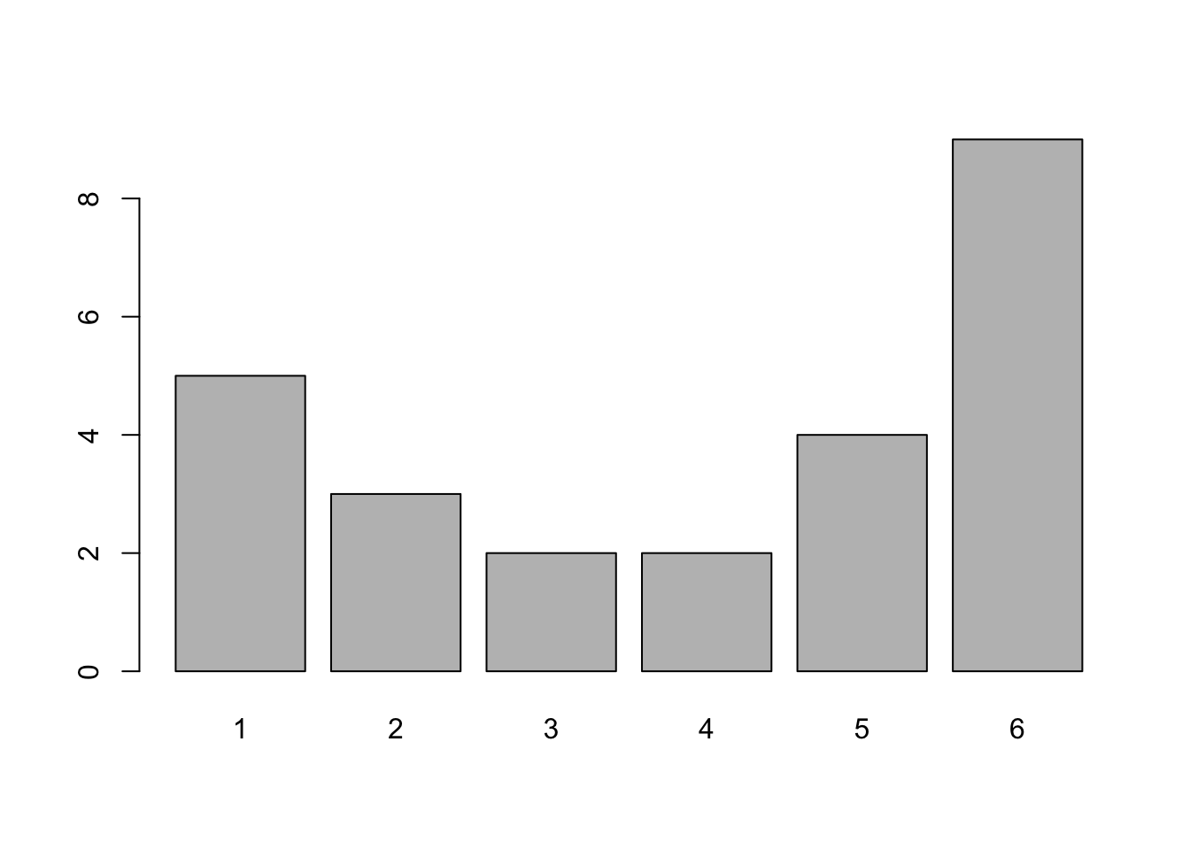
Figure 3.3: Better Bar Plot of rolls
This gives exactly the same information as table does, as we show below, but does it in a graphical way.
## rolls
## 1 2 3 4 5 6
## 5 3 2 2 4 9
Unless you are working with already tabulated data, that is data already in the form of a table, you will need to pair barplot with table.
You may have noticed that rolls is actually qualitative data. This was done so that barplot would at least generate some sort of graph. If we had attempted to use barplot on raw qualitative data, it would throw an error. Feel free to try and run barplot on the colors vector from the beginning of Section 3.1.1 without pairing it with table.
If we wanted to get the proportion, or relative frequency, of each roll and not the frequency, we can inject the R function proportions() as below:

Figure 3.4: Relative Frequency Bar Plot of rolls
- We still need to include
tableto get the relative frequency bar plot. - The graphical output of a frequency and relative frequency bar plot are identical except for the labels on the vertical axis.
- The
proportionsfunction can be used withtablewith or without thebarplotfunction. The composition function,proportions( table( x ) )will produce a relative frequency table.
We summarize this with the following:
If you have a vector, x, or column of a dataframe, df$Col, of values of a qualitative variable, we can make a bar plot of the frequencies it via:
or
If we want relative frequencies instead, we use the following code:
or
Example 3.2 (Type of Transition) Let’s look at the built in dataset mtcars. Use ?mtcars for more information about this dataset.
##                    mpg cyl disp  hp drat    wt  qsec vs am gear carb
## Mazda RX4         21.0   6  160 110 3.90 2.620 16.46  0  1    4    4
## Mazda RX4 Wag     21.0   6  160 110 3.90 2.875 17.02  0  1    4    4
## Datsun 710        22.8   4  108  93 3.85 2.320 18.61  1  1    4    1
## Hornet 4 Drive    21.4   6  258 110 3.08 3.215 19.44  1  0    3    1
## Hornet Sportabout 18.7   8  360 175 3.15 3.440 17.02  0  0    3    2
## Valiant           18.1   6  225 105 2.76 3.460 20.22  1  0    3    1
and look at the column mtcars$am which gives the type of transmission of each car in the dataframe where 0 = automatic and 1 = manual. We can create a frequency bar plot for this variable with:

Figure 3.5: Frequency Bar Plot of Transmission Type
or a relative frequency bar plot via:
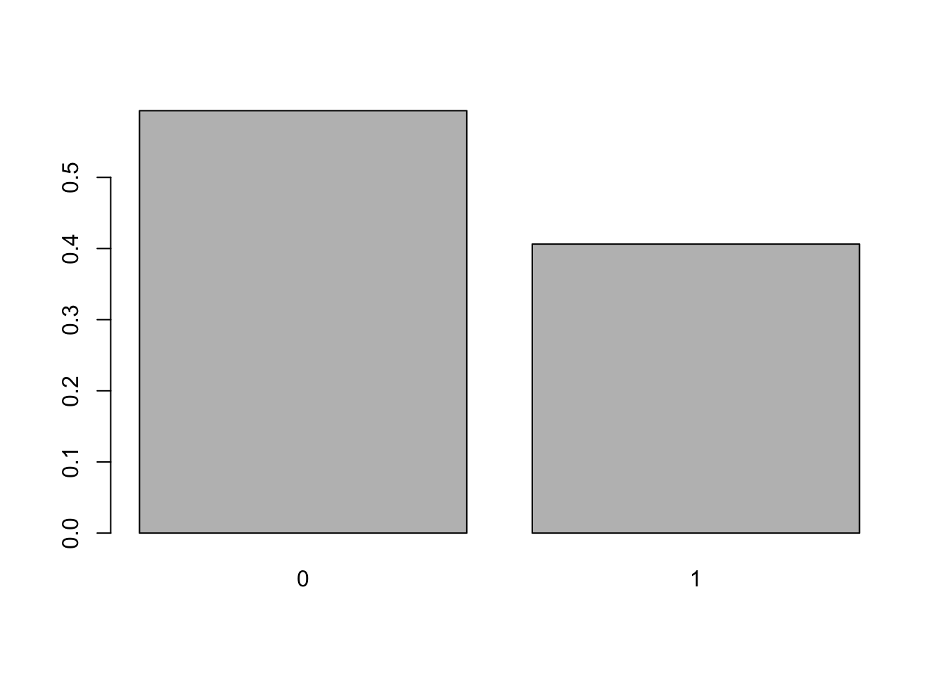
Figure 3.6: Relative Frequency Bar Plot of Transmission Type
We could also use the following three lines of code in which the second and third lines are directly copied from above.
This method of defining x and then using the stock code may be preferred for some readers, however, at this point we will be attempting to give single lines of code that work.
If you have not installed the package HistData, refer to Section 1.3.5 and do so. Load the package using the following line of code or selecting the check box next to HistData in the Packages tab of the lower right pane of RStudio.
Look at dataset DrinkWages and look at ?DrinkWages to learn a bit about the data. Make a bar plot showing the frequency of each wage class in the dataframe. Write full sentences explaining what the bar plot shows.
Definition 3.4 A Pareto Chart is a bar plot where the bars are ordered in descending order from left to right. A Pareto Chart can be be stated in terms of either observed frequency or relative frequency.
To get a Pareto chart of a qualitative variable, use the following code.
or
You can also include the function proportions in between sort and table to make the Pareto chart display relative frequencies.
Example 3.3 We can use the Bulls1996 data frame we introduced in Example 2.17. We begin by offering the code to download it if you do not have it on your machine.
Use the following code to download Bulls1996.
We remind ourselves what data is contained in Bulls1996 by running str on it.
## 'data.frame':    15 obs. of  8 variables:
##  $ No.       : int  0 30 35 53 54 9 23 25 7 13 ...
##  $ Player    : chr  "Randy Brown" "Jud Buechler" "Jason Caffey" "James Edwards" ...
##  $ Pos       : chr  "PG" "SF" "PF" "C" ...
##  $ Ht        : int  74 78 80 84 82 78 78 75 82 86 ...
##  $ Wt        : int  190 220 255 225 240 185 198 175 192 265 ...
##  $ Birth.Date: chr  "May 22, 1968" "June 19, 1968" "June 12, 1973" "November 22, 1955" ...
##  $ Exp       : int  4 5 0 18 6 9 10 7 2 4 ...
##  $ College   : chr  "Houston, New Mexico State" "Arizona" "Alabama" "Washington" ...
We can see give an example of a Pareto chart by using the Pos variable which gives the primary position that that player played.
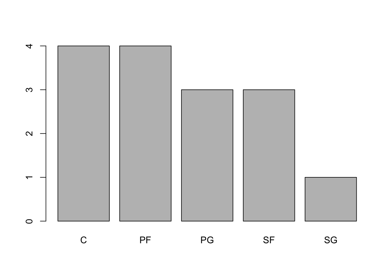
Figure 3.7: Pareto Chart of 1996 Bulls Positions
3.2 Comparing Qualitative Variables
Lets return to the mtcars dataframe and see how the number of cylinders a car has is related to the type of transmission it has. Using ?mtcars lets us know that a value of 0 in the am column means that the car has an automatic transmission while a value of 1 indicates it is a manual transmission. We can basically redo the work in the Section 3.1 using the exact same functions.
3.2.1 Two Way Tables
To get to a Comparative Bar Plot, which we will introduce in Section 3.2.2, we first look at a two way table using table again.
Definition 3.5 A Two Way Table is an array of frequencies (or relative frequencies) of a dataset broken down by 2 different variables. One variable’s values determine the rows and the other variable’s values determine the columns. The entry of each cell of the array is the frequency (or relative frequency) of individuals that match the values of the respective row and column.
Using ?table and looking at the Arguments section shows that the main input, listed as ..., is “one or more objects which can be interpreted as factors.” We can thus pass two difference columns of mtcars to table as below:
##
##      4  6  8
##   0  3  4 12
##   1  8  3  2
This table says that there are 3 cars which have an automatic transmission as well as 4 cylinders, 4 cars which have an automatic transmission as well as 6 cylinders, and so on.
We could also reverse the order of the columns in table to get:
##
##      0  1
##   4  3  8
##   6  4  3
##   8 12  2
This shows us that the entries in table behave like the options used with a dataframe via df[ , ]. The first entry controls the columns and the second entry controls the columns. Making a good graph may require the use to test which order produces the most understandable graph.
Refer back to the “Now it’s your turn!” example from Section 3.1.1 and use the code there to load the dataframe called Asylum1849 if necessary. Choose a couple of pairs of qualitative variables and construct two way tables to investigate the relationship between the variables. Can you see any patterns?
We will not be able to make an explicit decision if two variables are related until we get the machinery introduced in Chapter 11. For now, we can simply comment on patterns that appear to exist based on the tables we are able to create.
3.2.2 Comparative Bar Plot
Now that we are comfortable creating two way tables, we can proceed to visualizations of them. One way to visualize two way tables is to use a comparative bar plot.
Definition 3.6 A Comparative Bar Plot is a visual demonstration of the information in a two-way table. There are multiple ways of producing a comparative bar plot, but in all cases, there is a bar that represents the frequency (or relative frequency) of each cell of the corresponding two-way table.
We can do this with the barplot function.
The syntax for barplot for comparative bar plots is
#This code will not run unless the necessary values are inputted.
barplot( height, beside, legend.text )
where the arguments we use here are
height: Now the output of a two way table.beside: IfFALSEorF, the columns of height are portrayed as stacked bars, and ifTRUEorTthe columns are portrayed as juxtaposed bars.legend.text: Used to give more information to make our graphs more understandable.
Like before, barplot needs to be fed tabulated values, so you will need to also use table if working with raw data.
Returning to the example we saw in Section 3.2.1, we can use barplot to achieve the following.
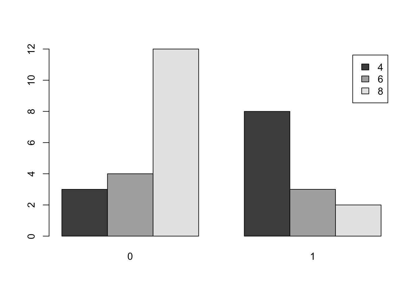
Figure 3.8: Comparative Bar Plot of cyl and am from mtcars Version 1
As mentioned before, we could reverse the roles of cyl and am to get an different way of displaying the same information.
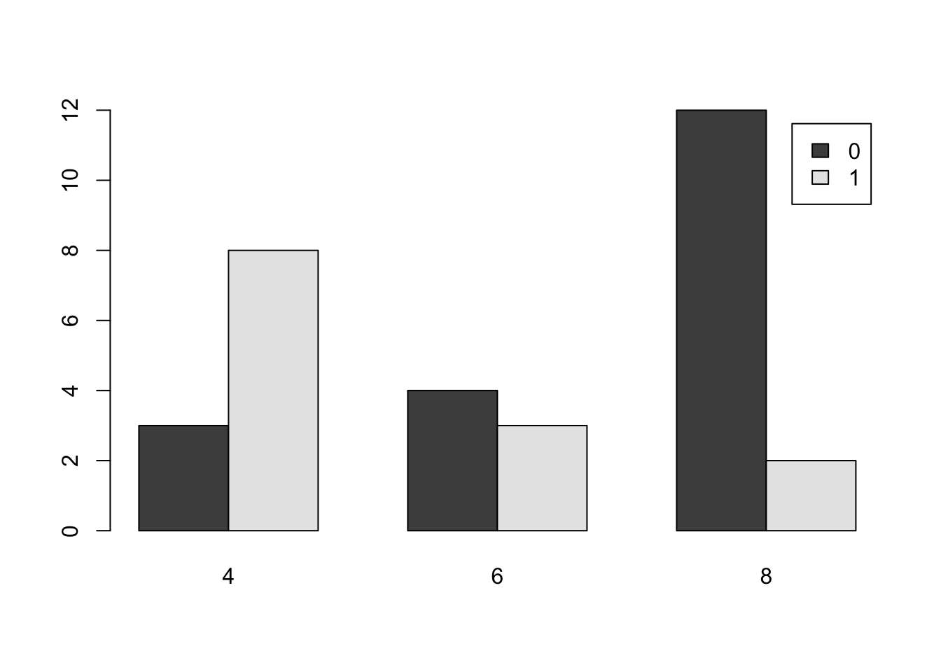
Figure 3.9: Comparative Bar Plot of cyl and am from mtcars Version 2
Here us are using beside = TRUE to make sure the bars are side by side, but we also show what beside = FALSE looks like below.
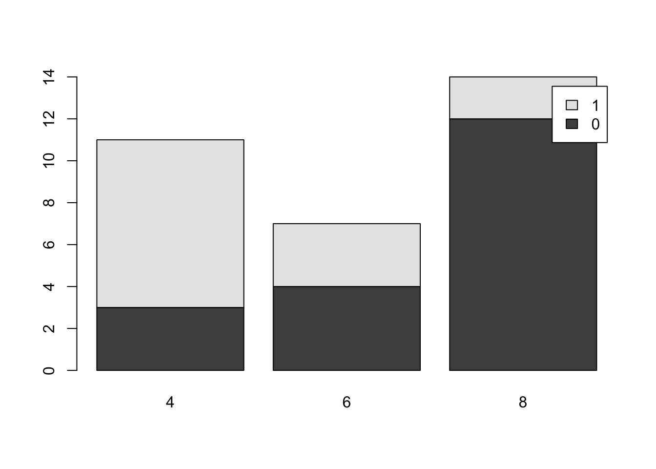
Figure 3.10: Comparative Bar Plot of cyl and am from mtcars Version 3
It is important to remember that although the graphs may appear different when we change the arguments of
barplot, the actual data has not changed and the differences are purely aesthetic. It is the job of the reader to always be a critical consumer and make sure they understand the graph they are viewing.As mentioned before, there are plenty of options available to make the above graphs better and avoid things like the awkward legend position above. However, this document will focus on trying to produce simple graphs.
We summarize the work of this section as well as Section 3.2.1 with the following code templates.
To get a Two Way Table of counts based on the columns Col1 and Col2 of a dataframe, df we use the code:
To get a Comparative Bar Plot based on counts based on the columns Col1 and Col2 of a dataframe, df we use the code:
Make a comparative bar plot of the number of gears a car had based on the shape of the engine. The two variables are gear which gives the number of forward gears a car had and vs which tells whether an engine was V-shaped (value of 0) or straight (value of 1). Try changing the order of the variables and playing with the beside argument. Can you see a relationship between the variables?
3.3 Graphing Quantitative Data
Quantitative data differs from qualitative data in the sense that it is always at the interval level and thus we can separate data into equally sized groups or “bins.” Doing so allows us to plot the frequency of not just individual values, but intervals of values that are close. For example, we may group all cars that have between 20 and 25 miles per gallon fuel efficiency. This type of graph is called a histogram and can be used for both continuous and discrete data types, see Section 2.2.4 for the details on the distinction.
Definition 3.7 A Histogram is a graphical representation of quantitative data. Data are broken into Bins or intervals of possible values and then a rectangle is drawn with each bin as a base with a height corresponding to the frequency (or relative frequency) of the values within each bin.
Our main tool for graphing quantitative data is a Histogram.
Bar plots should not be used to graph quantitative data.
Histograms should not be used to graph qualitative data.
3.3.1 Histograms for Continuous Data
We will investigate using a histogram for continuous data by using a new variable in mtcars. The variable mpg in the mtcars dataframe gives the fuel efficiency of each car in miles per gallon. We can make a histograms using the R function hist().
The syntax of hist is
where the arguments are:
x: The data to be plotted.right: By default,right = TRUEthe histogram cells are intervals of the form \((a, b]\), i.e., they include their right-hand endpoint, but not their left one. If the user specifies thatright = FALSE, the intervals are of the form \([a, b)\) which is common in many other introductory statistics textbooks.breaks: This controls the number of bins being used in the histogram. The simplest way to control this is by setting the argument equal to an integer which R will use to give the number of equal spaced breaks used.freq: (Usually) By default,freq = TRUEand the histogram graphic is a representation of frequencies. If the user specifiesfreq = FALSE, relative frequencies are used.
R attempts to give the best histogram it can by default, but the user can control nearly every aspect of it.
R may not use the exact number of cells you specify in
breaksand there are more direct tools to have more control, but this document does not go into those other than the ones in Section 3.3.2.
We can now make a histogram of the fuel efficiency of cars in the mtcars dataframe by using the following.

Figure 3.11: Histogram of Fuel Efficiency
From here we can see that there were 8 vehicles that had a fuel efficiency between 20 and 25 miles per gallon. To be precise, there were 8 vehicles in mtcars whose value in the column mpg was in the interval \((20,25]\). If a car had had a fuel efficiency of exactly 20 mpg, it would occur in the bin given by \((15,20]\). As mentioned in the remark above, it is possible to use the breaks option to control the values of the bins directly, but the use of a package such as ggplot2 is likely suggested if someone is wanting to create graphs that deviate too far from the default graphics produced by R.
It is important to remember that any differences in plots produced are completely attributable to the selection of the arguments and do not mean there has been any “change” in the data itself. The manipulation of graphs is often done to make a graph tell the story that the creator wants it to. There is the famous quote which Mark Twain attributed to the British Prime Minister Benjamin Disraeli in Chapters from My Autobiography, published in the North American Review in 1907:
“There are three kinds of lies: lies, damned lies, and statistics.”43
While slightly allegorical, it does point out that statistics can be used to deceive people with the subtleness needed to fully understand statistical graphs and calculations.
Example 3.4 To get a feel for what the breaks argument does, we run a few examples of histograms with different values of breaks. To do this, we introduce a new dataset called PlatypusData1.
Use the following code to download PlatypusData1.
As this is new data, we begin by looking at it with the functions str and head.
## 'data.frame':    218 obs. of  4 variables:
##  $ Weight       : num  1.12 0.94 NA 1.18 1.09 0.7 1.55 1 0.52 1.4 ...
##  $ Sex          : chr  "M" "F" "F" "M" ...
##  $ AgeClass     : chr  "SA" "A" "A" "A" ...
##  $ concentration: num  2.1 3.26 8.38 2.5 2.14 3.96 16.4 5.6 9.6 4.44 ...
This tells us that PlatypusData1 is a dataframe that consists of 218 observations, or individuals, each of which has 4 variables recorded for it. The variable Sex is a character string and we can see the possible values it has by running table.
##
##       F   M
##   1 109 108
This shows that our dataset contains observations of 109 females and 108 males as well as a single observation where the sex is not recorded. The variable AgeClass is also of the character type and contains the age of the platypus as shown below.
##
##       A   J  SA
##   1 167  46   4
Platypuses are not easily bred in captivity, and as such, exact ages are rarely known. As such, this data has classified the platypuses into either Juvenile (J), Adult (A), or Senior Adult (SA). We also see that there is a single observation does not have a recorded value for this variable. The interested reader is welcome to examine the article that the data originates from44, but we warn you that the article is quite scientifically dense. The variable concentration deals with the concentration of genomic DNA in a blood sample. We will examine and further discuss this variable later.
We will be focusing on the variable Weight which gives the mass45 of each platypus.
To see what hist will do by default, we simply run the following code.

Figure 3.12: Histogram of Platypus Masses with Default breaks
Here we see that R uses 11 bins when making a histogram for PlatypusData1$Weight. We can try to force R to use only a single bin by setting breaks = 1:
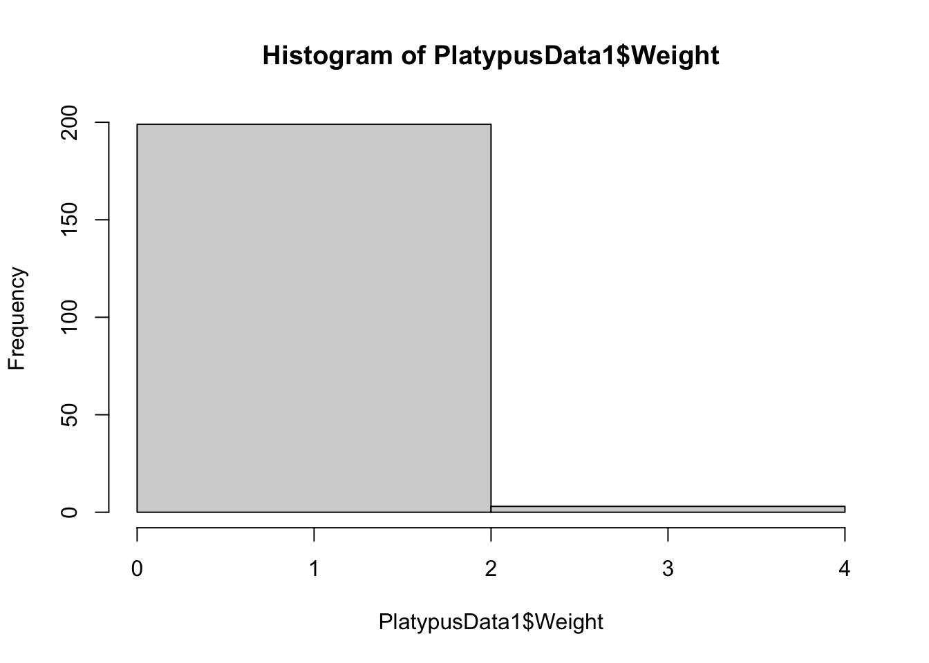
Figure 3.13: Histogram of Platypus Masses with breaks = 1
Instead of a single bin, we get a single “break” and two different bins. To see if this is indeed how breaks work, we proceed to produce histograms with breaks = 2 and breaks = 3.
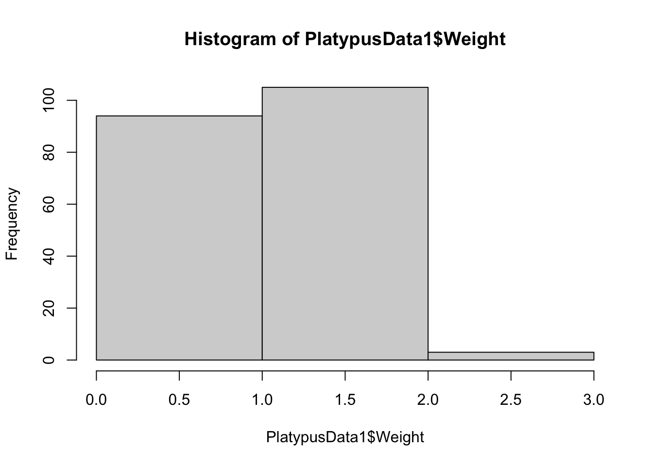
Figure 3.14: Histogram of Platypus Masses with breaks = 2
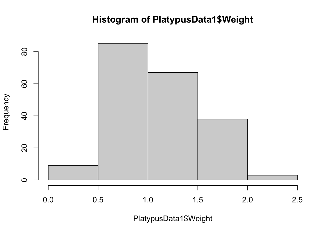
Figure 3.15: Histogram of Platypus Masses with breaks = 3
The histogram using breaks = 2 worked as we anticipated, but the histogram with breaks = 3 had 4 breaks and 5 bins. These examples show one thing: setting breaks to an integer asks R to use that many bins, but R will choose the number of bins it feels is best that is near the value we see.
Investigating further, we can also increase the number of bins with
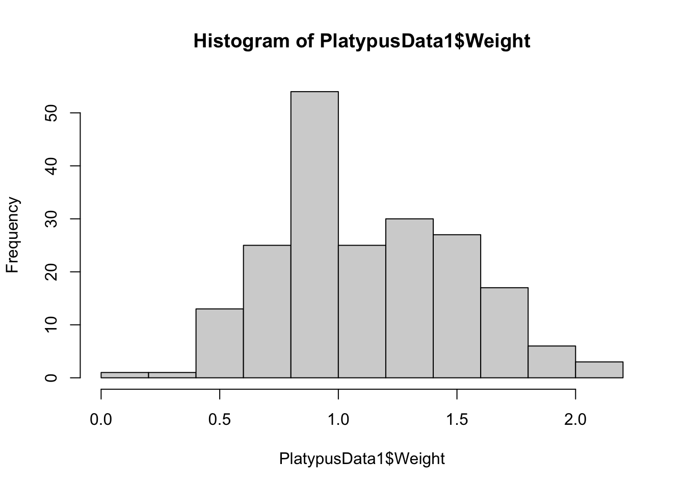
Figure 3.16: Histogram of Platypus Masses with breaks = 10
or even use more bins to get:
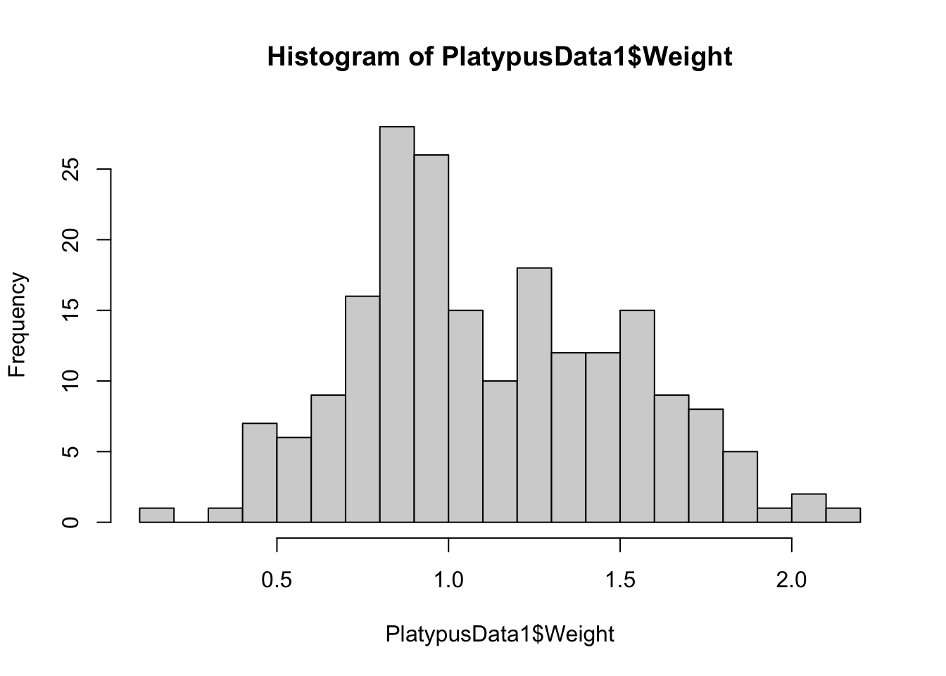
Figure 3.17: Histogram of Platypus Masses with breaks = 20
In all cases, the number of bins is near the value of breaks but fails to match in many cases. These examples reinforce our earlier remark that if the user wants more refined control, they will need to invest energy into learning a bit more coding or use advanced packages such as ggplot2.
Example 3.5 To see what freq does, we recall what the default histogram of mtcars$mpg looked like:
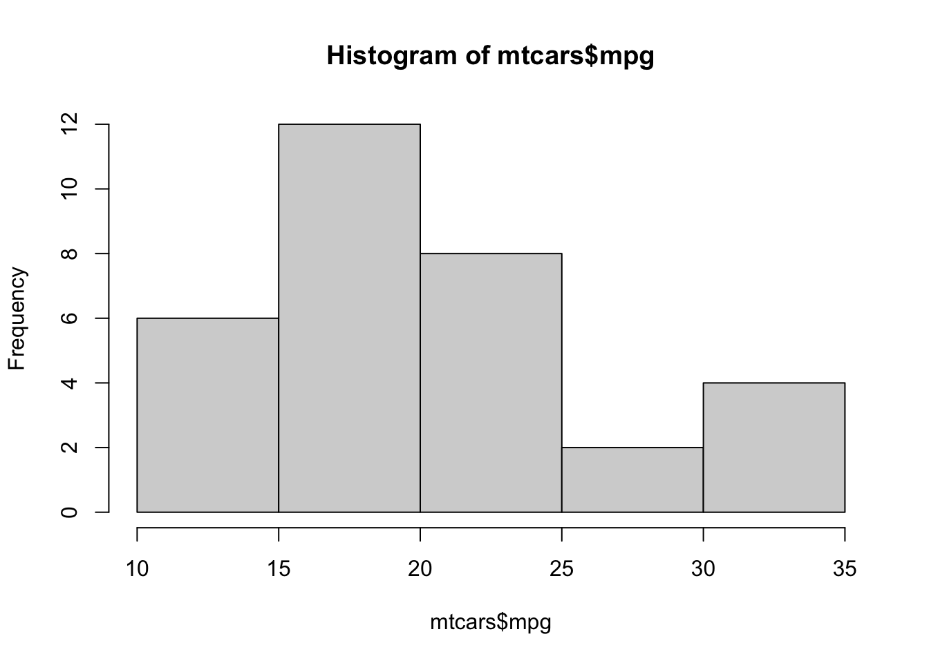
Figure 3.18: Frequency Histogram of Fuel Efficiency
We now can set freq = FALSE (or simply freq = F) to get:

Figure 3.19: Relative Frequency Histogram of Fuel Efficiency
This shows that freq = FALSE gives a Relative Frequency Histogram. Setting freq = TRUE or simply omitting the freq argument (because TRUE is the default value) gives a standard Frequency Histogram. Like bar plots, the shape of a histogram does not change when we move from frequencies to relative frequencies, only the values along the vertical axis do.
To make a basic histogram of a vector x, you can use the code:
or if we have a column of a dataframe, we would use:
Where we set freq = FALSE if we want relative frequencies rather than just frequencies. We can set freq = TRUE or omit freq if we want regular frequencies.
Example 3.6 (Working With Only Part of a Dataframe) Sometimes, we want to look at only a portion of a dataset. For example, if we want to make a histogram of the masses of just the male platypuses, we need to find just the portion of PlatypusData1, introduced and imported in Example 3.4, that contains this data. Recall that we can find a subset of PlatypusData1 by using PlatypusData1[ R , C ] where R is the Row Rules used to choose the rows we want and C is a Column Rule for the columns we want to use. For R we will use the command PlatypusData1$Sex == "M" which will effectively select only those rows where the platypus is male. If we look at PlatypusData1[ PlatypusData1$Sex == "M" , ] we get the following:
##    Weight Sex AgeClass concentration
## 1    1.12   M       SA          2.10
## 4    1.18   M        A          2.50
## 5    1.09   M        A          2.14
## 7    1.55   M        A         16.40
## 9    0.52   M        J          9.60
## 10   1.40   M        A          4.44
We have successfully selected just the rows of male platypuses. There are a couple of ways of progressing from here.
If we planned on doing more analysis of the male platypuses, it may be helpful to create a new dataframe of just these cars. We could do this via
If you now view MalePlatys you should see the same output as when we ran PlatypusData1[ PlatypusData1$Sex == "M" , ]. However, we can now simply pull the column Weight out of this dataframe by running the code below.
##   [1] 1.12 1.18 1.09 1.55 0.52 1.40 1.47 1.37 1.27 1.45 0.47 1.33 1.76 0.66 1.50
##  [16] 1.30 1.33 1.47 1.53 0.91 1.25 1.58 1.67 0.64 1.11 1.29 1.42 0.90 1.48 0.76
##  [31]   NA 1.53 1.20 1.52 1.48 1.60 1.36 1.56   NA 1.59 1.23   NA 1.10 1.21 1.62
##  [46] 1.68 0.90 1.79 1.10 1.43 1.47 1.64 0.88 1.69   NA   NA 1.80 1.83 1.84 1.74
##  [61] 1.45 1.15   NA 1.77 1.05 1.80 2.01 1.60 1.07   NA 0.84 2.11 1.15 1.73 1.84
##  [76] 1.58 1.03 0.82 2.08 1.55 1.66 1.39 1.64 1.86 1.84 0.11 0.85 1.51 0.93 1.79
##  [91] 1.50 1.18 1.46 1.28 1.36 1.56 0.76 1.02 1.99 1.58 0.82 1.64 0.90 0.93 1.34
## [106] 1.36 1.14 1.68
Since we now have a vector, we can now run:
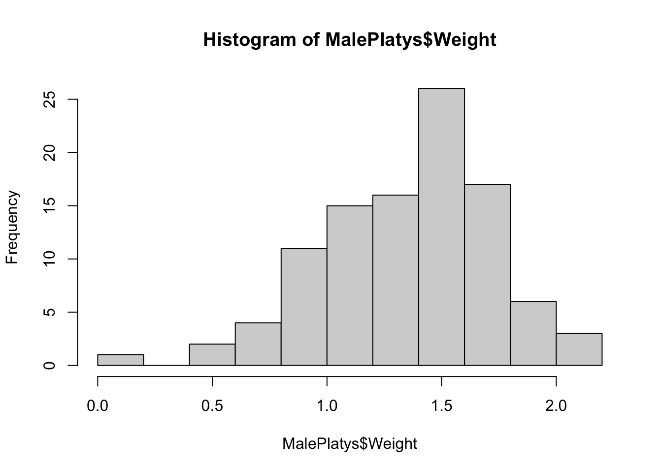
Figure 3.20: Frequency Histogram for Male Platypuses, Method 1
However, if we had no desire to investigate MalePlatys further, it may not be beneficial to create a new dataframe. We can pull just the weight values by using the following code:
##   [1] 1.12 1.18 1.09 1.55 0.52 1.40 1.47 1.37 1.27 1.45 0.47 1.33 1.76 0.66 1.50
##  [16] 1.30 1.33 1.47 1.53 0.91 1.25 1.58 1.67 0.64 1.11 1.29 1.42 0.90 1.48 0.76
##  [31]   NA 1.53 1.20 1.52 1.48 1.60 1.36 1.56   NA 1.59 1.23   NA 1.10 1.21 1.62
##  [46] 1.68 0.90 1.79 1.10 1.43 1.47 1.64 0.88 1.69   NA   NA 1.80 1.83 1.84 1.74
##  [61] 1.45 1.15   NA 1.77 1.05 1.80 2.01 1.60 1.07   NA 0.84 2.11 1.15 1.73 1.84
##  [76] 1.58 1.03 0.82 2.08 1.55 1.66 1.39 1.64 1.86 1.84 0.11 0.85 1.51 0.93 1.79
##  [91] 1.50 1.18 1.46 1.28 1.36 1.56 0.76 1.02 1.99 1.58 0.82 1.64 0.90 0.93 1.34
## [106] 1.36 1.14 1.68
We can then give a histogram of this by putting it into hist via:
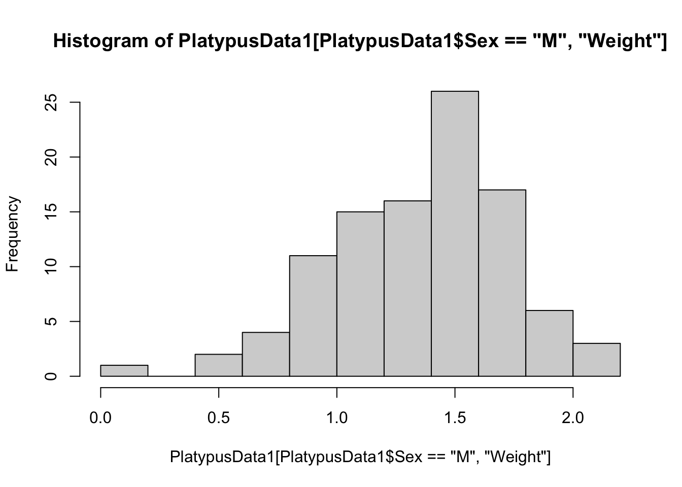
Figure 3.21: Frequency Histogram for Male Platypuses, Method 2
We could further refine our investigation to the weight of adult male platypuses. That is we want the Sex variable to be "M" and the AgeClass variable to be "A". To do this, we use the logical and operator, &.
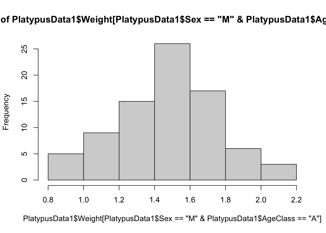
Figure 3.22: The weights of adult male platypuses
We now have a histogram of the weights of just adult male platypuses.
In Example 3.6, we see our first instance of “exploded” code.
Here we have broken the code across multiple lines to attempt to make it more readable. You could remove the blank spaces and line breaks above to get the following equivalent line of code.
It was decided that the density and length of this single line of code would encumber readers from being able to understand it. There is definitely a balancing act between keeping code concise and making it readable. You may want to take a moment to convince yourself that the two blocks of code above are equivalent.
From time to time, you will see this type of formatting for the complicated code we encounter. In particualr, you will see an even more elaborate chunk of exploded code in Section 3.3.2 when we give a “Code Template” for constructing histograms of discrete data.
There are many ways to accomplish the tasks of Example 3.6 with R. For example PlatypusData1$Weight[ PlatypusData1$Sex == "M" ] is equivalent to PlatypusData1[ PlatypusData1$Sex == "M", "Weight" ], but the latter form is easier to generalization if we wanted more than just one column. For example, the following code gives (the head of) a dataframe containing both the mass and age class of male platypuses.
##    Weight AgeClass
## 1    1.12       SA
## 4    1.18        A
## 5    1.09        A
## 7    1.55        A
## 9    0.52        J
## 10   1.40        A
The output is a new dataframe consisting of the portion of PlatypusData1 with only the rows where Sex is "M" and only the columns Weight and AgeClass.
You can also use the code PlatypusData1[ PlatypusData1$Sex == "M", ]$Weight and a few other variations. There is often not a single way to accomplish your goal in R and we encourage the reader to try things and see what they do.
3.3.2 Histograms for Discrete Data
When graphing continuous data, R typically does a fine job choosing the bins to split the data into. However, the hist function typically does not do a great job at making graphs of discrete data.
Example 3.7 Consider the following vector of dice rolls:
We can tabulate these to see what a histogram should look like.
## x
## 1 2 3 4 5 6
## 2 4 2 3 2 2
If we use hist to plot this, we get the following:
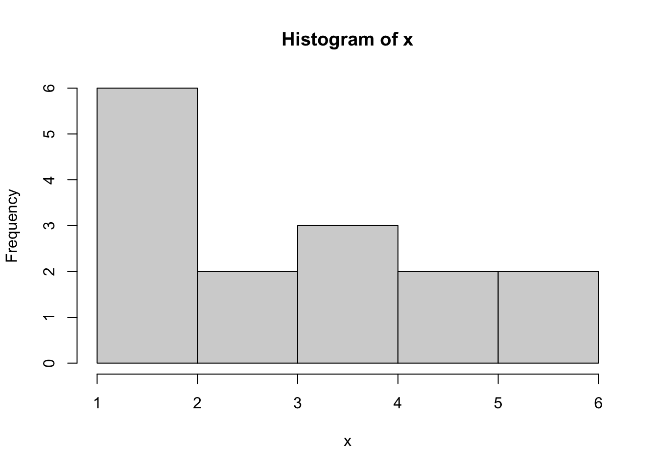
Figure 3.23: Bad Histogram of Dice Rolls Version 1
It appears that the counts for 1 and 2 have been combined. We could try the option of right = FALSE to solve this, but that gives the following:
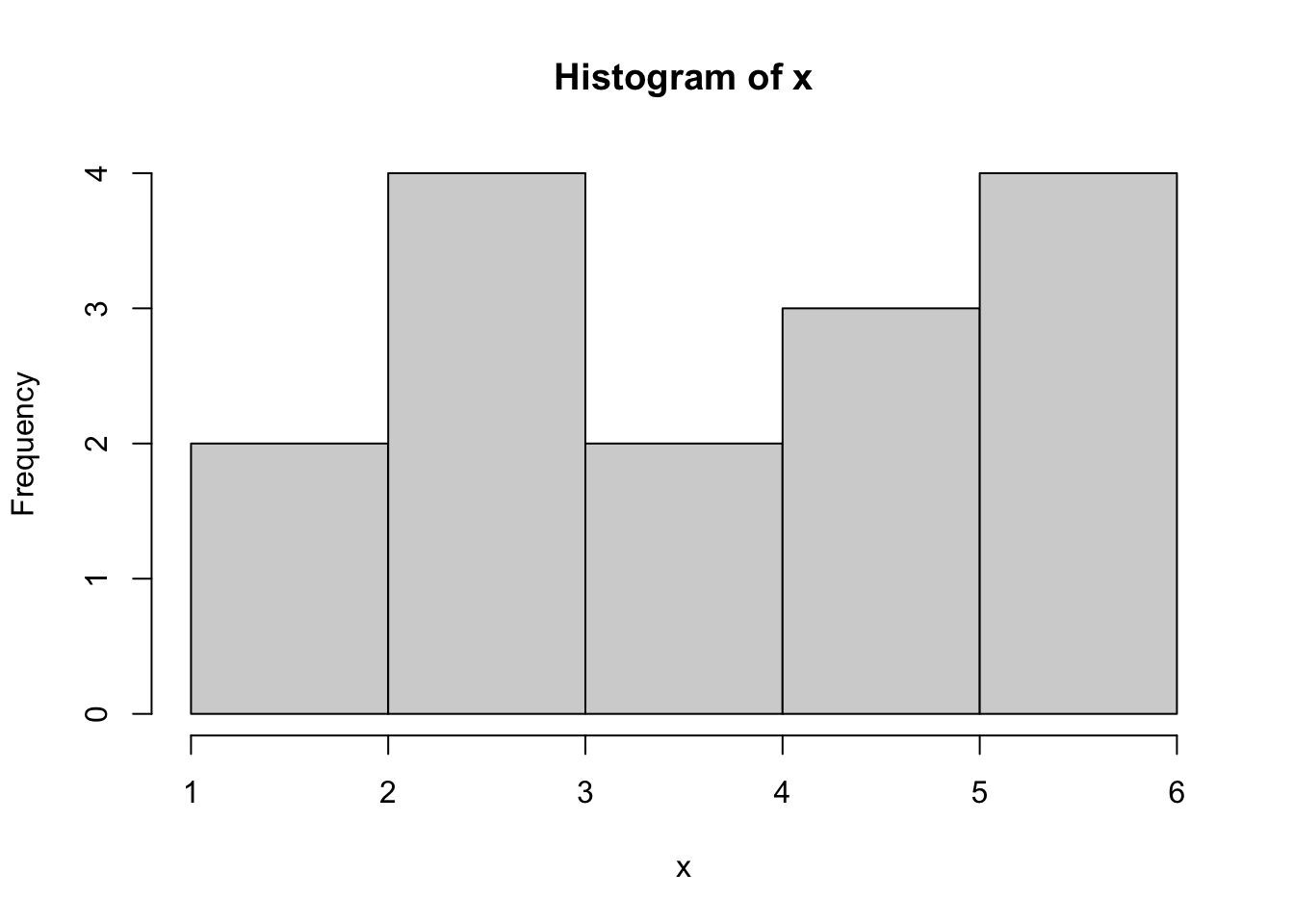
Figure 3.24: Bad Histogram of Dice Rolls Version 2
While this did fix the issue we had with 1s and 2s combining, we now get that the 5s and 6s have been combined.
While bar plots can be used for discrete quantitative data, we do not advise it and suggest the use of the method and Code Template here in Section 3.3.2.
A more traditional way to display discrete data with integer values is to have bins offset by one half. That is, we want the bin that is used for the value of 3, for example, to be from 2.5 to 3.5. We will illustrate this via a larger dataset.
Example 3.8 We begin by loading in the file called BabyData1. This file contains data about the births of a sample of babies.
Use the following code to download BabyData1.
As mentioned in Chapter 1, we should begin our investigation BabyData1 by using str and head.
## 'data.frame':    200 obs. of  12 variables:
##  $ mom_age      : int  35 22 35 23 23 26 25 32 41 22 ...
##  $ dad_age      : int  35 21 42 NA 28 31 37 38 39 24 ...
##  $ mom_educ     : int  6 3 4 1 4 3 5 5 4 3 ...
##  $ mom_marital  : int  1 1 1 1 1 2 1 1 1 2 ...
##  $ numlive      : int  2 1 0 2 0 1 0 1 0 0 ...
##  $ dobmm        : int  2 3 6 8 9 10 7 12 11 2 ...
##  $ gestation    : int  39 42 39 40 42 39 38 38 36 40 ...
##  $ sex          : chr  "F" "F" "F" "F" ...
##  $ weight       : int  3175 3884 3030 3629 3481 3374 2693 4338 2834 2948 ...
##  $ prenatalstart: int  1 2 2 1 2 4 1 1 2 1 ...
##  $ orig_id      : int  1047483 1468100 2260016 3583052 795674 3544316 3726920 2606970 2481971 243759 ...
##  $ preemie      : logi  FALSE FALSE FALSE FALSE FALSE FALSE ...
This shows us that BabyData1 is a dataframe and contains variables such as the age of the mother and the sex of the baby born. As the dataframe has 200 rows (or observations as it is listed in str), it is helpful to look at only a portion of the data using head now.
##   mom_age dad_age mom_educ mom_marital numlive dobmm gestation sex weight
## 1      35      35        6           1       2     2        39   F   3175
## 2      22      21        3           1       1     3        42   F   3884
## 3      35      42        4           1       0     6        39   F   3030
## 4      23      NA        1           1       2     8        40   F   3629
## 5      23      28        4           1       0     9        42   F   3481
## 6      26      31        3           2       1    10        39   M   3374
##   prenatalstart orig_id preemie
## 1             1 1047483   FALSE
## 2             2 1468100   FALSE
## 3             2 2260016   FALSE
## 4             1 3583052   FALSE
## 5             2  795674   FALSE
## 6             4 3544316   FALSE
This shows us a portion of BabyData1 but not in a way that would scroll our screen to lose sight of the information contained in the column names and labels. We will look at the data in the variable mom_age which lists the mother’s age at the time of the baby’s birth. We see that it is of type int which means we only have integer values in this variable. As such, to avoid the issues we had with the dice rolls, we will need to be much more explicit in how we setup our hist function.
The following code will give a histogram of BabyData1$mom_age where we want each bar of our histogram to include only 1 value.
data <- BabyData1$mom_age      #Entered by the User
bin_width <- 1                 #Entered by the User
#Do not change any values below this comment
hist(
      data,
      freq = TRUE,
      breaks = seq(
                      from = min( data, na.rm = TRUE ) - 0.5,
                      to = max( data, na.rm = TRUE ) + bin_width - 0.5,
                      by = bin_width
                  )
    )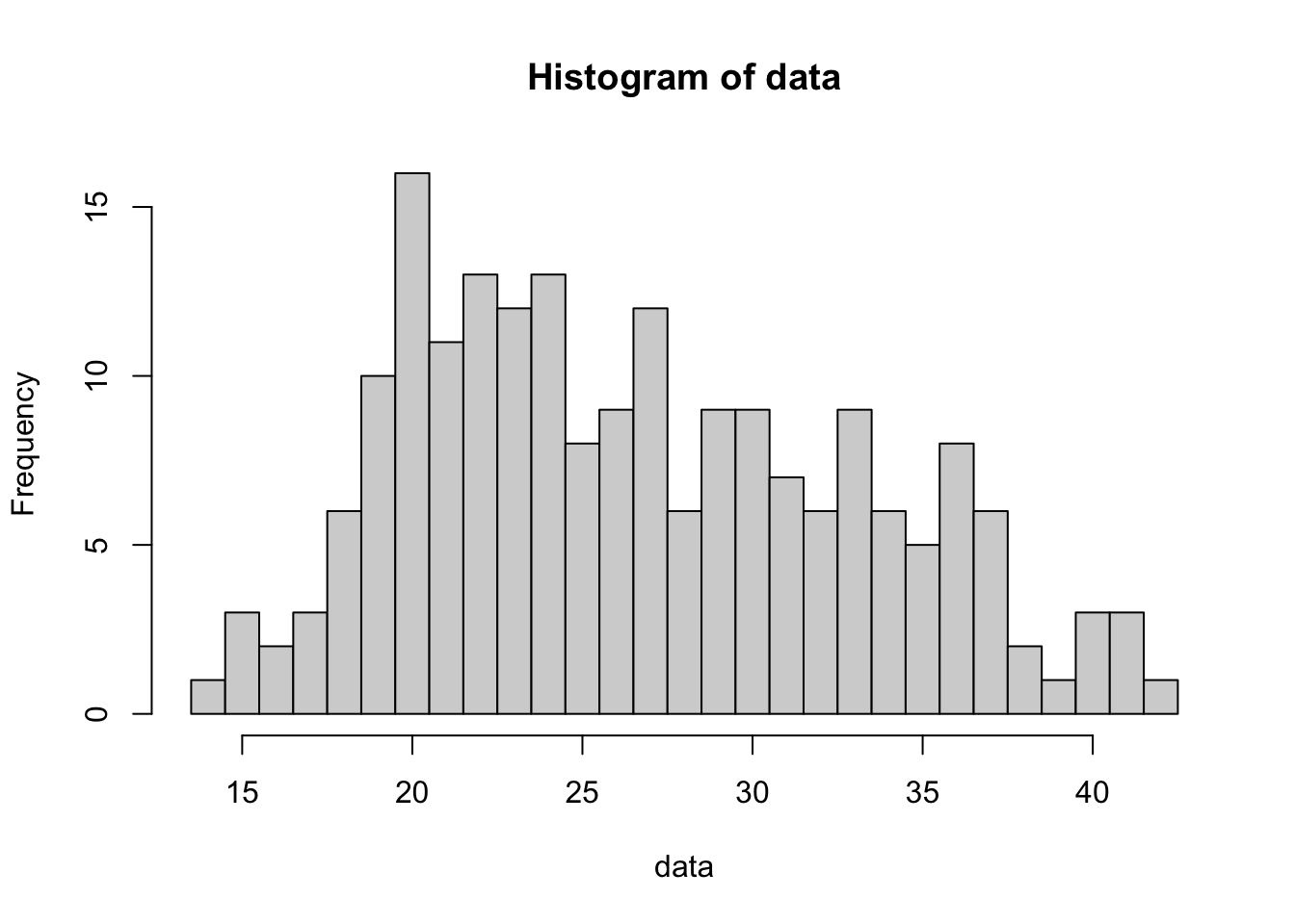
Figure 3.25: Histogram of Mothers’ Ages Version 1
If we wanted to smooth our the histogram by grouping the ages into bins of width 3, for example we could combine the ages 30, 31 and 32 into a single bin, we can easily accomplish this by setting the value of bin_width to be the number of values to group together. Below we set bin_width to be 3 and get a new histogram.
data <- BabyData1$mom_age      #Entered by the User
bin_width <- 3                 #Entered by the User
#Do not change any values below this comment
hist(
      data,
      freq = TRUE,
      breaks = seq(
                      from = min( data, na.rm = TRUE ) - 0.5,
                      to = max( data, na.rm = TRUE ) + bin_width - 0.5,
                      by = bin_width
                  )
    )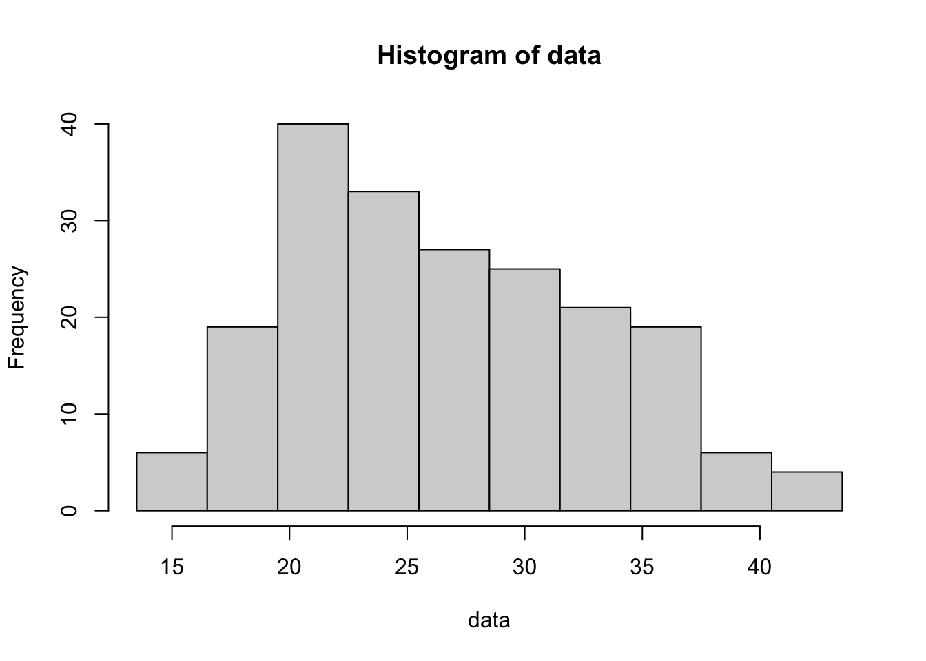
Figure 3.26: Histogram of Mothers’ Ages Version 2
The following code chunk should only be used for discrete data. See the Code Template in Section 3.3.1 if your data is not discrete. As a reminder, some data may be stored as integer values, but be from a continuous variable. See Section 2.2.4 for a reminder about discretized data.
To plot a histogram of discrete data, we can use the following code chunk. The user must supply the discrete data they wish to graph in the place of x and also the width of the bins they would like to use in as an integer in the place of w.
Using the x vector from Example 3.7, create a histogram that correctly displays the data.
3.3.3 Stem and Leaf Plots
To make a Stem and Leaf Plot we simply use the R function stem(). Stem and leaf plots are a fairly unique way to graph data, so we will introduce it via example.
The syntax of stem is
where the arguments are:
x: The data to be plotted.scale: This controls the plot length.width: The desired width of plot.
Example 3.9 We begin by looking at the variable qsec in mtcars which measures the quarter mile time of the car in seconds. We first look at the data and then a histogram of it.
##  [1] 16.46 17.02 18.61 19.44 17.02 20.22 15.84 20.00 22.90 18.30 18.90 17.40
## [13] 17.60 18.00 17.98 17.82 17.42 19.47 18.52 19.90 20.01 16.87 17.30 15.41
## [25] 17.05 18.90 16.70 16.90 14.50 15.50 14.60 18.60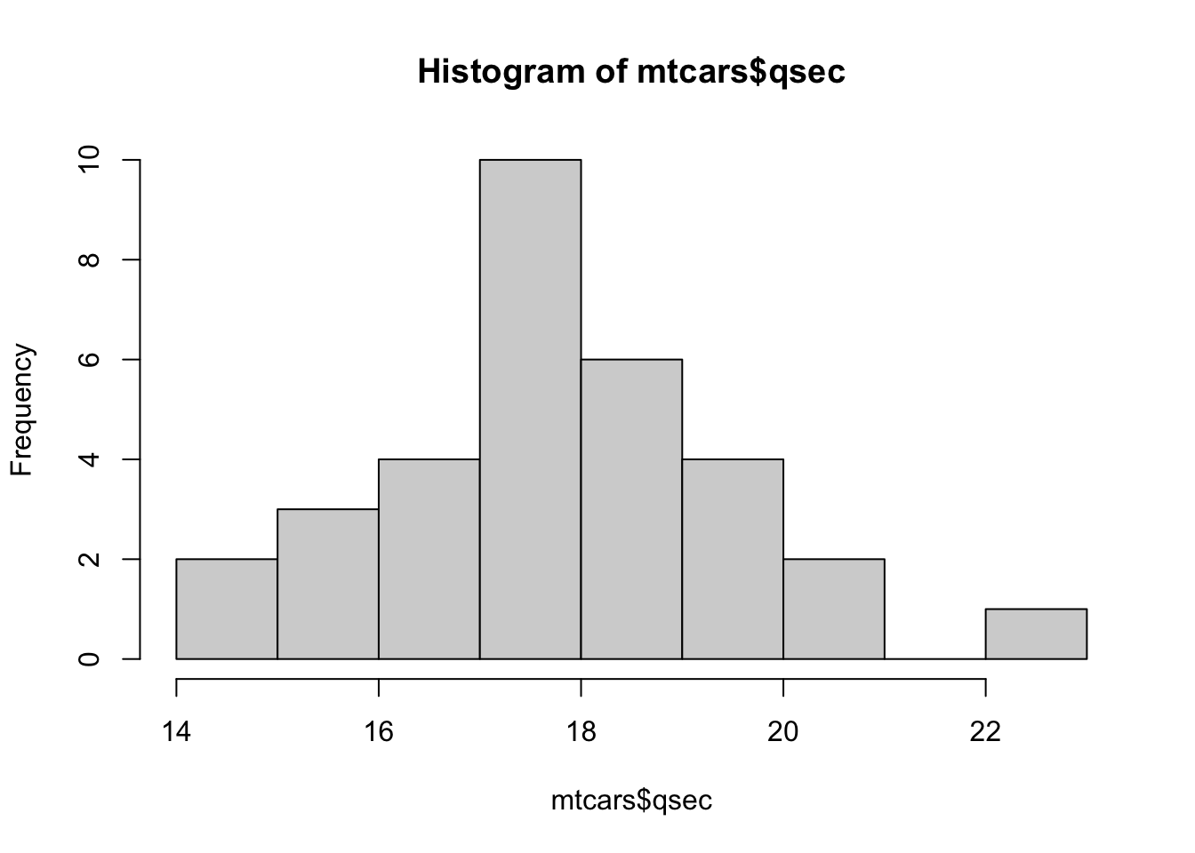
Figure 3.27: Histogram of Quarter Mile Times
We now implement the stem() function.
##
##   The decimal point is at the |
##
##   14 | 56
##   15 | 458
##   16 | 5799
##   17 | 00134468
##   18 | 00356699
##   19 | 459
##   20 | 002
##   21 |
##   22 | 9
If you were to turn the stem and leaf plot ninety degrees counterclockwise, we would see that these two graphs show nearly the same information. The histogram uses vertical rectangles to show the frequencies and the stem and leaf plot uses the leaf to mark each occurrence of a value with a specified stem.
The first value in mtcars$qsecwas 16.46. Looking at the stem and leaf plot we see the number 16 on the left side of the vertical lines. To the right of the | we see 5799. This means that our dataset contains values which round to 16.5, 16.7, 16.9, and 16.9. The 16 is known as the stem and the values 5, 7, 9, and 9 are the leaves of that stem. Leaves are always a single integer and are in numerical order of the value they represent. The stem of 21 is included regardless of the fact that it has no stems just as the histogram does not omit the portion of the number line containing 21.
The astute reader may notice a discrepancy between stem and leaf for the stems of 17 and 18 and the associated bins in the histogram of mtcars$qsec. This is explored in Exercise 3.9.
Example 3.10 (Split Stems) R often will automatically make split stems when necessary as shown with mtcars$wt which gives the vehicle’s weight in pounds.
##
##   The decimal point is at the |
##
##   1 | 5689
##   2 | 123
##   2 | 56889
##   3 | 22224444
##   3 | 55667888
##   4 | 1
##   4 |
##   5 | 334
Here there are two stems with a value of 2. One of them has the leaves 0 through 4 and the other has the leaves 5 through 9.
We can also use the scale argument to manually split stems for some datasets. Setting scale = 2 will roughly double the length (number of stems) as compared to the default settings. We can apply this to mtcars$qsec which had standard stems in Example 3.9.
##
##   The decimal point is at the |
##
##   14 | 56
##   15 | 4
##   15 | 58
##   16 |
##   16 | 5799
##   17 | 001344
##   17 | 68
##   18 | 003
##   18 | 56699
##   19 | 4
##   19 | 59
##   20 | 002
##   20 |
##   21 |
##   21 |
##   22 |
##   22 | 9
Example 3.11 (Double Stems) R can also double stems as seen by looking at the variable we looked at before, mtcars$mpg.
##
##   The decimal point is at the |
##
##   10 | 44
##   12 | 3
##   14 | 3702258
##   16 | 438
##   18 | 17227
##   20 | 00445
##   22 | 88
##   24 | 4
##   26 | 03
##   28 |
##   30 | 44
##   32 | 49
Looking at the stem of 18 we see values which are (when rounded) 18.1, 18.7, 19.2, 19.2, and 19.7. We know this because the values are always in order, so 18.2 cannot follow 18.7. Unfortunately, this can lead to some ambiguity as is the case with the 26 stem. The leaves of 0 and 3 could be either 26.0 and 26.3, 26.0 and 28.3, or 28.0 and 28.3. (28.0 and 26.3 would not be possible due to the stems having to be in ascending order of their data values.)
We can also use the scale argument to manually double stems for some datasets. Setting scale = 0.5 will roughly halve the length (number of stems) as compared to the default settings. We can apply this to mtcars$qsec which had standard stems in Example 3.9.
##
##   The decimal point is at the |
##
##   14 | 56458
##   16 | 579900134468
##   18 | 00356699459
##   20 | 002
##   22 | 9
Unfortunately, the scale argument for stem is a bit like breaks for histograms where setting breaks = 10, for example, gave a histogram that had roughly 10 bins. You should only attempt to modify the scale argument after looking at the default plot and deciding if a modification is warranted.
Definition 3.8 A good stem and leaf plot should include a legend or key which helps us interpret the plot. R does this as we see that it states The decimal point is at the | so that 22|9 can be quickly interpreted as 22.9.
Example 3.12 (Using a Stem and Leaf Legend) To see how to interpret this in general, we also look at mtcars$disp.
##  [1] 160.0 160.0 108.0 258.0 360.0 225.0 360.0 146.7 140.8 167.6 167.6 275.8
## [13] 275.8 275.8 472.0 460.0 440.0  78.7  75.7  71.1 120.1 318.0 304.0 350.0
## [25] 400.0  79.0 120.3  95.1 351.0 145.0 301.0 121.0
Knowing what values we are looking at, we can construct a stem and leaf plot.
##
##   The decimal point is 2 digit(s) to the right of the |
##
##   0 | 7888
##   1 | 012224
##   1 | 556677
##   2 | 3
##   2 | 6888
##   3 | 002
##   3 | 5566
##   4 | 04
##   4 | 67
Knowing that the first value in the dataset is 160.0 we look for this value in the plot. The legend says The decimal point is 2 digit(s) to the right of the |. This means that the stem of 1 relates to values between 100 and 199 and the leaves indicate the value in the tens place once rounded to the nearest ten, if needed. That is, we expect 160.0 to be shown as 1|6 and we indeed see a leaf of 6 after the (second) stem of 1. The max value in mtcars$disp is 472.0 which would round to 470 which therefore appears as the pair 4|7.
To make a stem and leaf plot of a vector x, you use the code:
or if we have a column of a dataframe, we would use:
Example 3.13 (The Width argument) The width argument defaults to 80 which is usually suitable for most plots. However, the user can define the width argument can be defined as to change the number of leaves we see on each row. For example, we can use the built in dataset ChickWeight. We begin by looking at the structure of ChickWeight.
## Classes 'nfnGroupedData', 'nfGroupedData', 'groupedData' and 'data.frame':   578 obs. of  4 variables:
##  $ weight: num  42 51 59 64 76 93 106 125 149 171 ...
##  $ Time  : num  0 2 4 6 8 10 12 14 16 18 ...
##  $ Chick : Ord.factor w/ 50 levels "18"<"16"<"15"<..: 15 15 15 15 15 15 15 15 15 15 ...
##  $ Diet  : Factor w/ 4 levels "1","2","3","4": 1 1 1 1 1 1 1 1 1 1 ...
##  - attr(*, "formula")=Class 'formula'  language weight ~ Time | Chick
##   .. ..- attr(*, ".Environment")=<environment: R_EmptyEnv>
##  - attr(*, "outer")=Class 'formula'  language ~Diet
##   .. ..- attr(*, ".Environment")=<environment: R_EmptyEnv>
##  - attr(*, "labels")=List of 2
##   ..$ x: chr "Time"
##   ..$ y: chr "Body weight"
##  - attr(*, "units")=List of 2
##   ..$ x: chr "(days)"
##   ..$ y: chr "(gm)"
We see that ChickWeight has a very complex structure! We fill focus our attention to the weight variable and look at a stem and leaf plot of it and setting width = 120.
##
##   The decimal point is 1 digit(s) to the right of the |
##
##    2 | 599999999
##    4 | 000001111111111111111111122222222222222233334566788888888999999999999900000011111111222233333444555556666777
##    6 | 0011111112222222233333444445555566667777788888890011111122222233333444444446667778889999
##    8 | 00112223344444455555566777788999990001223333566666788888889
##   10 | 0000111122233333334566667778889901122223445555667789
##   12 | 00002223333344445555667788890113444555566788889
##   14 | 11123444455556666677788890011234444555666777777789
##   16 | 00002233334444466788990000134445555789
##   18 | 12244444555677782225677778889999
##   20 | 0123444555557900245578
##   22 | 0012357701123344556788
##   24 | 08001699
##   26 | 12344569259
##   28 | 01780145
##   30 | 355798
##   32 | 12712
##   34 | 1
##   36 | 13
This produces a plot that (likely) scrolls your screen to display the whole thing. We can compare this to the default settings.
##
##   The decimal point is 1 digit(s) to the right of the |
##
##    2 | 599999999
##    4 | 00000111111111111111111112222222222222223333456678888888899999999999+38
##    6 | 00111111122222222333334444455555666677777888888900111111222222333334+8
##    8 | 00112223344444455555566777788999990001223333566666788888889
##   10 | 0000111122233333334566667778889901122223445555667789
##   12 | 00002223333344445555667788890113444555566788889
##   14 | 11123444455556666677788890011234444555666777777789
##   16 | 00002233334444466788990000134445555789
##   18 | 12244444555677782225677778889999
##   20 | 0123444555557900245578
##   22 | 0012357701123344556788
##   24 | 08001699
##   26 | 12344569259
##   28 | 01780145
##   30 | 355798
##   32 | 12712
##   34 | 1
##   36 | 13
We see on the stem of 4 that we have so many leaves that the final 38 values are simply recorded as +38 at the end of the line.
##
##   The decimal point is 1 digit(s) to the right of the |
##
##    3 | 599999999
##    4 | 00000111111111111111111112222222222222223333456678888888899999999999
##    5 | 000000111111112222333334445555566667778888899999
##    6 | 001111111222222223333344444555556666777778888889
##    7 | 0011111122222233333444444446667778889999
##    8 | 0011222334444445555556677778899999
##    9 | 0001223333566666788888889
##   10 | 00001111222333333345666677788899
##   11 | 01122223445555667789
##   12 | 0000222333334444555566778889
##   13 | 0113444555566788889
##   14 | 1112344445555666667778889
##   15 | 0011234444555666777777789
##   16 | 0000223333444446678899
##   17 | 0000134445555789
##   18 | 1224444455567778
##   19 | 2225677778889999
##   20 | 01234445555579
##   21 | 00245578
##   22 | 00123577
##   23 | 01123344556788
##   24 | 08
##   25 | 001699
##   26 | 12344569
##   27 | 259
##   28 | 0178
##   29 | 0145
##   30 | 35579
##   31 | 8
##   32 | 127
##   33 | 12
##   34 | 1
##   35 |
##   36 | 1
##   37 | 3
While the user is certainly at liberty to change the values of scale and width for the function stem, here at Statypus we encourage someone to do so only if the default stem and leaf plot has some shortcoming that they are looking to overcome.
3.4 Skew
In this section we will discuss the Skew of a distribution. However, before we begin, it is important to point out the distinction between the histograms we have been looking at and the underlying shape of the distribution. This concept is examined in more detail in Section 6.5.1, but we will boil that section down to the figure below dealing with the weight (in ounces) of Snickers bars.
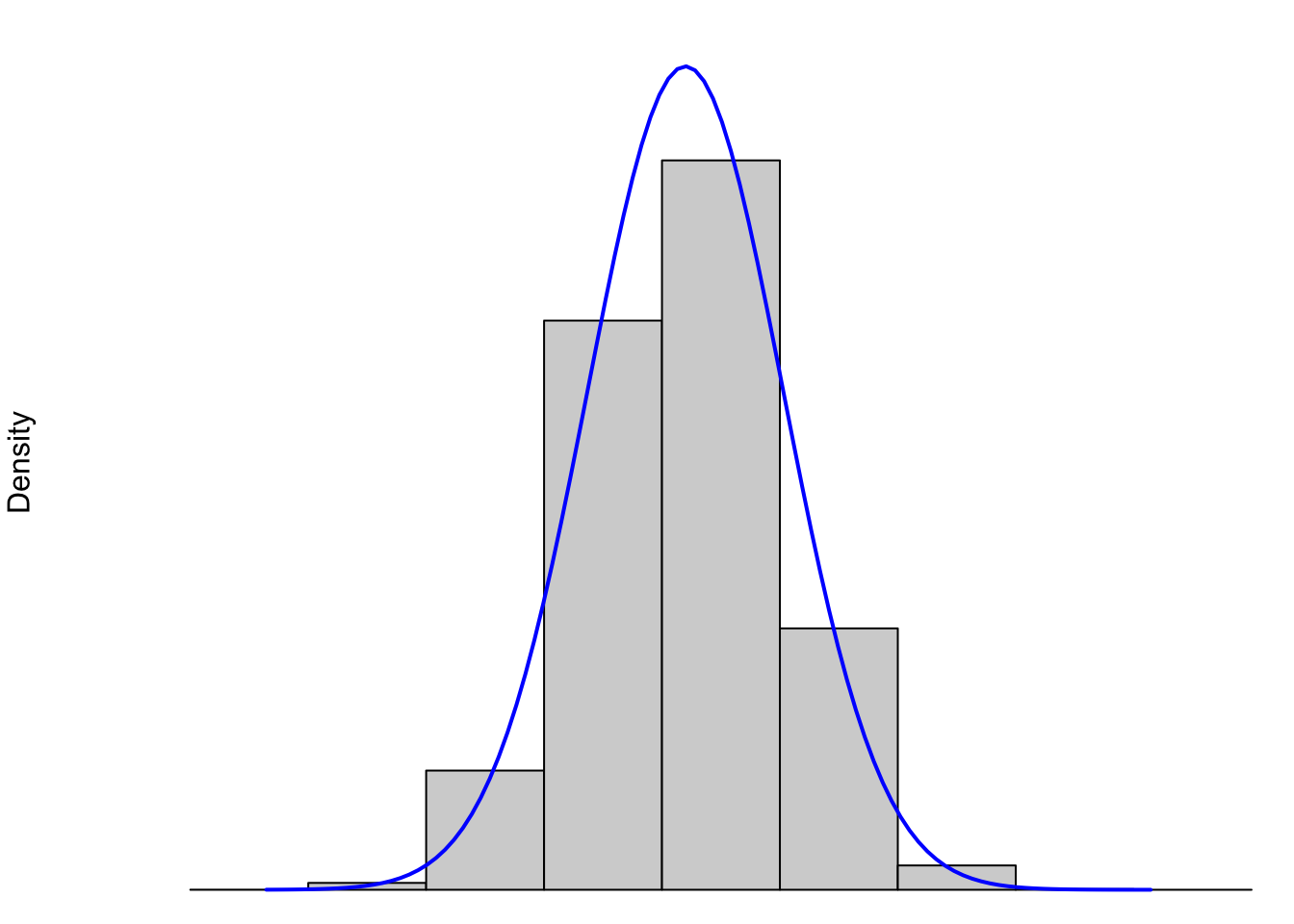
Figure 3.28: Histograms and its Underlying Distribution
When we discuss the shape of a distribution, we are really discussing the shape of the underlying “density” curve associated to it. (See Section 6.5.1 if you want to jump down that rabbit hole early.) That is to say, the entire population of Snickers bars (past, present, and future) is shown by the blue curve. While this population will never be truly infinite, it is so large that we do expect to see more “curve” to the data than flat boxes. The gray boxes are (as we just saw in Section 3.3.1) the histogram of a finite sample of Snickers bars and it is fairly clear that no finite number of Snickers bars or boxes in a histogram could produce a truly “smooth curve” like we see in blue above. However, this is the model that we use to describe the distribution.
However, not all data is as symmetric as the distribution of Snickers bars we see above. For example, the following plot shows data similar to the distribution of U.S. household incomes.
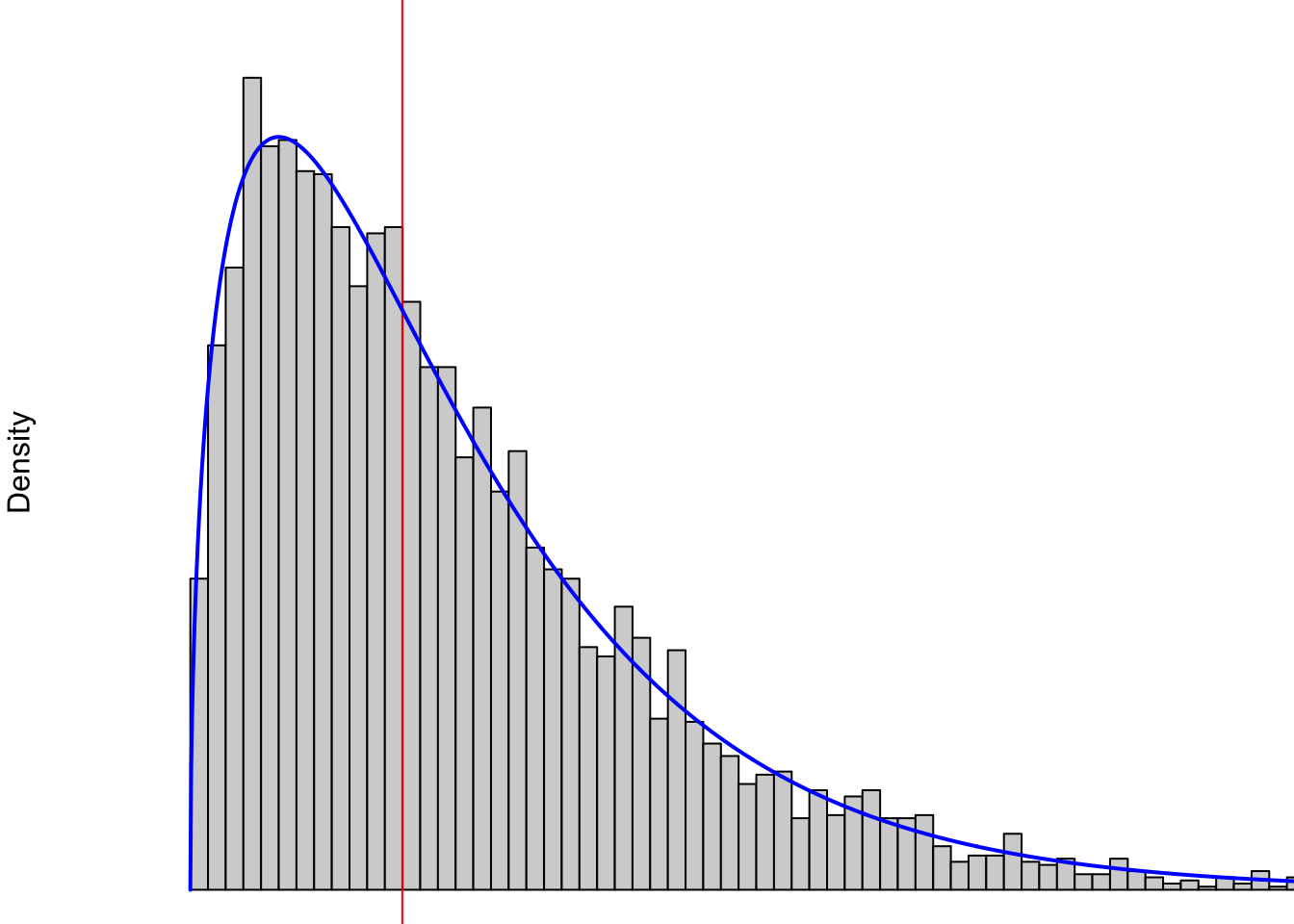
Figure 3.29: Non-symmetric Distribution Showing Right Skew
In 2024, the middle (this is the mean which we will define in Section 4.1.2 if you want to take a look) U.S. household income was approximately $80,000 and that is represented by the vertical red line in the above plot. At least at a simplistic view, it is not possible to have a negative income, so our values are “boxed” into the positive (technically non-negative) region. This means there is only a region of $80,000 to the left of the red line, but it is clearly possible to make more than $80,000 more than the red line or even multiple times that. For example, a family that has an annual income of $400,000 would sit at the far right of the part of the graph shown. Any family making more than $400,000 a year would literally be “off the chart” and is not shown.
Both of these distributions have a single “peak” to them which is sometimes called the “mode” of the distribution. Here at Statypus, we have chosen to avoid diving into the technicalities of the mode or modes of a distribution and will simply discuss modes as being the “peaks” of distributions like the blue curves shown above.
Therefore we will say that a Unimodal Distribution is a distribution where there is only a single peak on the graph. An example of a distribution that is not unimodal is shown below. Since it has two peaks, it is common to call this a Bimodal Distribution, but we will not spend any time getting into those weeds here.
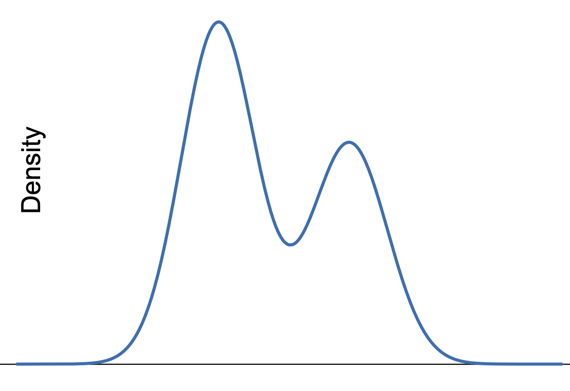
Figure 3.30: Bimodal Distribution
Definition 3.9 While a completely technical definition will not be given here, we will say that a unimodal distribution is Skewed Right if the distribution takes on values further to the right of the peak of the graph than it does to the left.
Similarly, a unimodal distribution is said to be Skewed Left if it takes on values further to the left of the peak of the graph than it does to the right.
We will also use the notation of Right Skewed and Left Skewed when it seems appropriate.
The distribution shown in Figure 3.29 is an example of a right skewed distribution.
Example 3.14 There are a lot of distributions that are right skewed. A lot of variables, such as household income discussed earlier, cannot take on negative values and thus can stretch further to the right than it can to the left.
Non-contrived left skewed data is actually more rare. However, we offer a unique example here. We begin by downloading another dataset about births, but this one is much larger than BabyData1. We will call this new dataset BabyData346
Use the following code to download BabyData3.
We begin by looking at the structure47 of the data.
## 'data.frame':    101400 obs. of  9 variables:
##  $ SEX    : int  2 2 2 1 1 1 1 2 2 1 ...
##  $ MARITAL: int  1 2 1 1 2 1 2 2 1 1 ...
##  $ FAGE   : int  33 19 33 25 21 21 29 23 27 30 ...
##  $ MAGE   : int  34 18 31 28 20 21 32 21 26 22 ...
##  $ GAINED : int  26 40 16 40 60 30 20 41 0 30 ...
##  $ VISITS : int  10 10 14 15 13 15 11 15 12 10 ...
##  $ FEDUC  : int  12 11 16 12 12 12 6 13 10 12 ...
##  $ MEDUC  : int  4 12 16 12 14 13 6 13 13 14 ...
##  $ WEEKS  : int  35 41 39 38 40 42 39 41 38 39 ...
This shows that BabyData3 contains data on over 100,000 different births. We will further investigate BabyData3 in Chapter 14, but will focus on only two variables here: FAGE and `MAGE. They represent the age of the baby’s father and mother respectively.
Consider the following histogram.
data <-  BabyData3$MAGE[ BabyData3$FAGE == 40 ]
bin_width <- 1
#Do not change any values below this comment
hist(
      data,
      freq = TRUE,
      breaks = seq(
                      from = min( data, na.rm = TRUE ) - 0.5,
                      to = max( data, na.rm = TRUE ) + bin_width - 0.5,
                      by = bin_width
                  )
    )

abline( v = median( data ), col = "red")  #Draws the red line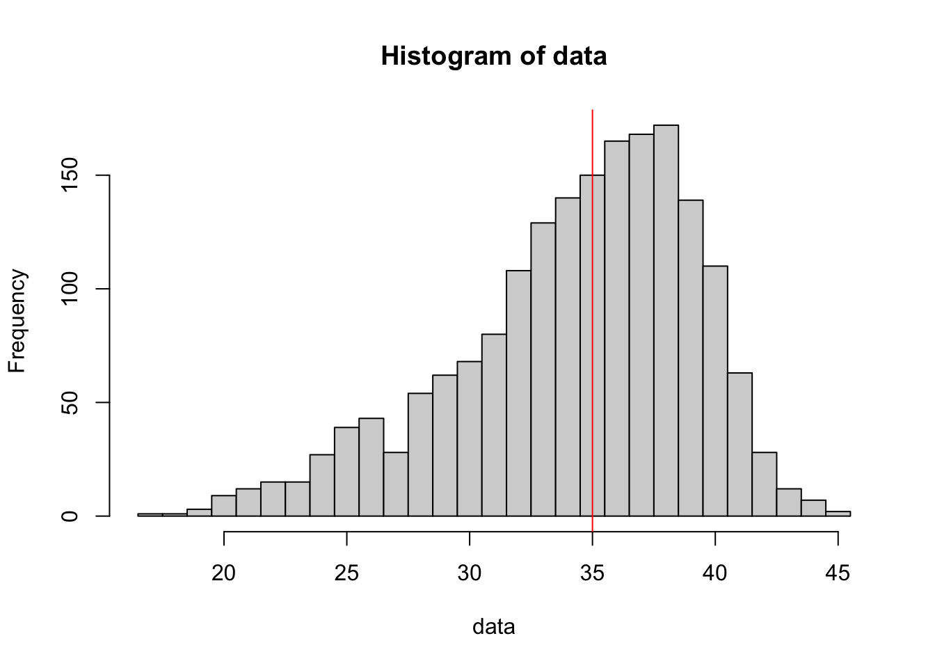
Figure 3.31: Left Skewed Distribution
What we see here is a histogram of the ages of mothers of babies whose father was 40 at the time of their birth. The red line indicates the middle value (again the median) of ages of the mothers.
This seems to say something about 40 year old men…
We will see how the concept of skew affects the statistics we get from samples in Section 4.5.
We can visualize skew with an exploration.
Review for Chapter 3
Chapter 3 Quiz: Using Graphs to Understand Data
This quiz tests your understanding of core statistical terminology, types of variables, and research methods presented in Chapter 3. The answers can be found prior to the Exercises section.
True or False: A bar chart is the appropriate type of graph to visually display the distribution of a quantitative variable.
True or False: A distribution is considered bimodal if its histogram displays two peaks.
True or False: The function
hist()works well with continuous data, but some care is required when working with discrete data.True or False: A histogram is identical to a Bar Chart, except that the bars in a Histogram must be ordered from tallest to shortest.
True or False: The height of the bars in a histogram can represent either the frequency (count) or the relative frequency (proportion) of observations falling into a specific bin.
True or False: The primary function used to create a histogram for a quantitative variable is
hist().True or False: The interquartile range (IQR)** represents the entire range of values from the minimum to the maximum observation in a dataset.
True or False: The stem plot (or stem-and-leaf plot) is a good tool for visualizing a small quantitative dataset because it retains the original numerical values of the observations.
Definitions
Section 3.1
Definition 3.1 \(\;\) A Frequency Table is an array listing the possible values of a dataset as well as the frequency that each value occurs in the dataset.
If data is already in a frequency table form, it is said to be Tabulated.
Definition 3.2 \(\;\) A Relative Frequency Table has the same structure of a frequency table, but lists the proportion of the dataset that is each particular value.
Definition 3.3 \(\;\) A Bar Plot is a visual demonstration of tabulated data. For each value of a dataset, a bar is drawn so that the height is equivalent to either the frequency or relative frequency of the value.
Definition 3.4 \(\;\) A Pareto Chart is a bar plot where the bars are ordered in descending order from left to right. A Pareto Chart can be be stated in terms of either observed frequency or relative frequency.
Section 3.2
Definition 3.5 \(\;\) A Two Way Table is an array of frequencies (or relative frequencies) of a dataset broken down by 2 different variables. One variable’s values determine the rows and the other variable’s values determine the columns. The entry of each cell of the array is the frequency (or relative frequency) of individuals that match the values of the respective row and column.
Definition 3.6 \(\;\) A Comparative Bar Plot is a visual demonstration of the information in a two way table. There are multiple ways of producing a comparative bar plot, but in all cases, there is a bar that represents the frequency (or relative frequency) of each cell of the corresponding two way table.
Section 3.3
Definition 3.7 \(\;\) A Histogram is a graphical representation of quantitative data. Data are broken into Bins or intervals of possible values and then a rectangle is drawn with each bin as a base with a height corresponding to the frequency (or relative frequency) of the values within each bin.
Definition 3.8 \(\;\) A good stem and leaf plot should include a legend or key which helps us interpret the plot. R does this as we see that it states The decimal point is at the | so that 22|9 can be quickly interpreted as 22.9.
Section 3.4
Definition 3.9 \(\;\) While a completely technical definition will not be given here, we will say that a unimodal distribution is Skewed Right if the distribution takes on values further to the right of the peak of the graph than it does to the left.
Similarly, a unimodal distribution is said to be Skewed Left if it takes on values further to the left of the peak of the graph than it does to the right.
Big Ideas
Section 3.1
Our main tool for graphing qualitative data is a bar plot (sometimes called a bar graph or bar chart).
Section 3.3
Our main tool for graphing quantitative data is a Histogram.
Important Alerts
Section 3.1
Unless you are working with already tabulated data, that is data already in the form of a table, you will need to pair barplot with table.
Section 3.3
Bar plots should not be used to graph quantitative data.
Histograms should not be used to graph qualitative data.
It is important to remember that any differences in plots produced are completely attributable to the selection of the arguments and do not mean there has been any “change” in the data itself. The manipulation of graphs is often done to make a graph tell the story that the creator wants it to. There is the famous quote which Mark Twain attributed to the British Prime Minister Benjamin Disraeli in Chapters from My Autobiography, published in the North American Review in 1907:
“There are three kinds of lies: lies, damned lies, and statistics.”48
While slightly allegorical, it does point out that statistics can be used to deceive people with the subtleness needed to fully understand statistical graphs and calculations.
Important Remarks
Section 3.1
There are many options/arguments which can be used with graphical functions which can be used to make better looking graphs. The view of taken by Statypus is that it is fairly easy to make R produce graphs, but making publishable level graphs may take considerable effort and/or skill.
Further, most R professionals would use an advanced graphical package such as ggplot2 to produce better graphical summaries of data.
- We still need to include
tableto get the relative frequency bar plot. - The graphical output of a frequency and relative frequency bar plot are identical except for the labels on the vertical axis.
- The
proportionsfunction can be used withtablewith or without thebarplotfunction. The composition function,proportions( table( x ) )will produce a relative frequency table.
It is important to remember that although the graphs may appear different when we change the arguments of
barplot, the actual data has not changed and the differences are purely aesthetic. It is the job of the reader to always be a critical consumer and make sure they understand the graph they are viewing.As mentioned before, there are plenty of options available to make the above graphs better and avoid things like the awkward legend position above. However, this document will focus on trying to produce simple graphs.
Section 3.3
While bar plots can be used for discrete quantitative data, we do not advise it and suggest the use of the method and Code Template in Section 3.3.2.
While the user is certainly at liberty to change the values of scale and width for the function stem, here at Statypus we encourage someone to do so only if the default stem and leaf plot has some shortcoming that they are looking to overcome.
Code Templates
Section 3.1
If you have a vector, x, or column of a dataframe, df$Col, of values of a qualitative variable, we can make a bar plot of the frequencies it via:
or
If we want relative frequencies instead, we use the following code:
or
To get a Pareto chart of a qualitative variable, use the following code.
or
You can also include the function proportions in between sort and table to make the Pareto chart display relative frequencies.
Section 3.2
To get a Two Way Table of counts based on the columns Col1 and Col2 of a dataframe, df we use the code:
Section 3.3
To make a basic histogram of a vector x, you can use the code:
or if we have a column of a dataframe, we would use:
Where we set freq = FALSE if we want relative frequencies rather than just frequencies. We can set freq = TRUE or omit freq if we want regular frequencies.
To plot a histogram of discrete data, we can use the following code chunk. The user must supply the discrete data they wish to graph in the place of x and also the width of the bins they would like to use in as an integer in the place of w.
New Functions
Section 3.1
The syntax of sample we will now use is
where the arguments are:
x: The vector of elements from which you are sampling.size: The number of samples you wish to take.replace: Whether you are sampling with replacement or not. Sampling without replacement means that sample will not pick the same value twice, and this is the default behavior. Passreplace = TRUEto sample if you wish to sample with replacement.
The syntax of table is
where the arguments are:
x: The data to be tabulated.exclude: Can be used to exclude certain values of a vector from the table.useNa: Used to determine whether to includeNAvalues in the table. The choices are"no","ifany", and"always".
Section 3.2
The syntax for barplot for comparative bar plots is
#This code will not run unless the necessary values are inputted.
barplot( height, beside, legend.text )
where the arguments we use here are
height: Now the output of a two way table.beside: IfFALSEorF, the columns of height are portrayed as stacked bars, and ifTRUEorTthe columns are portrayed as juxtaposed bars.legend.text: Used to give more information to make our graphs more understandable.
Section 3.3
The syntax of hist is
where the arguments are:
x: The data to be plotted.right: By default,right = TRUEthe histogram cells are intervals of the form \((a, b]\), i.e., they include their right-hand endpoint, but not their left one. If the user specifies thatright = FALSE, the intervals are of the form \([a, b)\) which is common in many other introductory statistics textbooks.breaks: This controls the number of bins being used in the histogram. The simplest way to control this is by setting the argument equal to an integer which R will use to give the number of equal spaced breaks used.freq: (Usually) By default,freq = TRUEand the histogram graphic is a representation of frequencies. If the user specifiesfreq = FALSE, relative frequencies are used.
Quiz Answers
- False (A Bar Chart is for Categorical variables; a Histogram is for Quantitative variables.)
- True
- True
- False (Histograms display quantitative data in contiguous bins; Bar Charts display categorical data.)
- True
- True (The Base R function is
hist().) - False (The IQR is the range of the middle 50% of the data, from Q1 to Q3.)
- True
Exercises
For Exercise 3.1, you should load the dataset Bulls1996. The code for this can be found in Example 3.3.
For Exercise 3.3, load the HistData package. See Section 1.3.5 for instructions for installing HistData if you do not have it on your machine.
For Exercise 3.4, you will need to load the dataset Asylum1849. The code for this can be found in the Now it’s your turn! which appears immediately following Example 3.1.
Exercise 3.1 For each of the following parts, identify where the student went wrong and find a way to fix their code. Feel free to run the code as it is to see what Errors or Warnings appear.
- After successfully loading the
Bulls1996data frame as done in Example 3.3, a student used the following code to try and display the contents of thePosvariable.
- A student tried to make a barplot of the
cylvariable in themtcarsdata frame using the following line of code.
- A student used the following line of code to try and create a relative frequency bar plot of
mtcars$am. No errors or warnings appeared, but the student knew something wasn’t quite right.
- Using the following code, a student was unsuccessful in obtaining a Stem and Leaf Plot of the data set
rivers.
Exercise 3.2 Would a bar plot or histogram be the appropriate graphical display for the values in mtcars$wt? Explain.
Exercise 3.3 Consider the dataset DrinksWages in the HistData package. Run ?DrinksWages and look at the meaning of the class column. Make a table and relative frequency bar plot of this variable. Which class is the least represented and what proportion of all observations does it represent?
Exercise 3.4 Create a Pareto chart for the married.single variable in the Asylum1849 data frame.
Exercise 3.5 The data set ToothGrowth deals with tooth growth in guinea pigs. Make a histogram of the values in the len column for only those guinea pigs who received orange juice.
Exercise 3.6 Again using the ToothGrowth data set, make a histogram of the values in the len column for only those guinea pigs who received ascorbic acid.
Exercise 3.7 Based on the results of Exercises 3.5 and 3.6, can you see any difference in the value of len based on the delivery method used?
Exercise 3.8 Using ToothGrowth, give a histogram of the values in len for each of the different dose levels, there should be three total histograms. Does it appear the dose level has an effect on the len variable?
Exercise 3.9 In Example 3.9 there was a discrepancy between some of the stems and the associated bins in the histogram of the data mtcars$qsec. List out the values in the stems and compare them to the values in the mtcars$qsec. What is causing the discrepancy between the histogram and stem and leaf plot?
Fauna of Australia. Vol. 1b. Australian Biological Resources Study (ABRS)↩︎
To be precise,
PlatypusData1is a part of the dataset titledID_Pop_Platypus.csvwhich can be found on GitHub.↩︎We will dive into this much more later, but the curious reader can see the note following Example 4.18 in Section 4.4.1 or the footnote in Example 5.8 in Section 5.4.↩︎
The curious reader may wonder what happened to
BabyData2or if even such a dataset exists. It does, but we won’t see that dataset until Chapter 14 where we investigate all three of the baby datasets.↩︎The observant reader may be curious as to the reason for the option
1:9in the following line of code. The entire dataframe actually contains 37 variables for each observation and we included the option1:9to only have R output the first 9 variables.↩︎