Chapter 14 QQ Analysis

Figure 14.1: A Statypus Doing Statistics in Nature
Due to their inefficient digestive system, a platypus can spend over 12 hours of every day swimming underwater eating. The main food of a platypus is insect larvae.211
FILL INTRODUCTION
New R Functions Used
All functions listed below have a help file built into RStudio. Most of these functions have options which are not fully covered or not mentioned in this chapter. To access more information about other functionality and uses for these functions, use the ? command. E.g. To see the help file for qqnorm, you can run ?qqnorm or ?qqnorm() in either an R Script or in your Console.
We will see the following functions in Chapter 14.
qqnorm(): A generic function which produces a normal QQ plot of the values which is used to test how Normal a dataset is.qqline(): When added to a QQ plot, it produces the line showing what a perfectly Normal distribution would look like.
14.1 Assessing Normality
Remark. This topic is optional in a lot of introductory statistics courses.
Very few real life datasets come from a population that is perfectly Normal.212 However, we use the Normal population as a model for many real life distributions. To see how appropriate the Normal distribution is as a model for a given sample, we can construct a QQ (or Quantile-Quantile) Plot. A QQ analysis compares a given dataset to a theoretical model. In our case, we will focus solely on the case where we compare a dataset to the Standard Normal Distribution. However, as it only compares quantiles to quantiles, this is equivalent to comparing the dataset in question to any Normal Distribution.
The QQ analysis finds the quantiles of the given dataset to the quantiles of the theoretical model. If the dataset fits the model, we can expect a nearly linear scatterplot in the QQ plot.
We will present some parts of code here as chunks of code to be run rather than individual lines or functions. Our first two functions we will use will create the QQ plot as well as the theoretical line that the dataset should follow if it was from a Normal distribution.
The syntax of qqnorm() and qqline() are
where the argument is:
x: The sample being tested for Normality.
The output of qqnorm is a list of 2 vectors which can be accessed the same way columns in a dataframe are. The QQ plot gives a graphical representation of the appropriateness of using a Normal model, but to make an objective decision, a measure of the relationship is necessary. We will use the correlation between the two columns in the output of qqnorm. We can do that with the following chunk of code.
In general, we can use the following block of code as our template for running a QQ analysis. This includes giving the length of the dataset, its histogram, the QQ plot, the QQ line, as well as the the correlation of the QQ plot.
We will see how to decipher the outputs of this analysis in the next section to determine if we want to decide that a dataset does not come from a Normal population.
The function qqline likely will not work unless it is used in conjunction of an existing plot. The previous use of qqnorm allows qqline to work properly.
Example 14.1 One dataset we have seen before is the distribution of the engine size, as measured by its displacement, found in mtcars$disp. The question we are investigating is if we can show that this sample comes from a population that is not Normally distributed. The histogram does not give us confidence that its population is Normal.
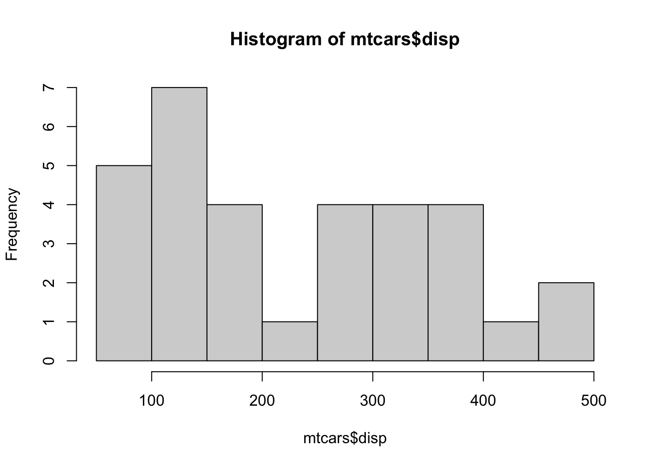
Figure 14.2: Histogram of mtcars$disp
To begin, we assume that the population that mtcars$disp comes from is Normal. We then attempt to see if the bimodal nature and lack of symmetry the sample has is sufficient evidence that the population is indeed not Normal.
We initially set the variable x to be mtcars$disp and then we can run the steps of analysis outlined above. We omit the histogram here as it was done just a moment ago.
## [1] 32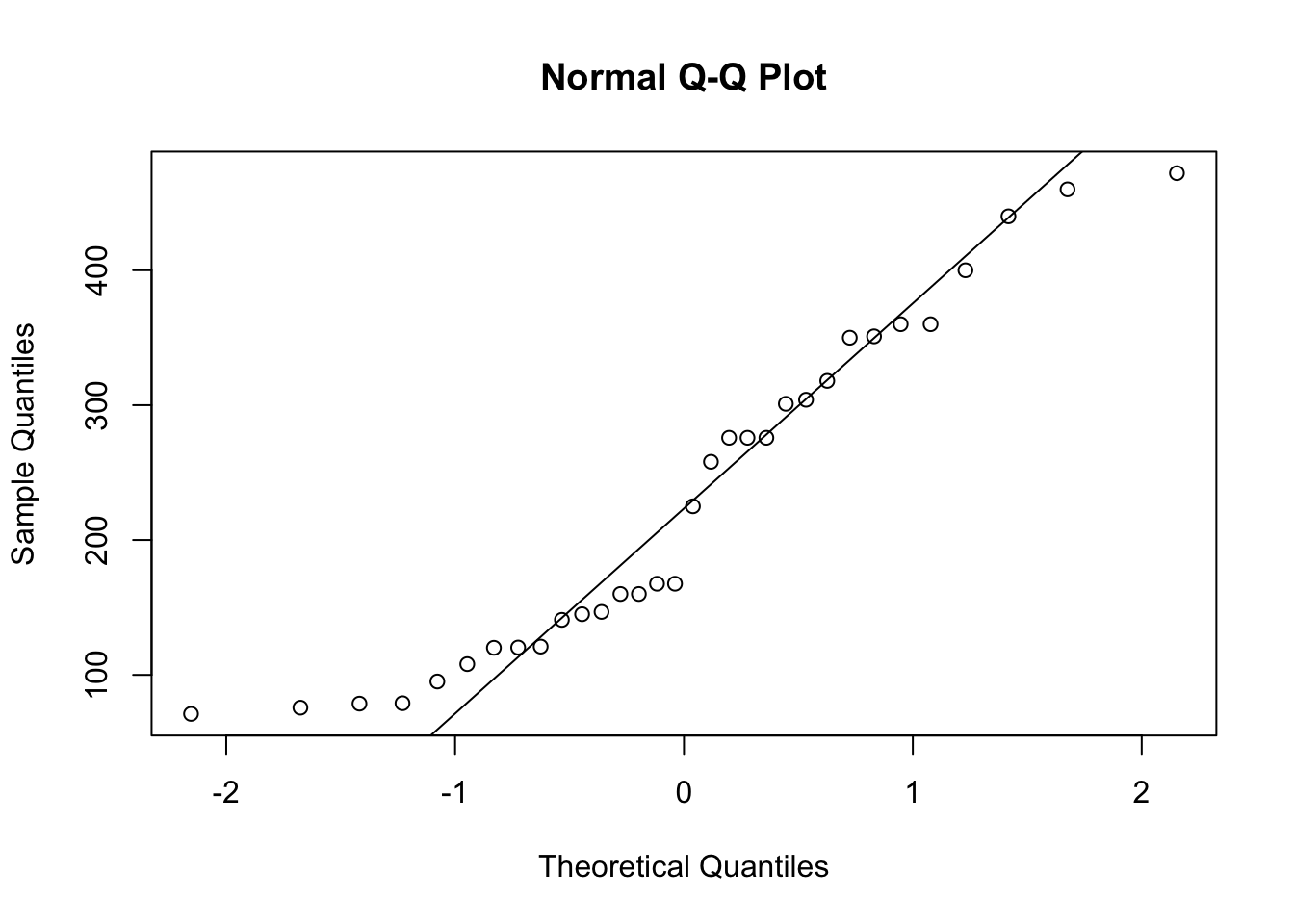
Figure 14.3: QQ Analysis of mtcars$disp
## [1] 0.9644599The analysis concludes with an \(r\) value of approximately 0.96. This is fairly close to 1, but we are not sure if it is “close enough” or not. We will hold off comment on this on until the next section.
14.1.1 Gentle Introduction to the Idea of Hypothesis Testing
To take the next step in or analysis of Normality, we ask a simple question:
How “Normal” should samples from a Normal population be and how can we measure that?
If we assumed that a dataset came from a non-Normal population, it would be impossible to gather any evidence to the contrary as no finite sample could ever be completely Normal. Therefore, we must assume that the population we are investigation is Normal and gather evidence to the contrary. This is similar to a court of law where we assume that a defendant (in this case the Normality of a population) is innocent (in this case, the population is Normal) and it is the duty of the prosecution (in this case, the statistician) to offer enough evidence to the contrary to force the court to find the defendant guilty (in this case, that the population is not Normal). If the prosecution fails to offer enough evidence against the assumption of innocence, the defendant is acquitted and found not guilty.213 In our analogy, this would say that while the QQ plot may not be perfectly linear, it does not deviate enough to give enough evidence to confidently conclude that the population is not Normal.
Leaving the allegorical, we will assume that the population is indeed Normal which means if we had the QQ plot for the entire population we would achieve an \(r\) of 1.214 We know that a sample will almost certainly never be perfect (and a finite sample is guaranteed to not be perfect), so we are left with the question:
Does the \(r\) value fall far enough below \(r=1\) to confidently say that the Population is not Normal?
As stated above, the concept of “far enough” is ambiguous. Fortunately, the National Institute of Standards and Technology has as webpage that shows the critical value for \(r\) based on the length of the vector. If the length of the vector in question falls between two values of \(N\) in the table, use the larger of the two values of \(N\). This is one of the reasons that we explicitly called for the length of the vector in our QQ analysis.
Link: https://www.itl.nist.gov/div898/handbook/eda/section3/eda3676.htm
To understand how to use this table, if we look at the 0.05 column, less than 5% of SRS of size \(N\) from a Normal population will have an \(r\) value less than \(r^*_{0.05}\). For 0.01 column, less than 1% of SRS of size \(N\) from a Normal population will have an \(r\) value less than \(r^*_{0.01}\). This is more fully examined in the appendix.
14.1.2 Small Sample Example
Example 14.2 Returning to Example 14.1, we refer to the NIST table for \(N = 32\), we get that \(r^*_{0.01} = 0.9490\).
Because \(r > r^*_{0.01}\), we cannot abandon the assumption that the sample of engine sizes found in mtcars$disp come from a Normal distribution.
Remark. It is absolutely imperative that it is clear that this is not proof that the population is Normally distributed. We simply have not found strong enough evidence to prove that the population is not Normal. When this happens, the user can use their own discretion if they want to use the Normal distribution as a model for the population the sample comes from.
Example 14.3 Our second example will be a much larger sample. We will begin by importing a data frame which contains variables about a sample of 200 births during the year of 1998 as recorded by the U.S.Department of Health and Human Services.
We can now run the same analysis we ran on mtcars$disp.
## [1] 200
Figure 14.4: QQ Analysis for BabyData1$weight
Figure 14.5: QQ Analysis for BabyData1$weight
## [1] 0.9824093Referring to the NIST table for \(N = 200\), we get that \(r^*_{0.01} = 0.9903\).
Because \(r < r^*_{0.01}\), we have sufficient evidence to conclude that the population of values of baby weights is not Normally distributed. Looking back at the histogram and the QQ-plot, it does look “more” Normal than the previous example which we did not have evidence came from a non-Normal population, at least at the 1% level.
There is a chance, still, that BabyData1$weight, is drawn from a Normal population, but that the random sample we are investigating simply is not representative of this fact. The curious reader can explore this further in the first portion of the appendix.
14.2 Examples of Random Samples from a Normal population
Earlier, we saw that mtcars$disp had a histogram which did not look Normal, yet our analysis failed to substantiate this. However, BabyData1 had a nicer looking histogram and a QQ plot which may have looked “better” to the naked eye yet we found sufficient evidence to conclude that it was drawn from a population that was not Normal.
The question that naturally arises is what random samples from a Normal population do look like. We can use rnorm to draw random samples from the population of IQ scores. Recall that IQ scores are standardized to be Normal with \(\mu_X = 100\) and \(\sigma_X = 15\). We do expect that the sample size will affect the shape of a sample’s distribution.
14.2.1 Small Sample Size:
We begin this investigation with a small sample size of \(N = 30\) which is similar to that of mtcars$disp. We show three distinct random samples of IQ scores below.
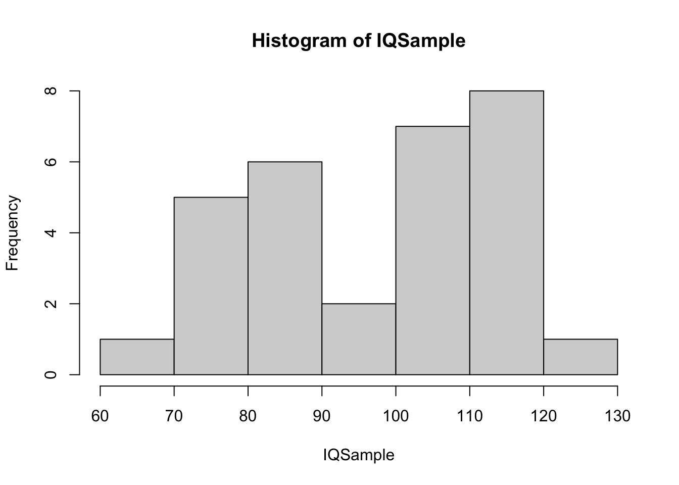
Figure 14.6: Histogram of Small IQ Sample 1
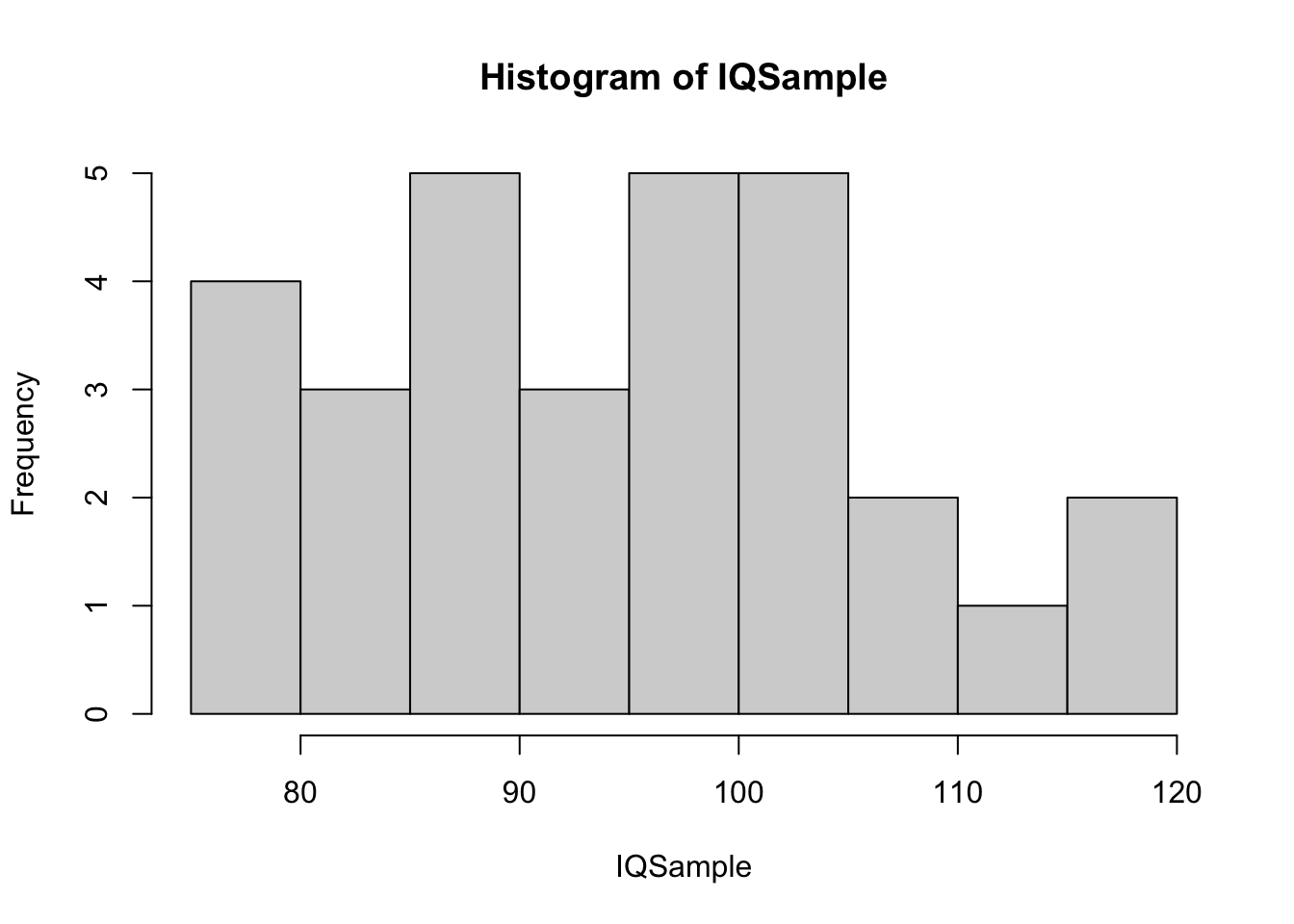
Figure 14.7: Histogram of Small IQ Sample 2
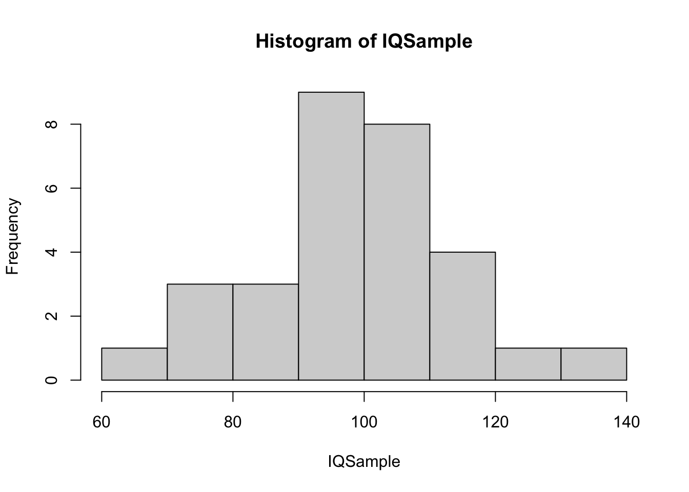
Figure 14.8: Histogram of Small IQ Sample 3
While the third of our samples looks fairly “bell” shaped, the other two samples don’t give any visual evidence that they derive from a Normal population. This gives supporting evidence that mtcars$disp may indeed come from a Normal population as its histogram does not look out of place among the histograms we see above.
14.2.2 Medium Sample Size:
We now move to samples of sizes \(N=200\) which are the size of BabyData1 which we concluded did not come from a Normal population.

Figure 14.9: Histogram of Medium IQ Sample 1
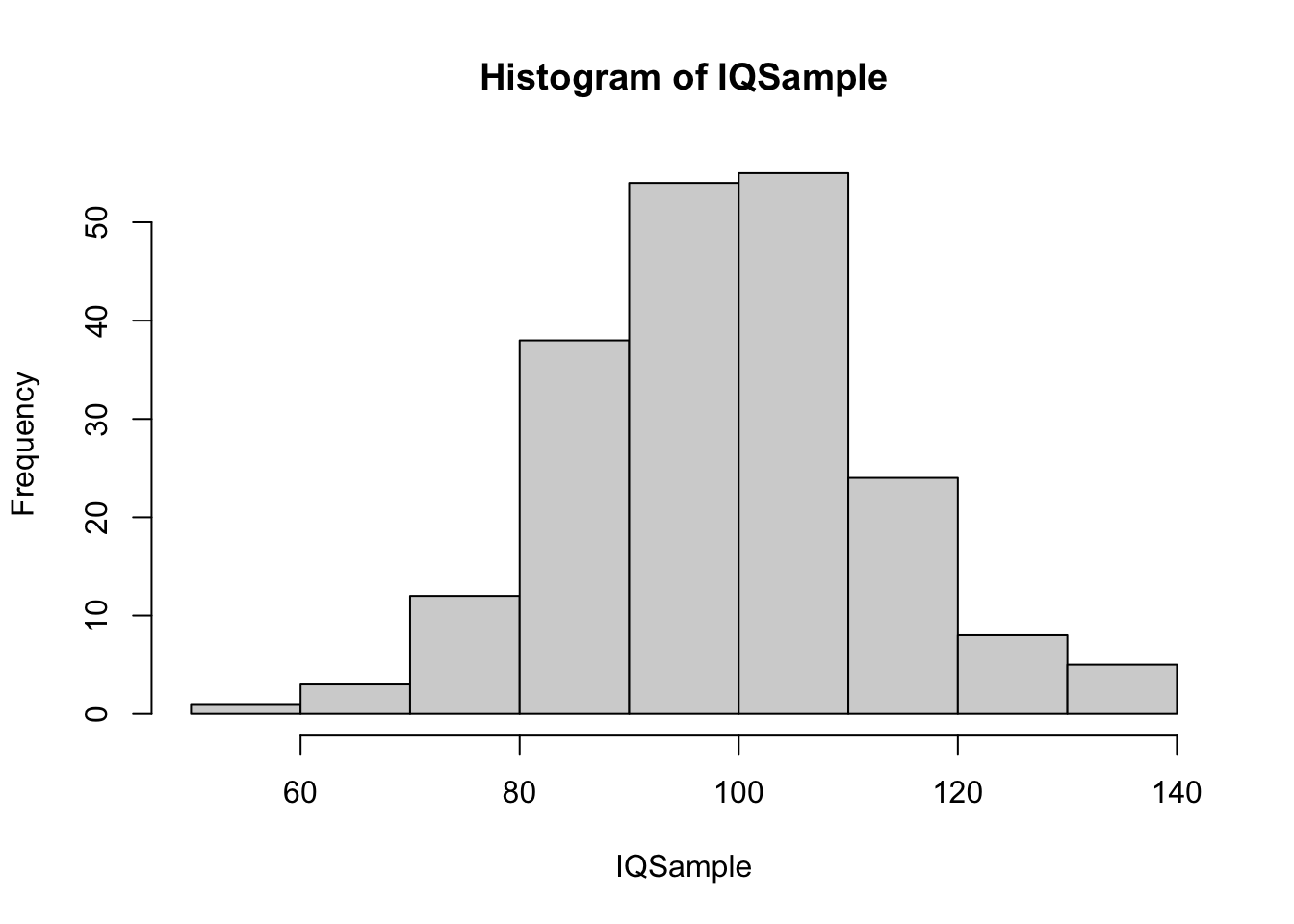
Figure 14.10: Histogram of Medium IQ Sample 2

Figure 14.11: Histogram of Medium IQ Sample 3
One takeaway from this simulation experiment is that while the histogram for BabyData1 did look very smooth and bell shaped, it did seem to show a clear sign of skew. This is possibly due to the presence of premature births, but abnormally large babies are often delivered early to ensure the health of the mother.
While the above samples may not look as “clean” as that of BabyData1, these histograms don’t show the same level of skew as they come from a Normal population. It is important to remind the reader that these simulations do not offer any proof that the population that BabyData1 comes from is not Normal, it is just meant to give a bit more confidence about the conclusion that we reached.
14.2.3 Large Sample Size:
We conclude this portion of our analysis with large samples of size \(N=1000\). We will see an example in the next section that has a similar sample size which can be compared to the following random samples from a Normal population.
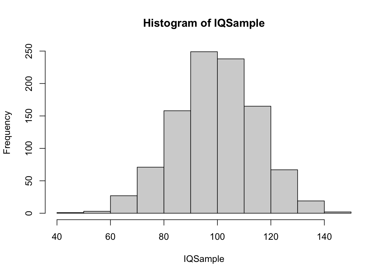
Figure 14.12: Histogram of Large IQ Sample 1
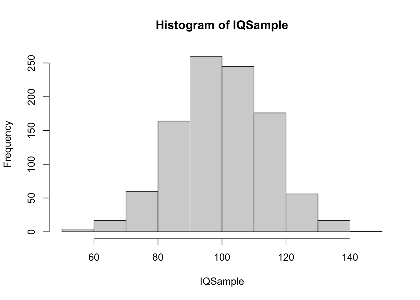
Figure 14.13: Histogram of Large IQ Sample 2
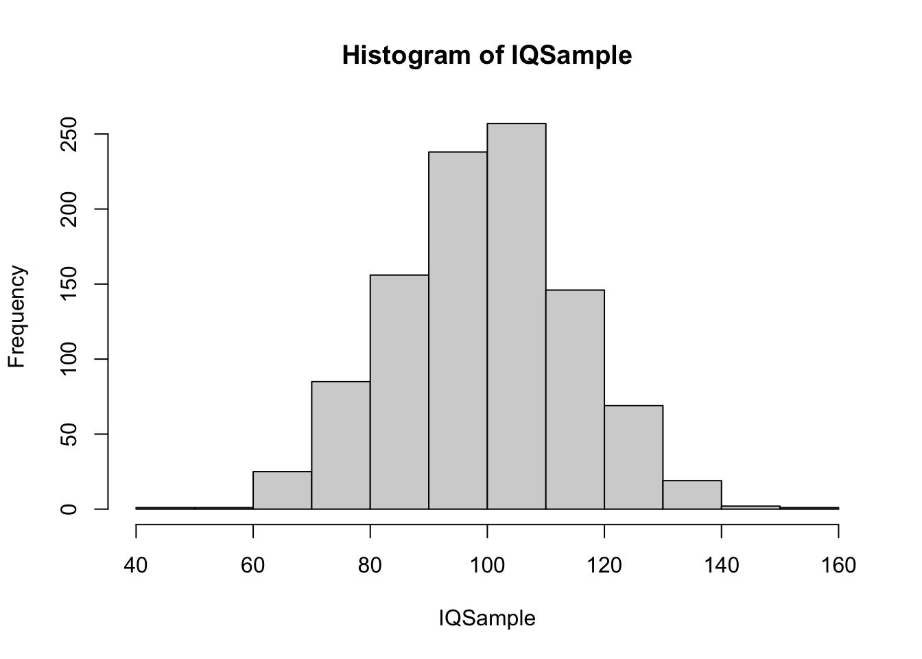
Figure 14.14: Histogram of Large IQ Sample 3
As suspected, none of these samples show anything that would lead someone to visually believe that the underlying population is not Normal. In fact, they show a similar structure and less variability from sample to sample.
We also did find that increasing the sample size made the samples more resemble the Normal distribution.
14.3 Further Investigation of Normality of BabyData1$weight
Some readers may have been left unsatisfied that the values in BabyData1$weight were certainly not from a Normal population. Both the histogram and QQ plot seemed more convincing than the example found for mtcars$disp.
We begin this investigation by finding a random sample from a population that has the same mean and standard deviation (here we use the sample standard deviation of BabyData1$weight as a population standard deviation) that BabyData1$weight had. We will use the sample function like we did in the Chapter 6.
set.seed(1.618)
IQSample <- rnorm( n = 200, mean = mean( BabyData1$weight ), sd = sd( BabyData1$weight ) )
x <- IQSample
length( x )
## [1] 200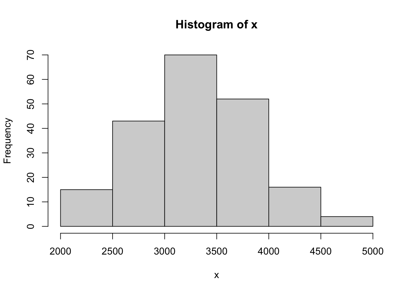
Figure 14.15: QQ Analysis of Random Baby Weights
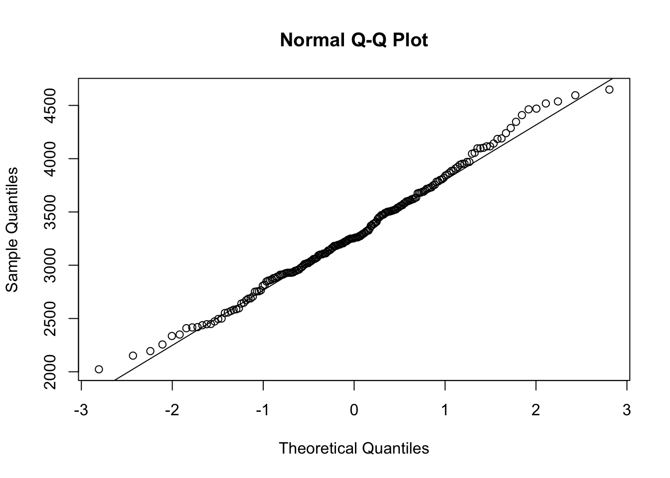
Figure 14.16: QQ Analysis of Random Baby Weights
## [1] 0.997001This sample gave us an \(r\) value of 0.99701, which is very close to 1. While this example was set with a fixed seed,215 if you run the above code block without the set.seed line (or choose a random number as a seed), you will get an \(r\) which is greater than \(r^*_{0.01} = 0.9903\) approximately 99% of the time. That is, only 1% of random samples from a Normal population will give an \(r\) value smaller than \(r^*_{0.01}\). We explore this more fully in the next section of the appendix. This analysis shows that if BabyData1$weight did indeed come from a Normal population, that the \(r\) value from the QQ calculation we found is extremely unlikely.
To investigate if BabyData1$weight was indeed just a very unlikely sample, we can pull from another even larger sample. The following data comes from Child Health and Development Studies. It has 1236 individuals in the dataset and we will be looking at the bwt variable/column which gives the baby’s birth weight.
## 'data.frame':    1236 obs. of  8 variables:
##  $ case     : int  1 2 3 4 5 6 7 8 9 10 ...
##  $ bwt      : int  120 113 128 123 108 136 138 132 120 143 ...
##  $ gestation: int  284 282 279 NA 282 286 244 245 289 299 ...
##  $ parity   : int  0 0 0 0 0 0 0 0 0 0 ...
##  $ age      : int  27 33 28 36 23 25 33 23 25 30 ...
##  $ height   : int  62 64 64 69 67 62 62 65 62 66 ...
##  $ weight   : int  100 135 115 190 125 93 178 140 125 136 ...
## $ smoke : int 0 0 1 0 1 0 0 0 0 1 ...## case bwt gestation parity age height weight smoke
## 1 1 120 284 0 27 62 100 0
## 2 2 113 282 0 33 64 135 0
## 3 3 128 279 0 28 64 115 1
## 4 4 123 NA 0 36 69 190 0
## 5 5 108 282 0 23 67 125 1
## 6 6 136 286 0 25 62 93 0It is of note that the bwt variable here is measured in ounces as compared to the grams used in BabyData1216. We can now run the QQ analysis on BabyData2$bwt
## [1] 1236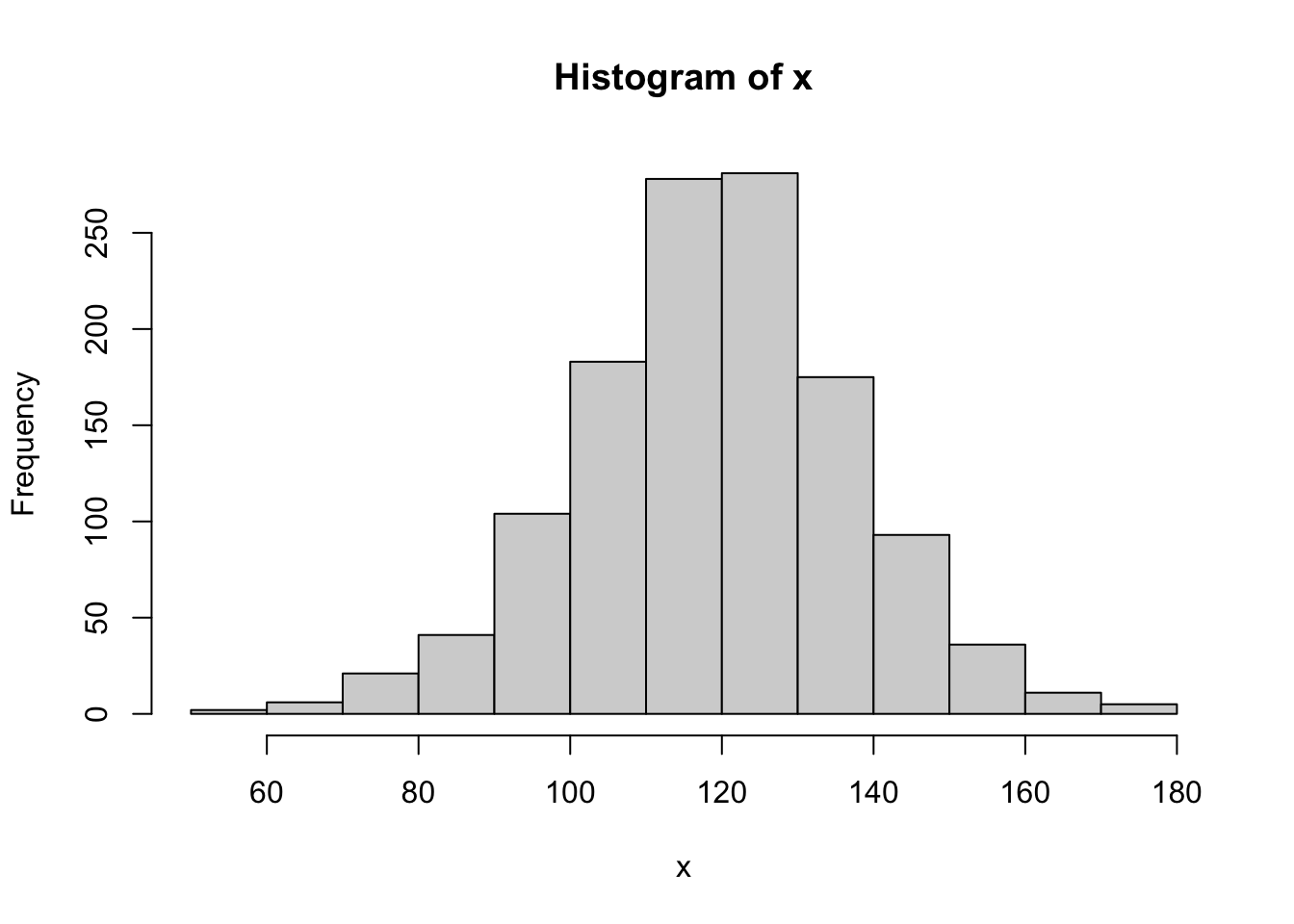
Figure 14.17: QQ Analysis for BabyData2$bwt
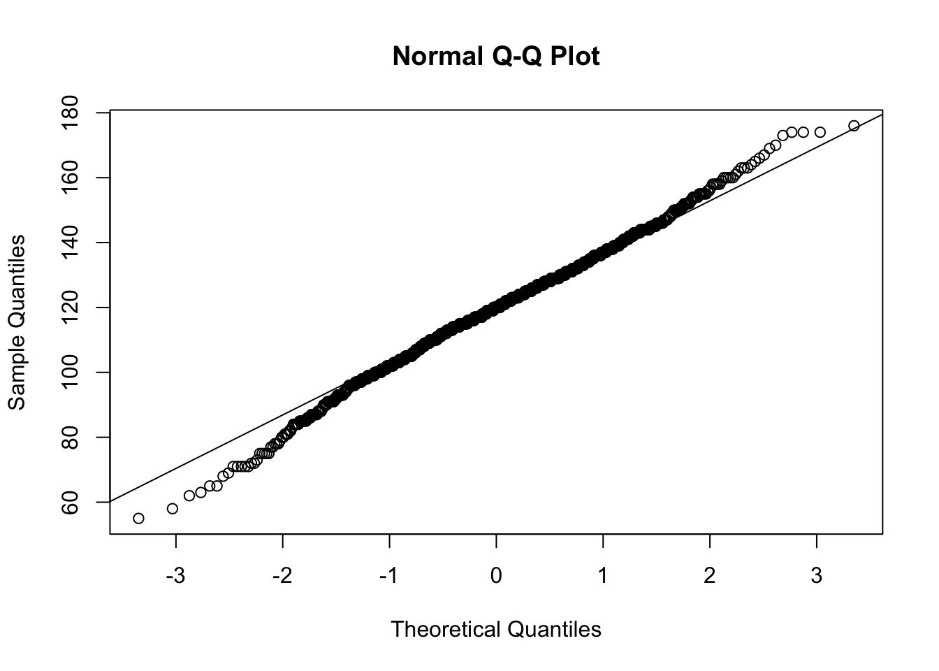
Figure 14.18: QQ Analysis for BabyData2$bwt
## [1] 0.9978498Referring to the table on the NIST website, we see that we should compare our \(r\) value to the value in the table. As the table has a maximum \(N\) value of 1000, we can simply say that \(r^*_{0.01} > 0.9979\). Thus, we have that \(r < 0.9979 < r^*_{0.01}\) once again, but this time it was (potentially) very close.217 Regardless, we have found sufficient evidence to conclude that BabyData2 comes from a population which is not Normal.
Going back to the simulations done in the previous section, we do see that the “width” of BabyData2 does appear to be narrower than that of the samples we found. This is at least some evidence that while the shape of distribution may have appeared Normal and the population is likely similar to a Normal distribution, it isn’t exactly Normal regardless.
For the really curious reader, the following dataset is the largest dataset corresponding to birth weights that the author could find. The origin has not been located, but it contains a staggering 101,400 individuals.218 It is fair to want to discount this data due to its unknown origins and construction, but it is shown here as an example of a very large dataset. The variable we will look at here is BWEIGHT which is the birth weight in pounds.
##   SEX MARITAL FAGE MAGE GAINED VISITS FEDUC BWEIGHT
## 1   2       1   33   34     26     10    12  4.3750
## 2   2       2   19   18     40     10    11  6.9375
## 3   2       1   33   31     16     14    16  8.5000
## 4   1       1   25   28     40     15    12  8.5000
## 5 1 2 21 20 60 13 12 9.0000Remark. The standard use of str or head can be used here, but either option will cause quite of a bit of output which may be difficult to parse. The specific choices shown here are meant to mimic the output of head but only show a few of the initial columns that are similar to the previous datasets we have looked at as well as the 10th column, which is the one we are investigating.
We can now run the same analysis which ends with getting an \(r\) value.
## [1] 101400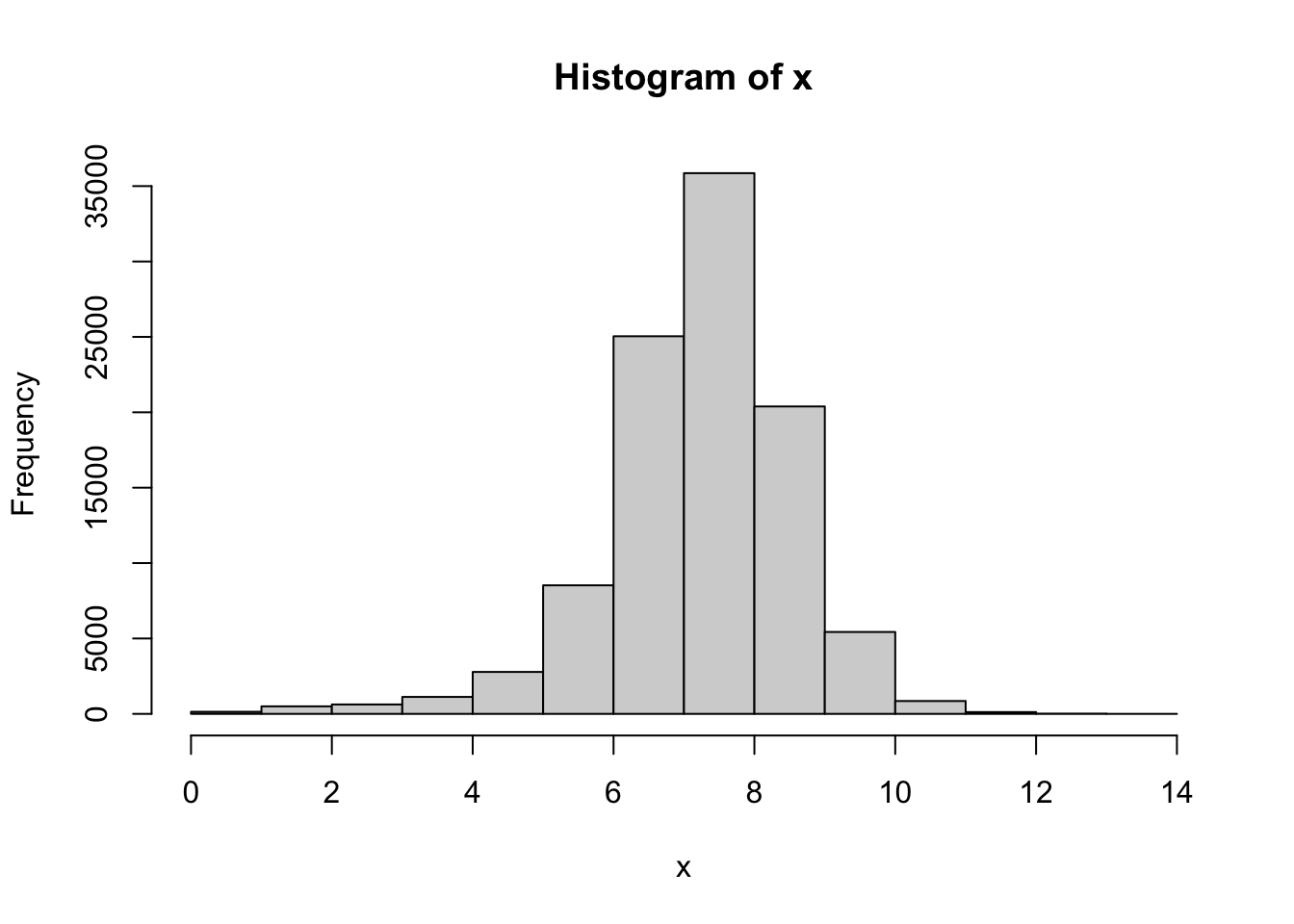
Figure 14.19: QQ Analysis for BabyData3$BWEIGHT
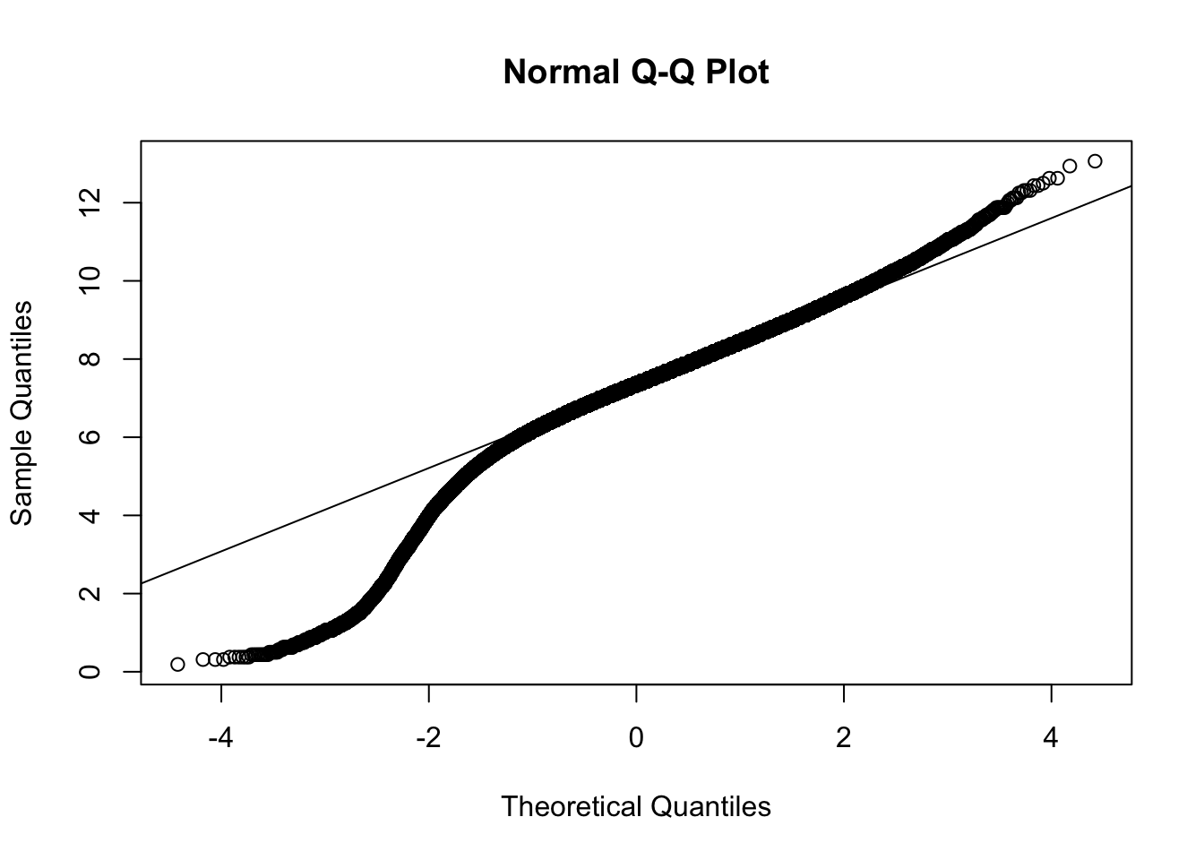
Figure 14.20: QQ Analysis for BabyData3$BWEIGHT
## [1] 0.9760736As before, we can simply say that \(r^*_{0.01} > 0.9979\), but it is fair to say that the actual critical value is well above 0.9979. With an \(r\) value of 0.9760736 we have that \(r\) is significantly lower than \(r^*_{0.01}\). Regardless, the QQ plot offers a very smooth graph showing that this sample definitely exhibits some clear skew. Thus, this sample does give sufficient evidence that the population of birth weights is not Normal.
14.4 Simulation to Justify \(r^*_\alpha\)
The critical values we use to test \(r\) for a QQ analysis were found on the NIST website. The curious reader may be curious about how these numbers were found. The website does offer citations to works the value are derived from, but both are advanced scholarly papers which could prove intractable to the reader. This section will not derive any of the values found in the table, but instead offer a simulation to justify the values of \(r^*_{0.01}\) and \(r^*_{0.51}\) for \(N=200\).
We will use the distribution of IQ scores as our basis of a Normal distribution219 and ask R to produce a random sample of 200 IQ scores, find it’s QQ plot,220 and then the correlation coefficient of the sample. R will then compare that value to the value of \(r^*_\alpha\) and repeat the process ten thousand times. The resulting output is the proportion of samples from a Normal distribution that would, none the less, result in an analysis that would lead someone to believe the underlying distribution was not Normal.
We first investigate \(r^*_{0.05}\) for \(N=200\).221 Referring to the NIST table, we see that \(r^*_{0.05} = 0.9930\). If this value is correct, we should expect that 5% of samples to have an \(r\) value that falls below 0.9930.
event05 <- replicate( 10000, {
  x <- rnorm( n = 200, mean = 100, sd = 15 )
  QQ <- qqnorm( x , plot = FALSE )
  cor( QQ$x, QQ$y ) < 0.9930
})
mean( event05 )
## [1] 0.0446This says that 4.46% of the samples would “fail” to appear Normal. Repeated simulations will offer different results, but this value is typical of all the cases that the author ran. This is strong evidence that \(r^*_{0.05} \approx 0.9930\).222
We now investigate \(r^*_{0.01}\) for \(N=200\). Referring to the NIST table, we see that \(r^*_{0.01} = 0.9903\). If this value is correct, we should expect that 1% of samples to have an \(r\) value that falls below 0.9903.
event01 <- replicate( 10000, {
  x <- rnorm( n = 200, mean = 100, sd = 15 )
  QQ <- qqnorm( x , plot = FALSE )
  cor( QQ$x, QQ$y ) < 0.9903
})
mean( event01 )
## [1] 0.0081This says that 0.8% of values would give results indicating they did not come from a Normal distribution. This is close enough to 1% (and repeated trials give consistent similar results) that we can be confident that \(r^*_{0.05} \approx 0.9903\).
Exercises
Exercise 14.1 Do a QQ analysis on the variable budget from the bechdel data frame. Based on this analysis, what type of skew does your QQ plot show? Does this align with its histogram?
Exercise 14.2 Run a QQ analysis on the variable calories from the hot_dogs data frame. What can you conclude?
Fauna of Australia. Vol. 1b. Australian Biological Resources Study (ABRS)↩︎
Even values like IQ scores which are designed to be Normal likely can’t be viewed as perfectly Normal as it is unlikely to achieve a negative IQ score while IQ scores above 200 have been recorded. Thus IQ scores are at least minimally skewed right.↩︎
This mindset and methodology we are mentioning here is the cornerstone to the idea behind hypothesis testing which will be covered in later chapters more fully.↩︎
Due to the construction, we get that the \(r\) found here is always positive, so we do not need to consider the case of \(r = -1\).↩︎
You can use the R function
set.seed()to guarantee repeatable results from random functions. This has been done here to have a fixed sample throughout the publication of this document. See?set.seedfor more information. The seed used here is a decimal approximation of the Golden Ratio.↩︎See the footnote in Example @ref(#BivariateBabyExample) in Section 5.4.↩︎
Some readers may want to dismiss the conclusion that the underlying population isn’t Normal due to how close \(r\) is to \(r^*_{0.01}\), but we remind the reader that if the population was Normal, less than 1% of all random samples would have an \(r\) this low. This is examined more fully in the next section.↩︎
If an advanced reader ever finds this footnote, the answer is yes. Simply doing random \(z\)-scores with
rnorm(200)would speed the code up to some degree. The IQ distribution is simply used to anchor the simulation around our earlier investigations.↩︎The more advanced reader will note that we have chosen to suppress the actual plot. As we will be running this process ten thousand times, this will save R the headache of producing 10000 plots that will never be seen anyway. However, the
qqnormmust be called in order to find the value of \(r\).↩︎The really advanced reader may question why care was taken to write the values of the simulation to memory as
event05before taking the mean of it. This is not necessary and likely does cause slowdown in the process, but it is done to mimic the techniques outlined in Section 13.3 which originated from the book which can be found at https://probstatsdata.com/.↩︎While the author will not disagree with the work mentioned on the NIST website, simulations run in a similar style as above shows that a value of \(r^*_{0.05} = 0.9932\) gives a proportion repeatedly closer to 5%. It is the view of the author that the reader should always be willing to question values given and investigate them themselves. Do you agree with the value of \(r^*_{0.01}\)?↩︎